
How To Create Facebook Landing Pages That Convert
By Jamie Ashley
Facebook has over 2.5 billion monthly active users.
It has a huge audience base that you can reach through Facebook Ads to increase your customer count.
But it’s useless unless your landing page is able to convert a healthy percentage of visitors to leads - then customers.
And people struggle - 65% of marketers fail to generate enough quality leads to fill the pipeline. That means those advertising dollars are being wasted and most businesses aren’t unlocking the true potential of Facebook Ads.
In this article, you’ll learn how to create high-converting landing pages tailored to your Facebook ads.
What is a Facebook landing page?
A landing page is a web page that’s designed to get visitors to take your desired action.
That may be to turn them into leads, download an app, or buy a product.
When creating a Facebook Ad campaign, it’s often ineffective to direct your audience straight to your products after they click it.
Why?
The majority of people didn’t log into Facebook to find an ad that’ll show them the hottest new product to buy.
They’re on the platform to be entertained, check in with friends, and kill time.
Instead of going straight for the sale, utilize a landing page that showcases relevant information to entice your audience while promoting a specific action.
It is the middle point between your promotional campaign (in this case Facebook Ads) and the service or product you are looking to promote or sell.
Therefore it is important that you make the landing page as effective and high-converting as possible - so your ad campaign is successful.
Creating a Facebook Ad campaign requires strategic planning that considers user psychology on the platform. Engaging potential customers through a thoughtful landing page experience creates a crucial bridge between casual browsing and purchase intent.
This transition space allows you to build trust and provide value before asking for the sale, dramatically increasing conversion rates.
By acknowledging that Facebook users are primarily seeking social connection rather than shopping opportunities, you can craft messaging that respects their mindset while gently guiding them toward your offering.
In order to create this high-converting landing page, it is best to use a dedicated landing page builder. They make the process easier and have a range of useful features to ensure you can optimize your pages over time.
Here are some examples:
Unbounce
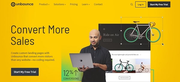
Unbounce is a popular landing page builder which makes converting clicks into leads, especially easy.
The landing pages and templates are made to convert, with particular features tailored for Facebook.
Mobile optimization allows you to flip between mobile and desktop and edit your pages fluently to create the best experience on either device. It also offers the ability to create super fast-loading mobile pages with SuperBoost and AMP.
Considering that 94% of Facebook Ad Revenue comes from mobile, this is where the majority of your leads will be generated.
LeadPages
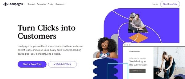
LeadPages is another great landing page builder and offers the ability to create Facebook Ads from within its interface.
This reduces the initial complexity of creating Facebook ad campaigns, and instead makes the process simple while integrating seamlessly with your landing page.
Of course, LeadPages also offers beautiful landing page templates, which are both mobile optimized and full of customization abilities with their drag-and-drop builder.
Instapage
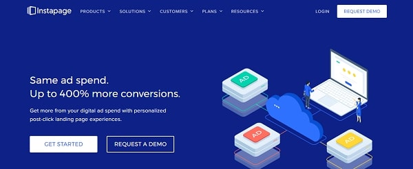
Instapage is a great option for Facebook landing pages.
It offers the ability to scale your campaigns by making it easy to publish and update pages within minutes. It also has a powerful A/B testing engine that helps you find the best version of your pages.
You can also reduce acquisition costs and improve CTR by creating and mapping out a relevant landing page for every keyword - as well as campaign and audience.
You can get a complete rundown of the best landing page builders in this guide.
Types of Facebook landing pages
Facebook is a social media platform, which means a couple of things. Firstly, unfortunately for businesses, most people aren’t in the state of mind needed to make a purchase.
This means you might face more hesitation from potential buyers.
This makes it even more important to create Facebook landing pages that are tailored to your goal. Instead of just direct sales pages, you should consider various types which include:
Squeeze page
A squeeze page is a landing page specifically designed to capture email addresses. They usually have a clear and simple CTA and some form of incentivization to encourage visitors to part with their email addresses.
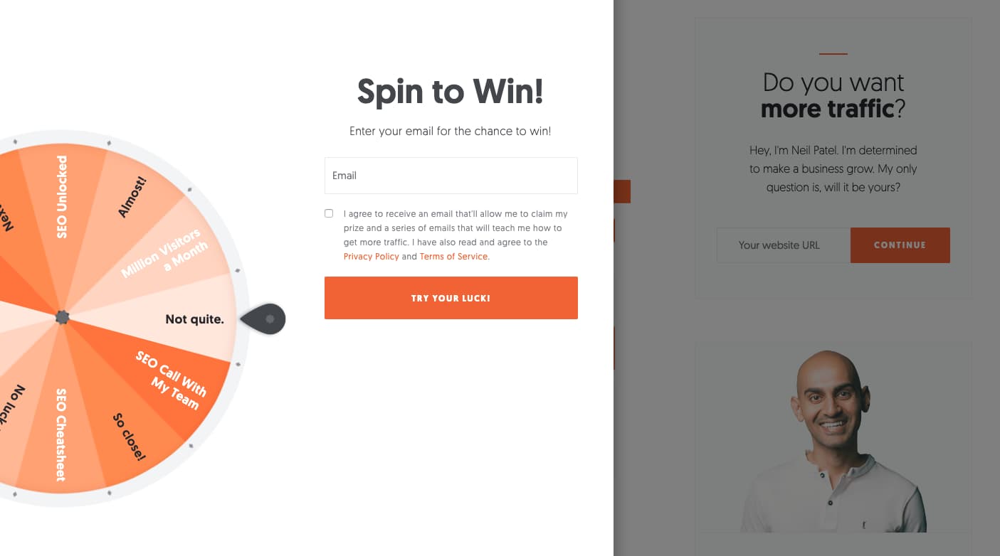
From Neil Patel
For example, Neil Patel has used a spin the wheel opt-in form to offer rewards, with a clear sign-up area to the right.
Squeeze pages should be used if you are actively trying to build an email list, which you can then use to develop more targeted audience outreach.
As a benefit, they’re often the easiest way to capture leads from Facebook Ads. Part of this is due to the low barrier of entry. Instead of asking them to purchase something you’re only asking visitors for their contact information.
Lead generation page
Similarly to squeeze pages, lead gen pages are designed specifically for the purpose of capturing personal information such as emails, phone numbers, company names, etc.
They usually ask for more information and have additional content for the prospect to check out before signing up.
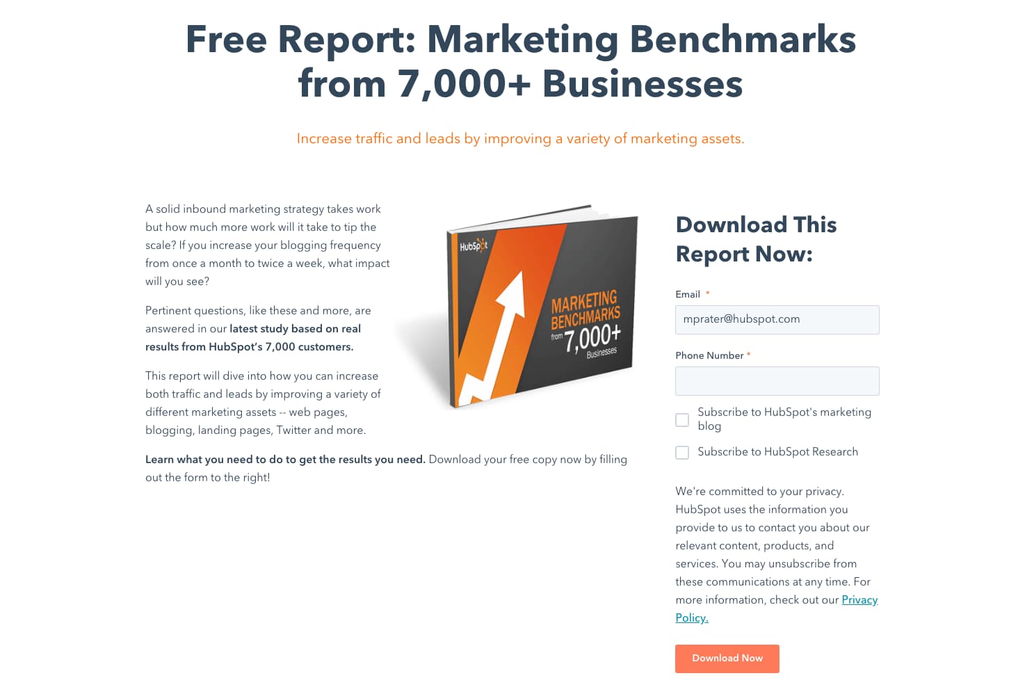
From HubSpot
In the example above, HubSpot is trying to capture an email address and phone number with the page. Lead generation pages should be used on similar occasions to squeeze pages.
More specifically, when you need more information about a prospect then dedicated lead gen pages are effective. Because you need more information, it’s often more effective to provide more information (or value) as well (in this case - a picture and a couple of blocks of text rather than just spin the wheel).
Click-through page
Click-through landing pages are designed to share the benefits and features of your product, without putting them off with a purchase button.
It could set the visitor up to take advantage of a free trial or some other offer (as seen below).
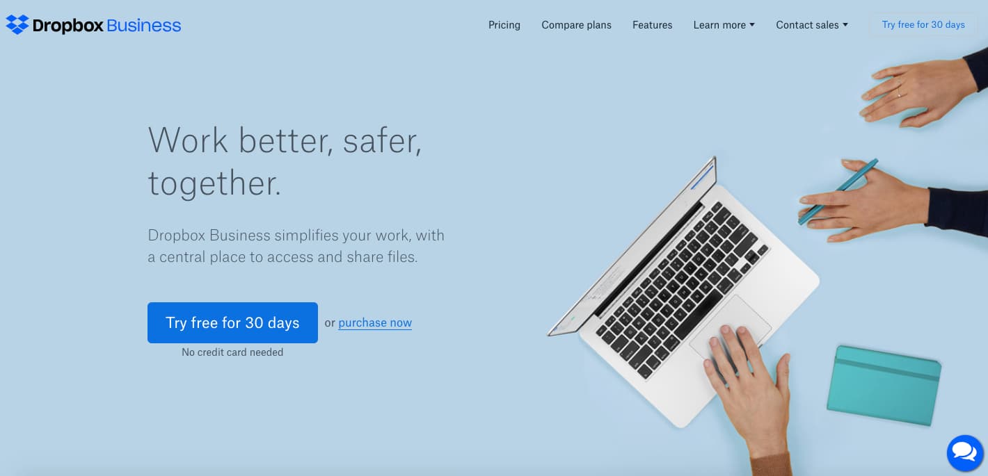
From there, after pressing the button, they would be referred to here.
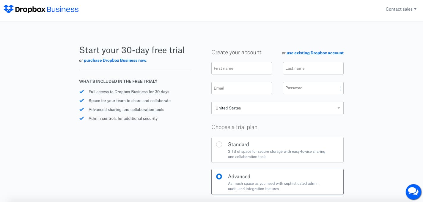
And fill in their details - which can later be used as part of an email marketing strategy aimed at getting the user to become a paying customer.
Click-through pages are best used when you want to give the details of the offer before asking them to sign up or purchase.
It is a page that usually attracts higher conversion rates than straight-up sales pages. Keep in mind, the conversion, in this case, is a click as opposed to a sale.
Sales page
Sales Pages have one thing in mind - to secure sales. They differ from Lead generation pages, as they are primarily focused on purchases instead of contact information (although they can attract both).
You can come across either long-form sales pages and short-form sales pages.
As their names suggest, they differ solely in that one utilizes large amounts of information and content to secure the sale.
The other one is relatively short and is ideal for products that are already understood or when your prospect is at a later stage of awareness.
Here are two examples:
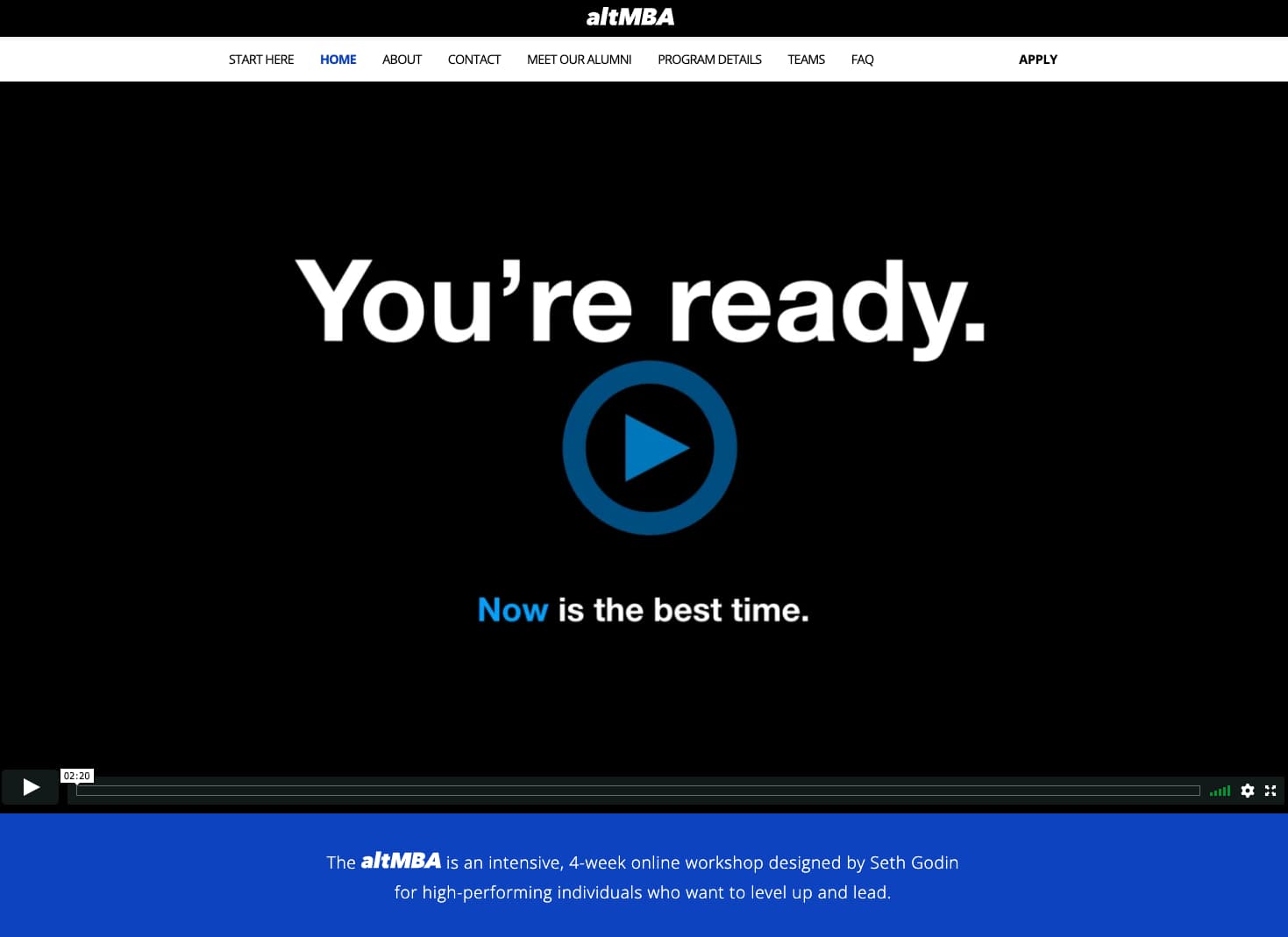
Credit: AltMBA
altMBA has used a video, text, and images to capture sales.
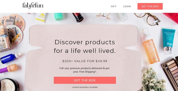
Credit: FabFutFun
In contrast, here is a short-form sales page, with a simple headline, image, and CTA.
Both can be effective and should be used when you are trying to sell directly without hassle.
How To Create A Compelling Facebook Landing Page
There are many elements required to make the most of your Facebook landing pages. It’s more than a nice layout and a pretty color scheme.
Message match
Say you were out shopping and decided to enter a store that was advertising the computers it had in stock.
Yet when you entered, you realized it was a toy store. Would you buy something, or leave straight away? Most likely you’d leave immediately and in some cases give the store owner a piece of your mind for misleading you.
The same principle applies online. Your Facebook Ads have to be consistent with your landing page. The following elements can determine whether or not the visitor feels like they’re in the right place:
- Imagery
- Main idea or promise
- Color scheme
- Wording
If there’s a disconnect between ad and page, you run the risk of losing a large number of prospects because they’re not sure they’re in the right place. This process of aligning your ads and landing pages is known as message match and could be the single most important thing you do to increase conversion rates.
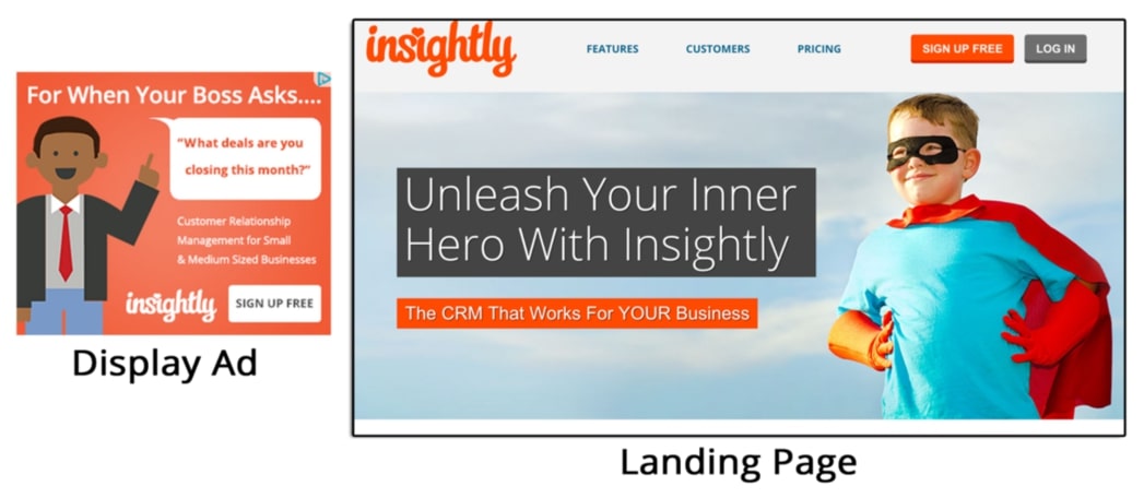
Credit: Insightly
Insightly has failed at some aspects of message match - the display ad and landing page have a different imagery style, wording, and even benefits.
However, to an extent, their color scheme is similar enough that people could believe they are in the right place.
Its bounce rate (how many people leave right after entering) would, therefore, be higher than otherwise if they improved the other aspects.
To avoid this, make sure you create a specific landing page for each variation of your Facebook Ads. Or, match your Facebook Ad variations to your landing pages.
To optimize your advertising strategy and improve campaign tracking, it is recommended to create dedicated landing pages for each variation of your Facebook Ads.
Another approach is to align your Facebook Ad variations with corresponding landing pages, which enhances management and provides a seamless user experience.
Additionally, you can consider FB ad library to gain valuable insights into your competitors’ ad strategies and stay informed about the latest trends in the industry.
Keep it as consistent as possible (color, headlines, message, etc). When your audience lands on your pages, they know they’re in the right place and are less likely to bounce immediately.
Optimize for mobile
As I mentioned earlier, 94% of Facebook’s ad revenue comes from mobile.
But what does that mean to you?
Facebook earns money from each click. From the spread of their advertising revenue, it appears that people are clicking from mobile devices more often.
Therefore, it’s important your Facebook landing page is optimized for mobile - and gives the best user experience. The best landing page builders allow you to view and edit the mobile version of your pages.
Here’s an example of the PayPal landing page for desktop visitors:
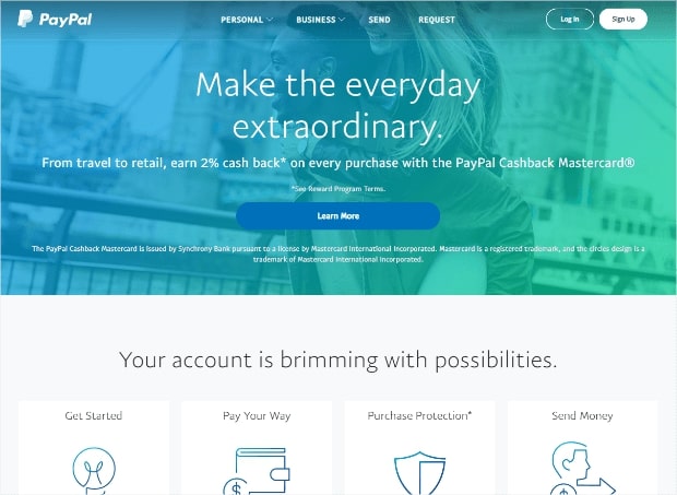
Below is the version mobile visitors experience.
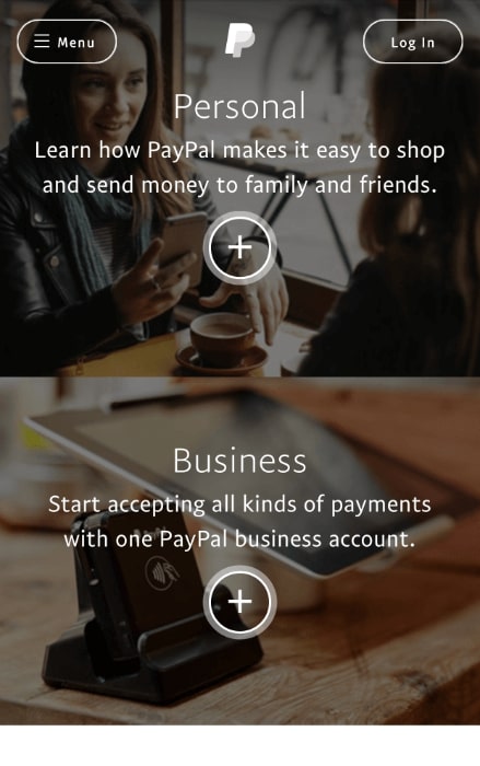
This teaches us a couple of things.
Mobile users should be offered a simpler landing page - with clear CTAs and concise information. Desktop users have a larger screen that can comfortably display more information and effects.
Remember, however, that both should be visually engaging, and keep the CTA as the center of focus (look below for more on CTAs).
Test The Offer
Nobody gets it right the first time, and you won’t be any different.
Instead of expecting an amazing conversion rate straight away, consider how you can improve over time.
Here are some things to consider tweaking to find what works best:
- Headline
- Images
- Including a video or not
- Position of your CTA
- Color scheme
- Font
- Page layout
Also, consider changing the offer you’re presenting to prospects that visit your page. Rather than a 7-day trial, test out a 14-day trial, a 30-day trial, and even 50% off for the first month.
Ahrefs offers a 7-Day Trial for $7 - which weeds out tire kickers, encourages the right kind of prospects to sign up, and gives the company a bit of extra revenue
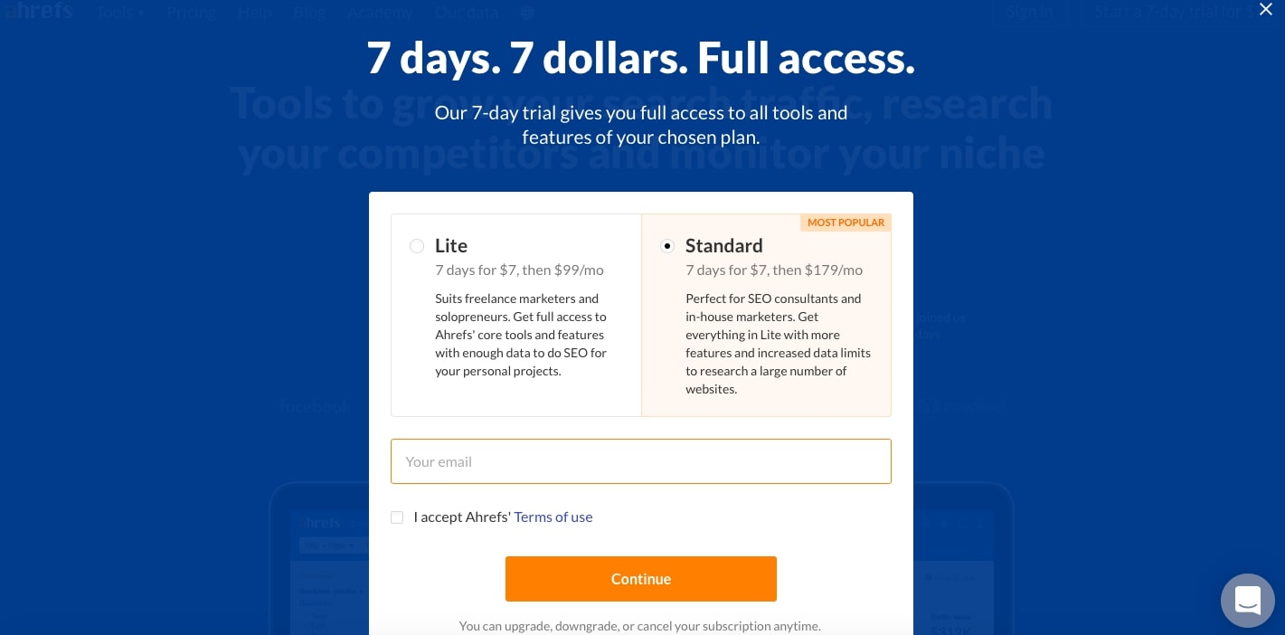
This is an aspect of your landing page that you can change with very little hassle and could transform your conversion rate.
Mentioning pricing, monthly vs one-time payment, could also make an impact. Of course, make sure you know your lifetime value and decide whether or not a change would impact your profitability.
70% of companies offer monthly billing - but who wouldn’t be incentivized to spend a bit of money once, and have the product for a lifetime?
These different avenues can be explored by building multiple landing pages. Each one has a different offer or main promise. Whichever one does best can be the control for the next set of landing pages you produce.
Create a strong CTA (call to action)
When a prospect clicks your ad, and enters your landing page - what do you want them to do?
This could vary between different types of landing pages.
For example, with a squeeze page, you’re trying to build up an email list, compared to a sales page where you are trying to create sales.
Your CTA is the button that gets your prospects started with the process.
Therefore it should be the main focus of your landing page, and where you direct all their attention to.
Look at this example for some tips on how to optimize your CTA.
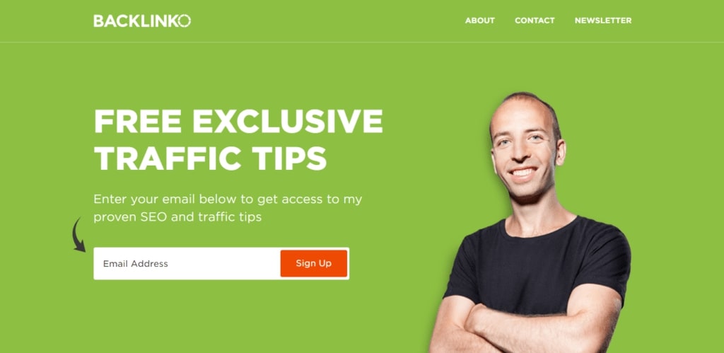
Credit: Backlinko
Firstly, the color of your CTA button should contrast to its background. In this case, the orange ‘Sign Up’ is clear against the green background.
Hubspot, increased its conversion rate by over 10% on a landing page by switching the color of its CTA from green to red.
The CTA text you use is also important. In this case ‘Sign Up’ is effective as it is concise and delivers a simple message.
It could be improved by using incentivizing words that speak to the benefit someone is about to receive such as ‘GET MORE TRAFFIC’’.
Also, consider creating a sense of urgency with timing words - something like ‘now’ or ‘quick!’ could have worked well.
In the end, you want to make the next step as easy and obvious as possible for your prospects.
Conclusion
You should now understand what a Facebook landing page is, how to build one, the different types, and the elements that make it stand out from the crowd.
Facebook Ads are a great way to bring in traffic - but won’t be effective unless your landing page is successful in converting customers.
By following the steps above, you won’t have any trouble. However, make sure you continue tweaking and changing your page until you’ve reached a conversion rate you’re proud of.
Jamie Ashley
Jamie Ashley is the founder of The E-Commerce Entrepreneur, and a Digital Marketing and Social Media enthusiast. He writes content ranging from guides to earning money online, to product reviews and tutorials.
Copyright 2018 - 2020, KyLeads. All rights reserved.
