How to present your survey data in a way that’s visually appealing, engaging, and informative?
Through the magic of visualization.
Survey results can make a significant impact on your brand’s key decisions
So you need to make sure that your visualization makes the reporting easier and understandable to your audience.
In this guide, we discuss how to conduct surveys, analyze survey results properly, and visualize those results from A to Z.
Table of Contents
Introduction to Surveys
What is a survey?
A survey is a research activity that aims to collect information from a group of people for a particular topic.
These results are then analyzed, and a conclusion is based on user opinion, knowledge, or behavior.
There are three main types of surveys.
Let’s review them one by one:
- Longitudinal: To collect data over a long time to see how something varies during this time.
- Retrospective: To collect information related to past events.
- Cross-sectional: To collect data about a small group of people (which belong to a large population) during a small time.
Survey results can be of two types – qualitative or quantitative.
Quantitative: This type of survey is collected from concrete, close-ended questions. Since they’re simple “yes/no” questions, they’re much easier to analyze and quantify.
Qualitative: This is generally collected from open-ended questions where participants are asked about their opinion. They’re relatively harder to visualize.
Why do you need to use surveys in your business?
With surveys, you can take your business to the next level.
Get to know your customer. Find out where you’re lacking, and learn to overcome your shortcomings.
Eventually, you will be ahead of your competitors by learning from these findings.
What goals can you achieve with survey results?
- Explore new business opportunities
- Discover your audience interests
- Understand the demographics of your audience
- Power up your branding and positioning
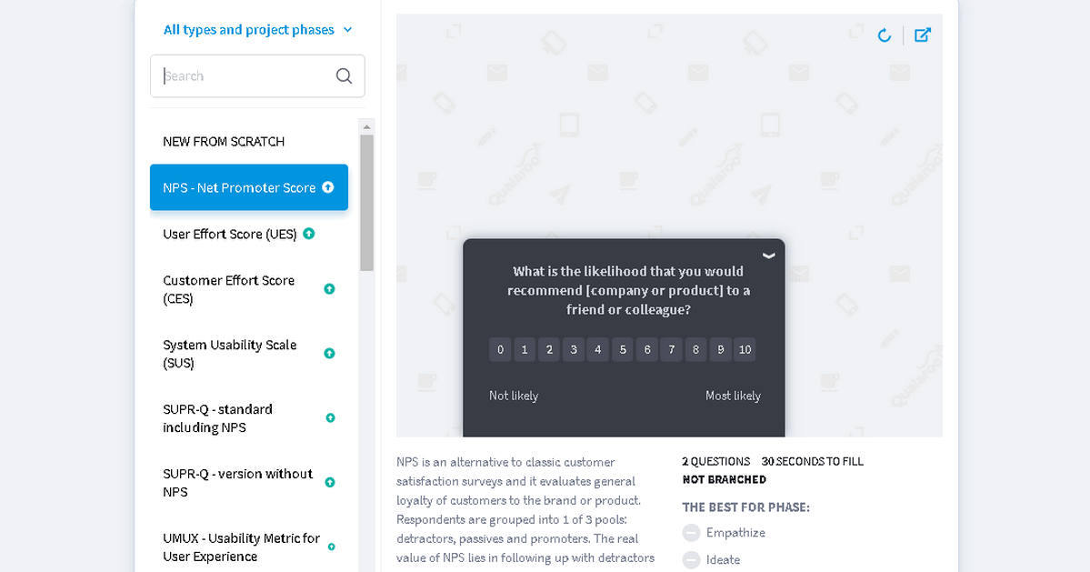
Tools You Can Use to Create Surveys
Depending on the type of survey you’re working on, we’ve listed a few tools to help you make the most out of them!
- KyLeads

KyLeads is an excellent tool to create engaging quizzes for surveys. By using quizzes created with KyLeads you will be able to convert up to 30% of your visitors into leads. With several templates to choose from, you won’t have any issues visualizing surveys’ results!
- SurveyMonkey
Another powerful tool for creating surveys is SurveyMonkey. This platform offers a wide range of templates to speed up the process of creating a survey.
With a free basic plan, you can create unlimited surveys! 🙂
Bonus tip: Download the results as a CSV/Excel file for data visualization.
- SurveySparrow
SurveySparrow allows you to build different types of surveys like chat, classic, and offline surveys. It also offers free-themed templates and data visualization options to visualize survey results in a more personalized and advanced way.
- Typeform
Typeform is an online service that helps you create customized forms like quizzes, customer feedback, payment forms, and surveys.
It allows you to get data in different formats e.g. spreadsheet, graph, and summary. This will then help to visualize survey results easily.
- Survicate
Survicate aims to help business owners identify customer trends and behavior with surveys.
You can find factors that encourage, prevent, and confuse clients to make desired actions on your site.
- Qualaroo
Qualaroo helps automate the user research process without dehumanizing the experience. With surveys, you will be able to get essential information about your customers based on your business needs.
You can choose the tool based on your business needs.
Moving on, let’s discuss how to analyze survey results.
How to Analyze Survey Results
Visuals make it so much easier to analyze survey results.
Before you conduct the process of data visualization, remember that you need to analyze the results first.
Analyzing and visualizing survey results is a crucial aspect of deriving actionable insights and informed decision-making in any business context. As highlighted by KyLeads, effective data visualization turns complex survey data into comprehensible and engaging information, facilitating easier interpretation and presentation.
Want your survey data to stand out? Consider turning those raw numbers into visuals with data visualization services. It’s like giving your data a makeover—transforming plain stats into vibrant charts and graphs that grab attention and make things crystal clear for anyone viewing them.
Tools like a double bar graph maker make it even easier to create engaging comparisons that highlight key insights. It’s an easy and fun way to bring your data to life.
As you sift through the survey data, consider using Redbird. This AI-powered analytics tool helps in transforming complex data into actionable insights. Redbird’s sophisticated data processing capabilities allow you to dig deeper into the survey responses, identifying underlying trends and correlations that might not be visible through traditional analysis methods. Let’s face it: numbers can be a snooze-fest.
But throw in some eye-catching visuals, and suddenly, those survey results come alive. It’s like turning a bland spreadsheet into a colorful story that even the most data-phobic team member can’t resist. Just remember, before you start creating those snazzy charts and graphs, you’ve got to roll up your sleeves and dig into the raw data. Think of it as prepping ingredients before cooking up a feast for the eyes.
By employing a variety of tools and techniques, from pie charts and bar graphs to sophisticated software like Tableau, businesses can unveil patterns, trends, and insights that drive strategic decisions.
Such embedded analytics solutions allow businesses to visualize data intuitively. Visualization effectiveness depends heavily on matching chart types to data characteristics—time-series data demands line graphs that reveal trends, categorical comparisons work best with bar charts, part-to-whole relationships require pie charts or treemaps, and correlations between variables need scatter plots—as mismatched visualization types obscure insights rather than illuminating them, turning potentially valuable data into confusing graphics that mislead rather than inform.
However, to elevate the quality and impact of these visualizations further, professional data visualization consulting services offer specialized expertise.
These services leverage advanced analytics and design principles to craft compelling visual narratives that resonate with stakeholders and support data-driven strategies.
For organizations looking to harness the full potential of their survey data through expertly designed visuals, exploring professional data visualization consulting services can be a transformative step towards enhanced understanding and business excellence.
Of course, the analysis also depends on the type of survey conducted. That is, you need to take into account how the data was collected.
- Start with the end goal in mind – Why are you creating the survey?
Your first step is to ensure that you’ve asked the right questions from the right people to collect the data you need.
Let’s consider an example.
You want to understand the customers’ reaction to your new feature update.
- Is it favorable?
- Are people even interested in this?
- What suggestions would people like to add?
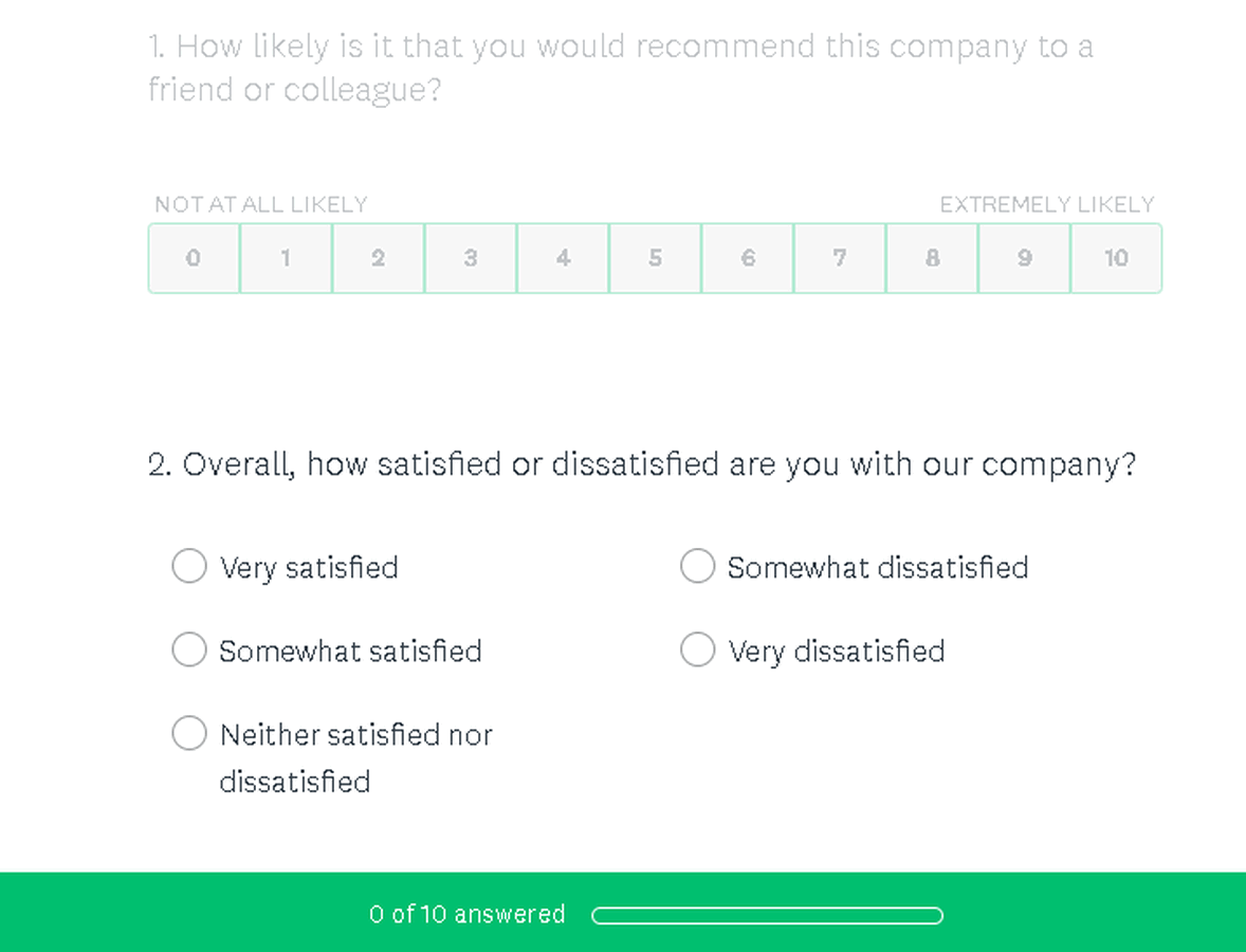
One of your survey questions will be “How do you rate a new tool?”.
You can suggest a rating from 0 to 5.
After running the survey among 2K users, you’ve received the following results:
- 70% rated the feature with “5”
- 20% rated with “4”
- 8% rated with “3”
- 2% rated with “2.”
The final survey results look like this:
- 1400 users loved the feature
- 400 users liked it
- 160 users found it mediocre
- 40 users didn’t like the feature
These numbers from a single question have split your target audience into four groups.
You can move ahead with analyzing these groups by asking more targeted questions.
- Filter results into various groups and subgroups as per the relevancy
Incorporating AI thematic analysis can help uncover patterns in qualitative responses, transforming raw feedback into structured, actionable insights. What’s really fascinating is how the deeper layers of feedback often reveal surprising connections we might have missed at first glance.
Our team has found that cross-referencing these lower ratings with actual user behavior patterns sometimes tells a completely different story – like users who gave a “3” rating but actually use the feature more frequently than those who rated it higher.
After collecting survey results, you can work on it further.
Draw your attention to two groups that rated the feature unfavorably: with “3” and “2.”
The next set of strategic questions should be for both these groups, depending on your subgoals of the specific groups you’re targeting.
- Validate the data
It is strictly important to validate the data you got. You can do this by analyzing the questions from your survey. Take a look at these questions and think about the next:
- What are the replies I received from [such] questions?
- Which replies are the most important ones?
- What are the exact replies I got from the responders in group Y?
- Which group of responders are affected by [this] issue?
- How can I resolve the issues faced by group Y?
- etc.
Answer these questions for yourself and validate the data you got from the survey.
- Examine your results
Examine your survey results to ensure that they’re efficient with the following tips:
- A sample size of the survey
Remember that it’s quality over quantity, every time!
Take a sample of your interest group, and then focus on analyzing these results!
- Pay attention to the insights of the survey, not to the data itself
What insights can you derive from the data?
Your insights should be understandable enough when presented to your team.
- Complement your data with other information
If you want to impress your team with the survey report, you should complement the data with other additional information.
Consider adding in other sources of data, your own experience, and an overall analysis of the survey results.
Helpful tip: Remember to point out when the data you’re presenting is from your survey vs. when it’s taken from third-party sources.
- Draw conclusions
Of course, you need to remember that you need to conduct a thorough analysis of your survey.
Doing this manually may still result in human errors.
Especially if you’re dealing with a large data set.
In this case, you can take help from data analysis software to make your work easy for you!
We recommend using Tableau or BlazeSQL – both are great data analysis and data visualization tools, with BlazeSQL being particularly useful if your survey data lives in a SQL database. These platforms not only minimize the risk of human error but also dramatically accelerate the process of identifying patterns, correlations, and outliers within your survey data, delivering insights that might otherwise take days to uncover manually. With intuitive dashboards and visual reporting features, even team members without a technical background can interpret complex data sets with confidence, ensuring that your survey findings translate into clear, actionable decisions across the entire organization.
If you need more alternatives, you can review such tools as Nvivo, Interpris, or Thematic software.
How to Visualize Survey Results
Good job! By now, you know how to conduct a survey, collect data, and analyze it properly!
Now, let’s find out how you can visualize survey results in seven different ways.
There are plenty of tools you can use to visualize survey results. Let’s discuss how to visualize survey results with the help of Visme (and all the amazing charts you can build with it!)
- Pie charts
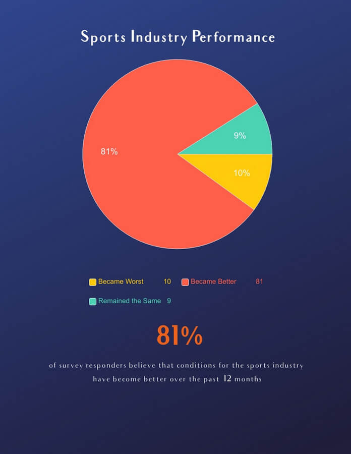
Pie charts are extensively used in data analysis. They show proportions and percentages to help teams make informed decisions. They’re ideal to give a quick overview of what the proportional distribution is like.
- Bar graphs
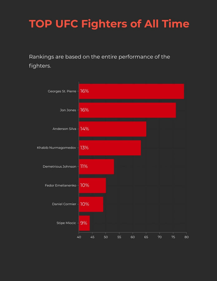
A bar graph would be the best choice for visualizing a small piece of survey results.
- Data visualization presentation
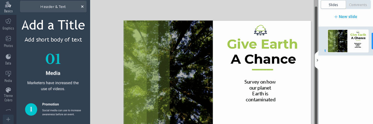
Do you need to create a comprehensive survey that includes a lot of questions, charts, infographics all in one place?
Then it’s best to use a presentation format!
You can use an online presentation maker tool to create your own personalized, branded presentation.
Or even grab some professionally designed ideas for presentation slides. By using these visuals, your survey will look more visually appealing. This will save you time and effort, allowing you to prepare more thoroughly.
Embarking on the journey of data interpretation, the AI presentation maker tool emerges as a navigator, guiding the transformation of intricate survey findings into digestible, engaging visual stories. This tool is not just a facilitator of aesthetic enhancement; it’s a bridge connecting data’s depth with the audience’s understanding, ensuring each slide resonates with purpose and clarity.
By leveraging such advanced technology, professionals can craft presentations that are not only visually striking but are also imbued with the precision of AI-driven design insights. This synergy between human creativity and machine efficiency paves the way for presentations that captivate, inform, and inspire, marking a new horizon in the art of data storytelling
By utilizing professionally designed visuals, you tap into the power of visual communication, elevating the impact of your survey and the effectiveness of your message. This approach not only streamlines your survey creation process but also enhances the quality of the data you collect and the presentations you create.
- Venn diagram
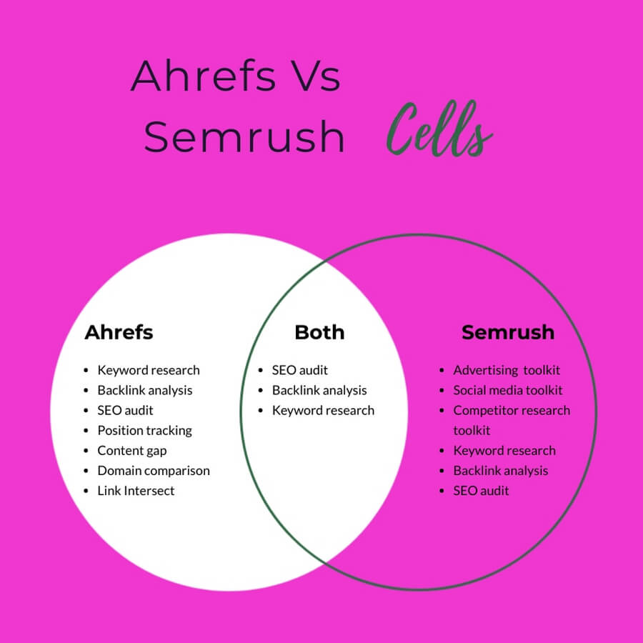
A Venn diagram is a type of diagram made from two or more circles overlapping. The goal of this diagram is to show similarities between the properties represented in the circles.
It helps to visualize survey results, especially, if they’re a comparison between two or more things.
- Line Graphs
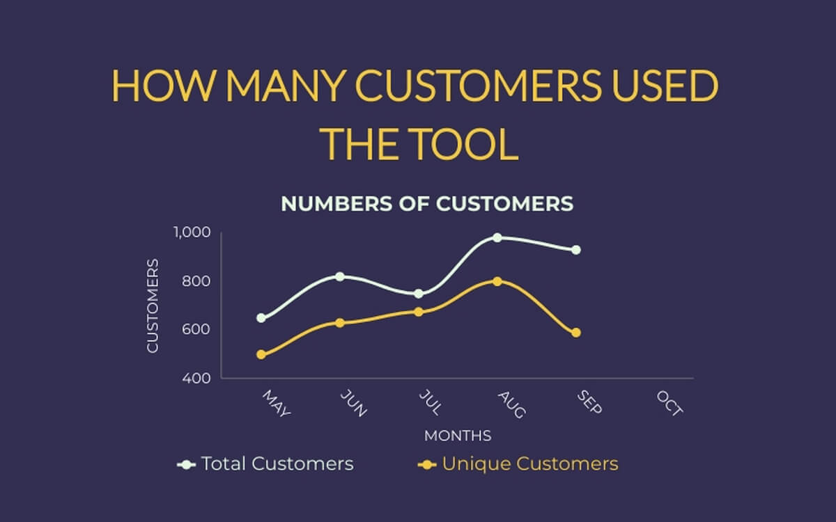
A line graph or a line chart is a type of data visualization that aims to demonstrate the changes in value across specific time intervals. The dots connect lines and fall on the intersection of value and time.
With line graphs, you can visualize those results, transforming raw data into a clear narrative that you can easily comprehend. Think of it as your visual tour guide, helping you explore the peaks and valleys of your data journey. And that’s pretty awesome, because this way, complex data looks like a familiar landscape.
- Pictographs
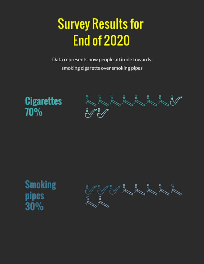
Pictographs allow you to use icons on your survey results report. They use symbols like shapes and icons to convey the meaning of survey results.
Let’s say, you need to visualize survey results that illustrate what people prefer to smoke: cigarettes or smoking pipes?
In this case, you can use pictographs.
- Infographics
Infographics are a great way to visually represent survey results. With the help of infographics, you can showcase different statistics by applying graphs and illustrations.
These engaging visuals not only make the data more digestible for the audience but also add a touch of creativity, making the information more memorable and impact.
Whether it’s bar charts, pie graphs, or creative icons, infographics provide a versatile and effective means of presenting survey findings. Moreover, can be easily customized and branded to match your company’s identity, giving your survey results a professional and cohesive look.
By incorporating your logo, colors, and brand elements, you can create a consistent brand image while presenting the data in a visually appealing manner. This versatility not only saves time but also maximizes the impact of your survey findings, reaching different audiences through various channels.
There you have it, all seven ways on how to visualize survey results!
To Sum Up
Surveys are critically essential for your business. They can help you collect information that might be missed otherwise!
All you need to do is collect relevant data, and present it in a simple (yet visually attractive way!)
Hope you’ve learned something informative and valuable in this article. If you have more ideas on how to visualize survey results, feel free to share them in the comments.