This year eCommerce sales worldwide are expected to surpass $4 trillion. It’s quickly growing into a much larger industry. As a result, more people are opening their own eCommerce stores.
Most of these new store owners focus their efforts on driving traffic. They naturally assume that if they get more visits they will drive more sales.
Sure, traffic will help, but it alone won’t suffice. To generate the most sales from your traffic you need to have a high converting landing page(s) to accompany it.
So, to help you get it right, I have put together my top tips for creating eCommerce landing pages that convert. Implement them today to generate more leads and sales…
Table of Contents
#1 Use visuals:
What do you do when you go to a store to buy something?
You look at the product clearly, you feel it, you might even smell it and wear it if it is a piece of clothing. Most people want this experience when they buy something. This is one of the reasons why only 14.1% of people buy their products online.
Increase eCommerce sales by offering people an experience closest to the one they have in store. One way to do this is through visuals. Include as many pictures as you can on the eCommerce landing page. They need to display the product clearly.
Get into your customers’ minds and think about how they might view the product in the store and take pictures of your products from all those angles.
If the current setting is too distracting or doesn’t highlight the product well, change the background to create a cleaner, more professional look that draws attention to the details customers care about most.
Yet even expansive visual galleries risk inadequately replacing tangible product experiences without sufficient explanatory eCommerce landing page copy addressing unanswered questions. Before funneling maximum resources into amplifying visual content, eCommerce landing page messaging requires realignment with analytics identifying most prevalent barriers abandonment.
Businesses may boost consumer attention, engagement, and conversions by providing a more interactive shopping experience. Integrating a Shopify Quiz App, which enables online retailers to provide personalized product suggestions based on customer preferences, is one efficient method to accomplish this.
Quizzes offer a guided technique for clients to identify items that are targeted to their specific needs, rather than relying just on static product listings. This improves customer happiness and sales by expediting the decision-making process and reducing reluctance.
You can also include a video that shows the product from various angles and in action as videos can increase conversion rates by 80%. And using an in cart upsell Shopify app lets you present timely add on offers directly in the cart, helping increase order value before checkout.
Speaking of product videos, using an AI video editor has been a total game-changer for our ecommerce content lately – we’re pumping out these slick, professional-looking product showcases in like half the time it used to take us.
You can also create visuals with AI to complement product videos, making it easier to produce realistic, high-quality imagery without heavy manual editing. The fundamental challenge facing eCommerce businesses isn’t just replicating the in-store experience through visuals and videos, but addressing the psychological trust gap that occurs when customers can’t physically validate product quality before purchase – a gap that even perfect photography can’t completely bridge if the underlying messaging doesn’t anticipate and answer the specific doubts preventing conversion.
For brands looking to scale visual content without handling everything in-house, business video production services can help maintain consistent quality and branding across all campaigns.
It’s wild how these tools can automatically adjust lighting, create smooth transitions, and even suggest the best angles to highlight product features, almost like having a pro videographer on speed dial. What really blows my mind is how it can generate different versions of the same video optimized for various platforms, so you’re not stuck editing separate cuts for TikTok, Instagram, and your website.
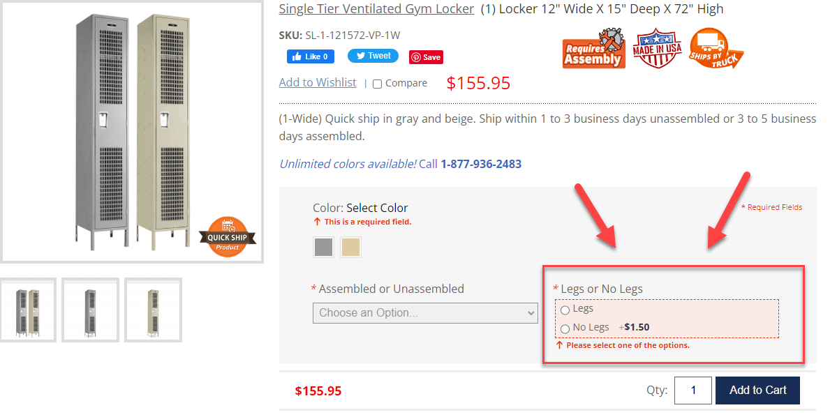
A good example of a landing page with lots of visuals is this one from Sephora.
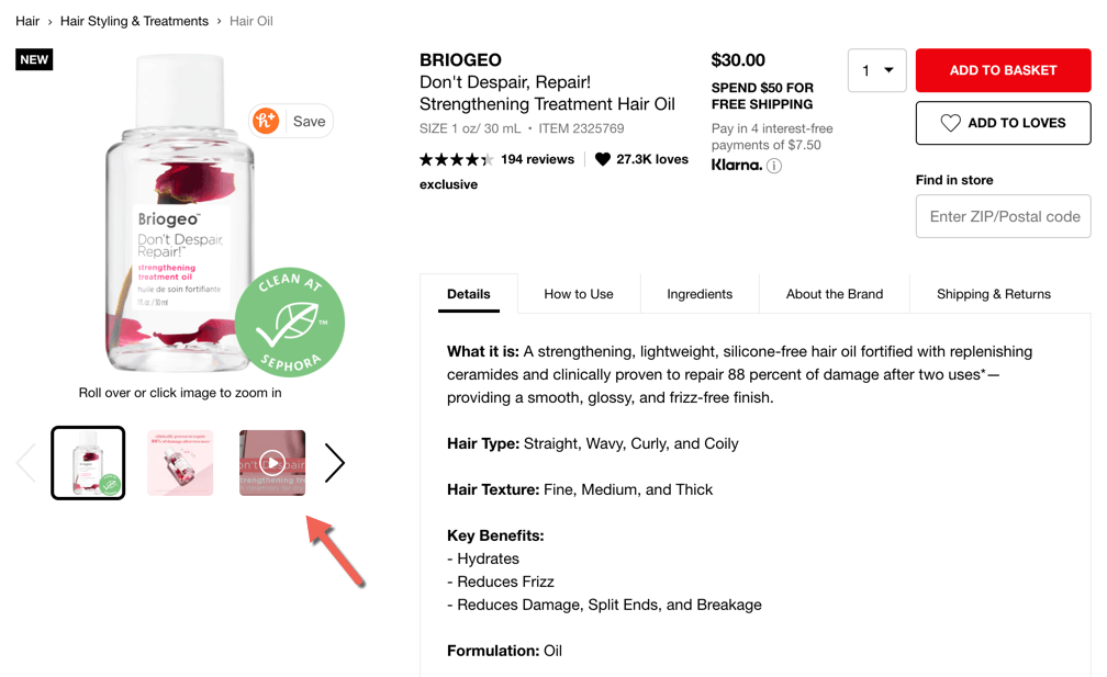
It included a few pictures that show the product and also describe it. It also included a short video where you can see the product, learn about how it can be used, and highlights compliments from people who use it.
PalaLeather greets web visitors with a large image that takes up half the screen and lines up with the promotion shown on this landing page.

Along with the image, there’s all the information one needs to make a buying decision, including the discount, the code to use, and the occasion.
There are many tools you can use to edit images and make them stand out. Of course, you want to showcase the product properly but you also want something that’ll show the lifestyle associated with the product.
A well-crafted logo plays a crucial role in strengthening brand identity and building a professional image for any business. For individuals seeking an easy and efficient approach to logo design, utilizing resources such as a logo maker offers a hassle-free solution while delivering exceptional quality. Visually striking logos not only attract attention but also leave a lasting impression on customers, boosting eCommerce success. You can consider using a page builder or a theme to create a visually appealing and high-converting website.
Keep in mind that in the rapidly progressing sphere of eCommerce, mere possession of superior images isn’t sufficient. What counts is the strategic employment of tech advancements such as a headless store frontend to enhance user interactions. This methodology separates the user-facing interface from the backend, promoting swifter page loading and a seamless navigation experience.
#2 Add easy to read well-written copy:
When you start an eCommerce brand, you likely don’t consider all the writing you have to do. People want to learn as much as they can about the product online, so provide this information. Write about how the product feels, looks, smells, what it does, etc. And then include the benefits of all these things.
Crafting a thriving eCommerce platform extends beyond the mere presence of an extensive product selection. It revolves around establishing a seamless and delightful online shopping journey for your valuable customers.
Incorporating some of the best AI tools for ecommerce can further enhance this experience by helping you personalize recommendations, streamline navigation, and optimize the entire buying process.
Each aspect of your eCommerce website, ranging from user-friendly navigation to comprehensive product depictions and captivating visuals, should be meticulously tailored to prioritize user satisfaction.
Even offering personalized recommendations or offering intelligent alternatives on no results found pages make a big difference in the experience of your customers.
Always bear in mind that your website serves as the virtual face of your business, and it should exude the utmost quality and professionalism that define your brand.
Also, write it in the simplest language possible. The writing should be at a 3rd to a 4th-grade reading level. This is because people are busy. They don’t want to spend a lot of time reading and deciphering the copy on product pages.
Dermeleve is a great example of this, providing a simple two-lined description of what the product is and where you can find it.
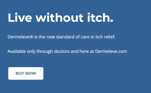
This simplistic style ensures that the message is communicated quickly and effectively, which is perfect for when people are in desperate need of a solution and are looking to make a purchase.
To help simplify it you can use a tool like Hemingway.
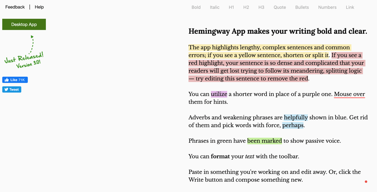
Copy and paste your text into it and it will tell you what the reading level is. It will also provide suggestions on how to simplify it. Keep doing this until the text is easy to read. You can then add it to the landing page.
Check out the above page from Sephora again. You can see how easy to read and detailed the copy is. It includes details about the product, how to use it, the ingredients, etc. The copy also compliments the visuals.
Go through more of their product landing pages to get a few ideas. When analyzing competitor strategies, many businesses use specialized tools to check the Shopify store’s theme and understand which design elements contribute to higher conversion rates.
If you don’t want to figure out on your own how it works properly, then you can go for an ecommerce development company. This can save you a lot of time.
For Shopify-based stores, working with a professional Shopify development company ensures the landing page is built and optimized according to platform best practices. Professional development partners bring expertise in conversion rate optimization techniques that go beyond aesthetics—implementing strategic element placement based on eye-tracking studies, A/B testing frameworks that systematically improve performance, and technical optimizations like schema markup and structured data that enhance search visibility while maintaining visual appeal.
The cost-benefit analysis typically favors outsourcing for businesses lacking in-house technical talent: DIY approaches seem economical initially but often result in months of trial-and-error, suboptimal implementations that leave conversion opportunities untapped, and opportunity costs from leadership time spent learning technical skills instead of focusing on core business strategy and customer relationships.
All that will be required of you is to provide your optimization vision and business plan, the rest will be done for you by experts. Many business giants and corporations do it this way.
Trust me, having a solid business plan will make all the difference when you’re working with these development companies – they’re not mind readers, after all. I’ve seen too many entrepreneurs walk in with vague ideas and end up spending way more time and money going back and forth with revisions.
The cool thing is, once you’ve got your business plan nailed down, these experts can take your vision and run with it, creating something that looks as polished as those Sephora pages we were just talking about.
#3 Display social proof on your eCommerce landing pages:
We like to imitate each other. When you visit a restaurant in a new locality would you go to the one with a long line or the one without?
It’s usually the former. Even though you know it is going to be a while, you don’t mind waiting because you know that all those people are waiting for a reason. The food is probably better there.
It is the same reason why when you shop online, you look for the products with the best reviews. It shows that other people have used the product and like it.
This is why you should let people leave legitimate reviews of your products and display them conspicuously on your landing pages.
Whether it’s a traditional restaurant or a ghost kitchen, positive customer reviews can build trust and attract more customers to try your offerings.
Embracing legitimate reviews and feedback is crucial, whether you’re curating an online menu or hosting servers. Just as positive customer reviews build trust in a restaurant’s offerings, showcasing testimonials from satisfied clients on your website can attract more customers to try your bare metal server solutions.
This works in an analogous way when developing your eCommerce site. Want to instill confidence in potential buyers? Or maybe your main goal is to foster trust and motivate them to look into and finally make a purchase from your online marketplace?
For this, consider consulting professionals in ecommerce marketplace development to help tailor your site to meet these goals effectively. A successful e-commerce platform utilizes strong design principles to ensure easy navigation and engaging call-to-action buttons, effectively guiding users from awareness to purchase.
Implementing these analytics-driven optimizations often requires expertise from a specialized Shopify agency that understands both technical requirements and marketing fundamentals.
Be sure to post real customer testimonials about your site and products! You can tell a thousand times how cool your product is, but users still tend to put more faith in those who have had an experience with your stuff. Dirty marketing has gotten so boring to everyone that users are more likely to trust real people.
While branding and design considerations come into play, it’s essential to find a color scheme that aligns seamlessly with your logo and branding, much like a restaurant’s decor harmonizes with its overall theme.
So, when opting for a bare metal server, make sure it complements your brand’s identity and enhances the overall user experience – just like how a well-designed ecommerce landing page from Vanity Planet does.
While that may be true in certain cases, it may not always be feasible. This is especially true if your branding and logo design don’t play nice with red.
Okay, let’s talk real talk about bare metal servers. These things are basically the muscle cars of the tech world – pure, unadulterated power with no unnecessary extras. If you’re running a business that needs serious horsepower, a bare metal server is like having your own dedicated tech beast.
No sharing resources, no getting slowed down by other people’s random processes. It’s your hardware, your rules. Think of it like having a killer workspace where everything’s exactly how you want it – no compromises, no waiting in line, just pure performance tailored to exactly what you need.
Try to choose the color that plays in accordance with your logo design and branding.
An online logo maker is a tool that allows you to create logos online without the need for professional design skills. These services provide a wide range of ready-made templates, that can be customized according to the user’s preferences, including the choice of colors, fonts, shapes and other elements.
The ability to create logos online has democratized brand identity development, allowing businesses of all sizes to craft professional visual signatures without the traditional agency price tags that once made distinctive branding a luxury for startups.
Modern platforms have evolved far beyond basic templates, now offering sophisticated color psychology guidance and typography matching that helps even design novices create logos with subconscious appeal to specific market segments. The real magic happens when these tools incorporate instant mockup generators that show your potential logo in real-world applications – from business cards to storefront signage – providing critical context that flat designs simply can’t convey.
Such tools are usually easy to use and require minimal effort to create a unique brand. These services allow users to save time and resources by offering affordable options that can be used for a business, brand or web project.
An example can be seen on this ecommerce landing page from Vanity Planet.
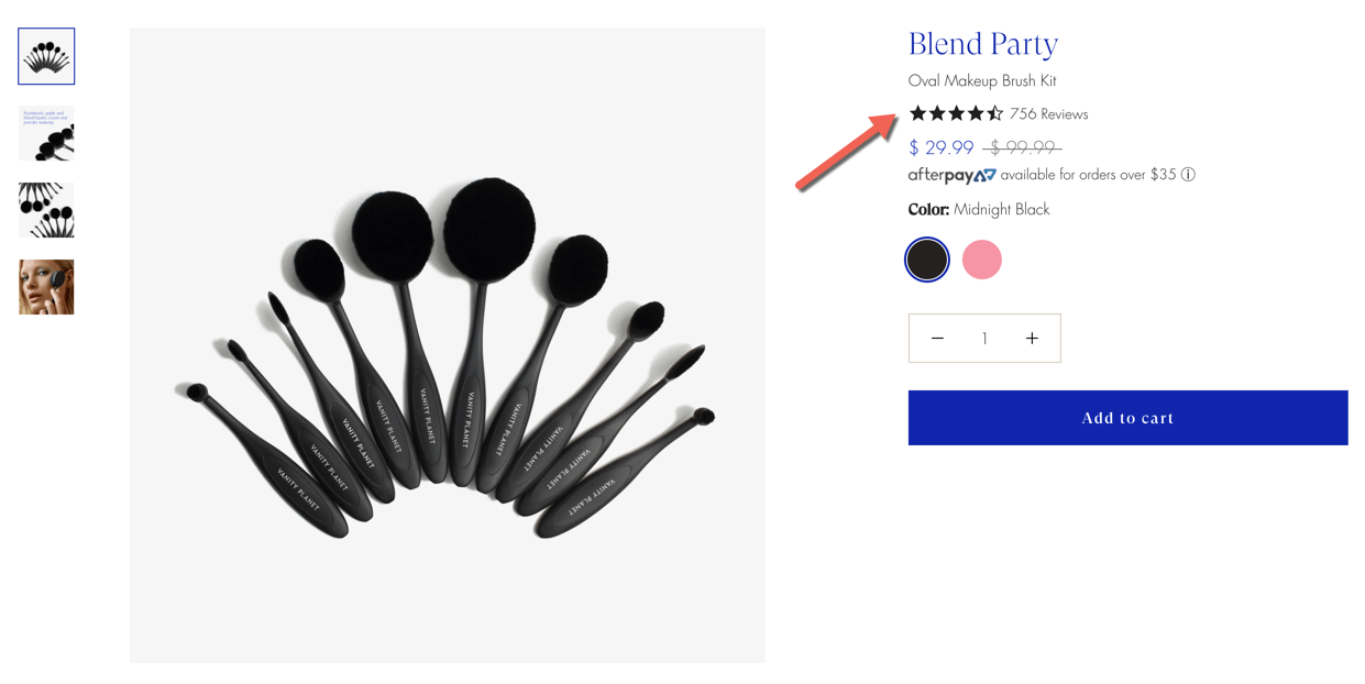
The number of reviews and the average rating are displayed right at the top. When you click on it you are taken to the bottom of the page where you can read the reviews.
It also displays Instagram posts from people who used their products (user-generated content).
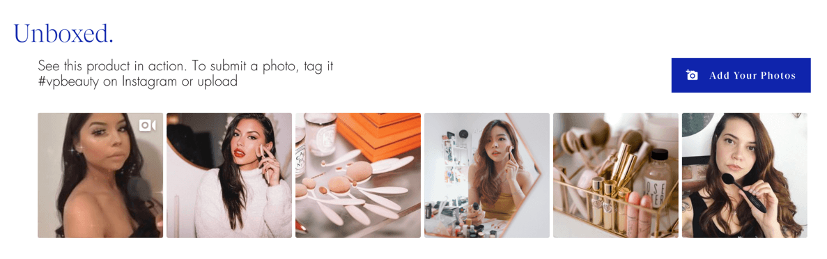
These can help boost social proof further as they look more real. You can see that a real person left this review.
It also encourages users to add their photos here or tag them with the #vpbeauty hashtag on Instagram. This will convince some of the people to buy the product and leave a review for their 15 minutes of fame.
There are many eCommerce tools that will help you set up something akin to this or hire a designer who will.
#4 Get your eCommerce landing page to load in a few seconds
Loading time can affect the conversion rate of your landing page. The longer a page takes to load, the more people will abandon it. 47% of customers expect your page to load in less than 2 seconds.
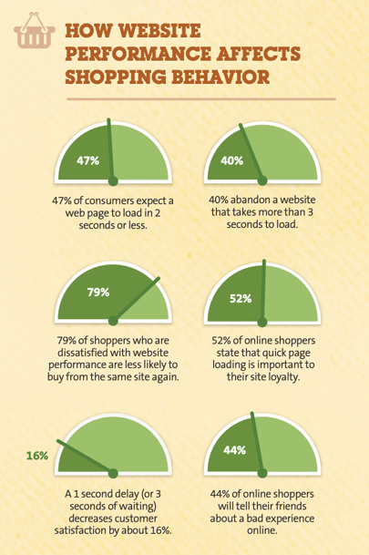
If your site takes more than 3 seconds to load, 40% of visitors will abandon it. Every 1-second delay can reduce conversions by 7%.
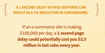
This can cost you a lot of money.
Creating an eCommerce store that loads quickly can be harder to achieve, especially if your landing page is image-heavy.
Host your eCommerce store on a good server that can handle this load. It is best to build your eCommerce store with a tool like Shopify as it comes equipped with a robust hosting service.
Yet tackling intricate ecommerce personalization in-house risks overextending current competencies versus commissioning veteran custom ecommerce development services. Rather than attempting complex custom ecommerce capabilities alone, collaborating with specialized partners combines internal vision with proven “custom ecommerce development” excellence.
If you have experience with the Linux operating system, you still have several choices to consider. It would be beneficial to acquire cheap Linux VPS and tailor the server to meet your specific requirements.
Not only that, but it enables you to easily incorporate additional computing capabilities. You should also think about using containerization technologies to effectively oversee and expand your eCommerce application on the Linux VPS.
Furthermore, it is important to regularly assess the server’s performance and implement automated scaling solutions to ensure that your online store can smoothly handle different levels of incoming traffic.
This will ensure that your site loads in seconds.
In the ever-evolving landscape of eCommerce, the quest for a successful online presence becomes an intricate dance of perplexity and burstiness.
Just as skilled writers blend sentence variations, businesses must orchestrate a symphony of digital strategies to thrive. Embracing the concept of perplexity, Shopify development services offer the technical prowess required to navigate the complexities of online platforms.
Their expertise aligns with the art of crafting diverse sentences, enabling businesses to create multifaceted online experiences that resonate with customers.
Through the lens of burstiness, eCommerce ventures encompass a spectrum of strategies – from concise product descriptions to comprehensive user guides – each contributing to the harmonious composition of an impactful online storefront.
Boosting your digital storefront’s success hinges on prioritizing imaginative logo design and branding. These elements are integral to your marketing blueprint and essential for boosting your brand’s visibility.
Developing a unique brand persona is more than just elevating your business’s profile; it involves drawing in a broader clientele and launching your business into new realms of recognition and prosperity. This strategy guarantees that your brand distinguishes itself uniquely, building a strong rapport with your customers.
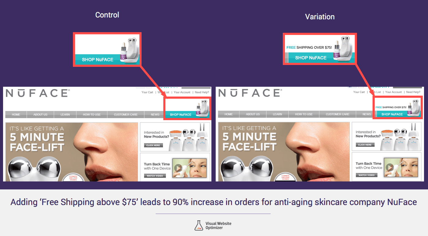
#5 If you offer free shipping tell people about it:
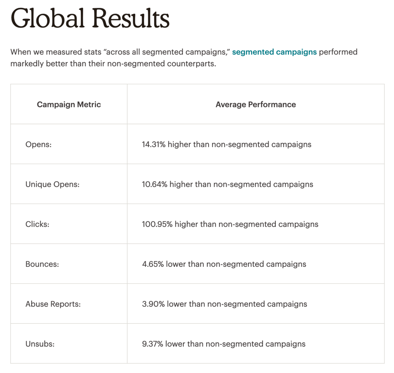
Ecommerce retailers agree that free shipping is their most effective sales promotion method.
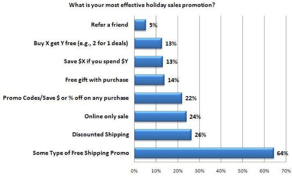
Offering free shipping and mentioning it on your site has been shown to increase orders by 90%.
It can also lift your average order value. If you do offer free shipping, make sure you display it with a conspicuous message like on this landing page from Quadlock.
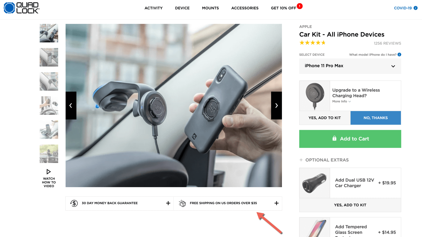
It makes sure you see the free shipping offer for orders over $35 by placing the message in a prominent location.
Another example comes from BedroomFurnitureDiscounts, where you get free shipping with set dressers. This information is displayed both in the listing title and with a specific banner that promises ‘Free White Glove Delivery’.
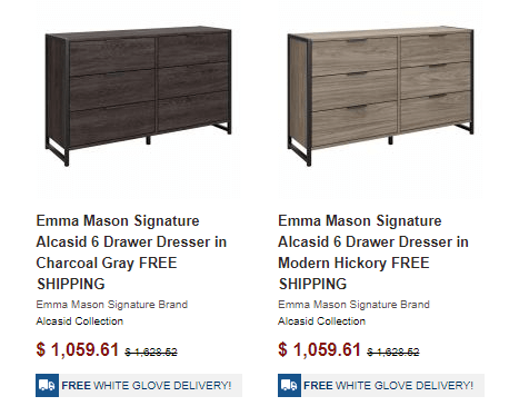
This double mention doesn’t just remind people of the offer, but it also helps to increase the perceived value of the product.
#6 Have a prominent call to action button:
Placing an attractive call to action button can convince more visitors to add the product to their cart. Place a big button with a contrasting color like in the above example from Quadlock.
Another thing I like about this landing page is that the button is sticky.
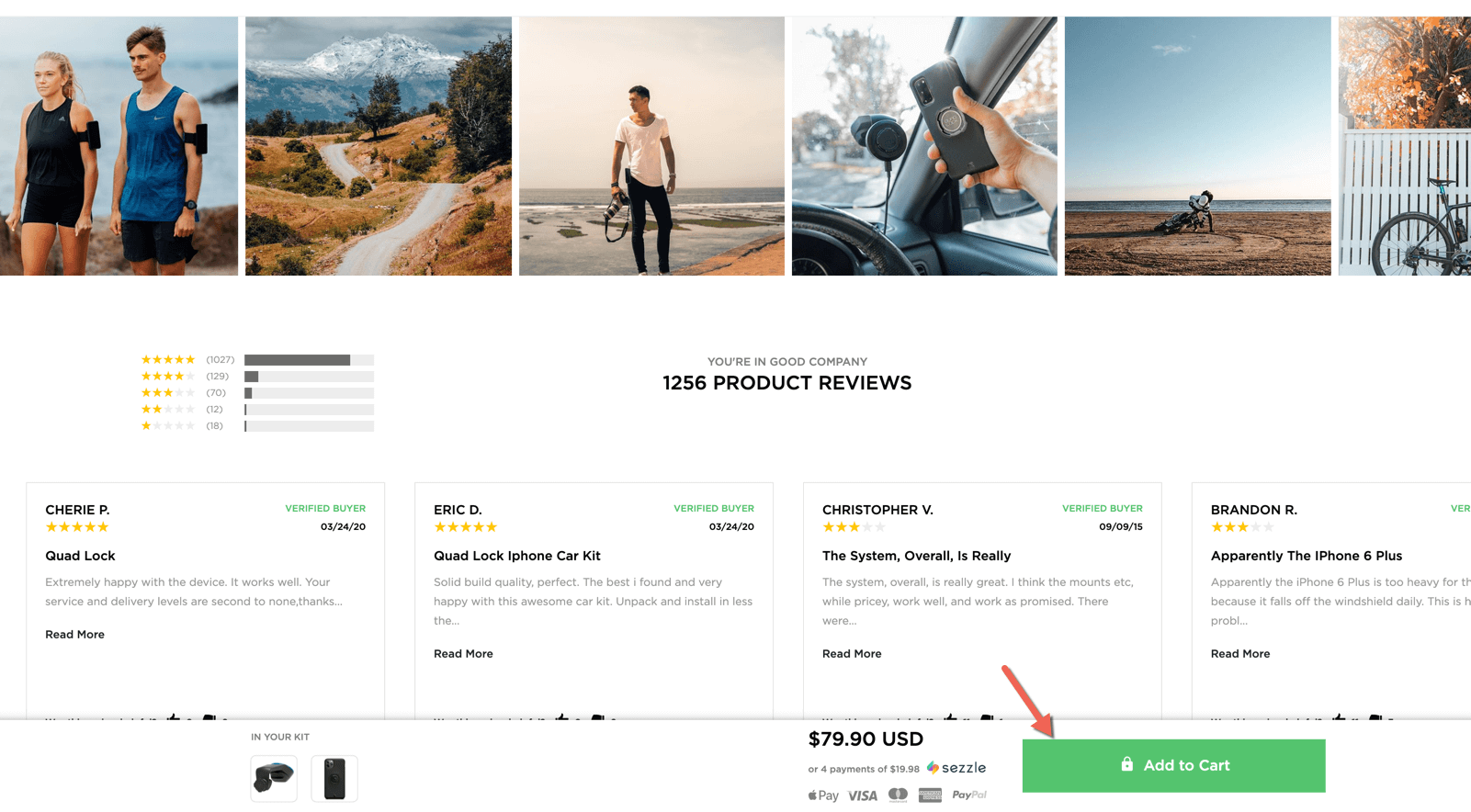
When I scroll down the page and look at other things like reviews, I am able to view another call to action button that reminds me to take action if I like the product.
#7 Place an exit intent popup:
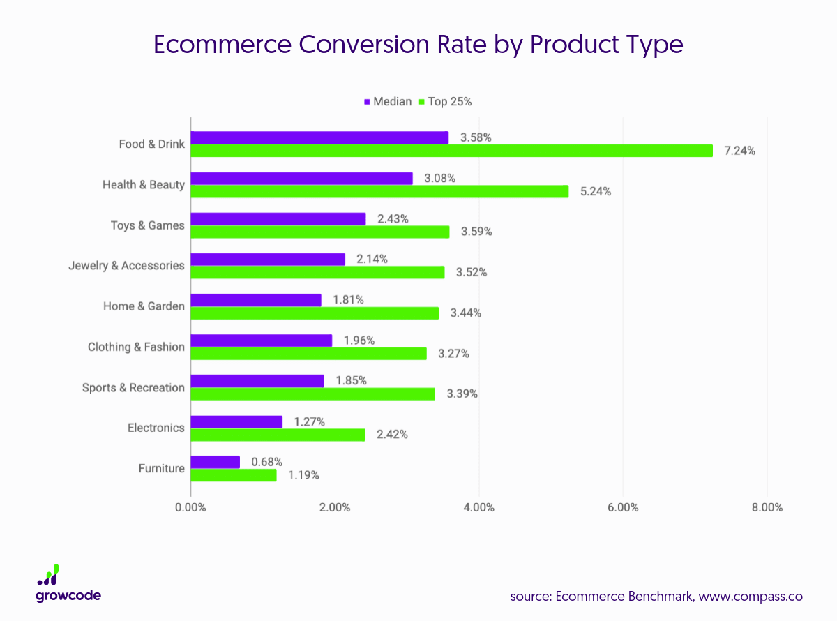
No matter how well your landing page is built, most people visiting it will not convert. As the median eCommerce conversion rate ranges from .68% to 3.58% depending on the industry. This means that for every 100 visits you will generate around 1 to 4 sales.
Most visitors won’t buy for a number of reasons. It could be that they don’t need the product immediately, they don’t have the money, or they were distracted by something else. The reasons are endless. In this process, cold email software can be used as one of several outreach methods to connect with relevant audiences and test messaging effectiveness.
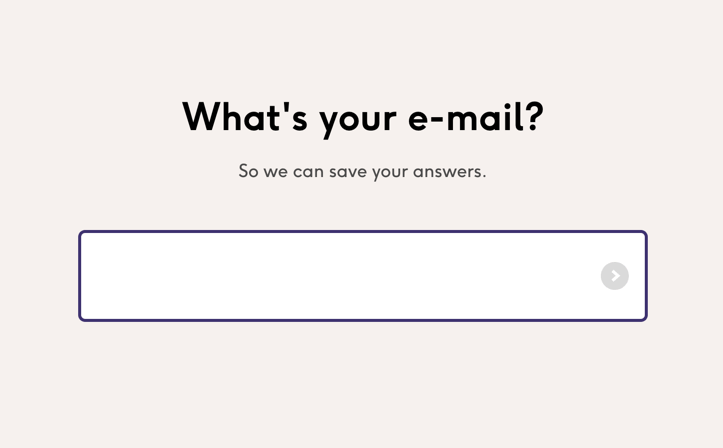
They might not do so at that moment, but if they are interested then they may buy in the future. This is why you should have a backup plan in place to convert those visitors into email subscribers. If they sign up, you can reach out to them later via email software like Mailchimp or MailerLite, and promote your products.
This can be highly effective in generating sales as email is 40 times more effective than other methods like social media for the acquisition of customers.
You can implement a back up by creating an exit-intent popup that asks people to sign up in exchange for a discount like Society6 does here.

It pops up when people are about to leave the site and those who are interested will sign up. Some of them will take advantage of the discount and buy immediately. Many won’t, but it will have their email address and can reach out to them later.
To set up your exit-intent popups you can use a tool like KyLeads. Alternatively, many store owners use Shopify Popup Apps to build exit-intent offers, email capture popups, and timed discounts directly inside their Shopify store.
It makes it easy to create custom popups that either appear when someone moves their cursor off the browser or after a time delay.
#8 Create extra landing pages for converting warm and cold traffic:
If you want to go a step further with building up your email list you should also create landing pages that are solely dedicated to generating more leads. You can offer a lead magnet like an ebook or a guide or provide discount codes again.
A great example of a good lead generation landing page is this one from care/of. It’s actually the homepage itself.

It asks you to take part in a quiz.
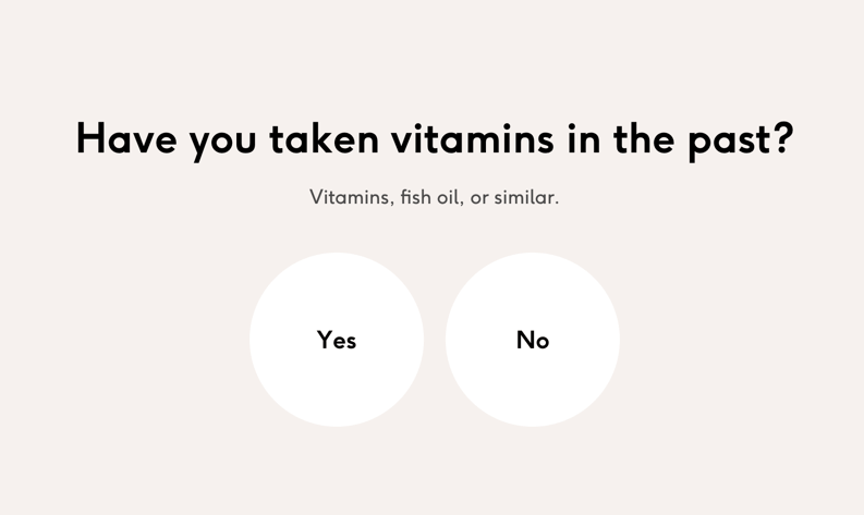
When you do it asks you a bunch of questions about vitamins and your health.
And then it asks you to provide your email address.
This helps them understand you better and email you the right offers. They can segment their email lists based on answers and keep unsubscription rates low and open and click rates high.
You can set up a landing page like this with a tool like Leadpages. But to set up the quiz you will need a separate tool like KyQuizzes.
And to segment your list you will need to use a good email service provider that lets you tag subscribers.
#9 Split test eCommerce landing pages with ads:
No matter how meticulous you are with setting up your eCommerce landing page, you won’t create the perfect version in your first attempt. This is why you should split test the early versions of your landing pages to see which one converts best.
Create several versions of your landing pages and split test them by sending traffic with ads. Even if you only plan to use organic methods like SEO and social media sharing, you should still use ads for this. As it will be hard to generate traffic quickly and test your pages using any other method. Here are some tips for split testing your landing pages with ads.
Focusing on eCommerce platform development ensures that your site remains scalable and adaptable to future growth, which is essential for long-term success.
Make only one change to each version:
While split testing landing pages only make one change to each new version because if you make too many changes you won’t know what brought about the positive or negative result.
For example, one version of the landing page can have a call to action button of a different color, while another can have a different headline and another can have a new image.
Let’s say you have a landing page for inventory management software. In one version, you might go for a pro and modern look with a blue “Get Started” button, giving off a trustworthy and efficient vibe.
Designers can significantly improve conversion rates by carefully crafting engaging call-to-action buttons that communicate value and inspire immediate user interaction.
In another, you could use some vibrant colors, like an orange button, to add a pop of energy and creativity.
Small business owners are discovering how inventory management software can transform their operations from a guessing game to a precise science. Solutions like Gather AI, an AI-powered inventory management system that works with autonomous drones to scan warehouse shelves and collect accurate data, make this transformation even more efficient and reliable.
Warehouse managers talk about these ecommerce warehouse systems like they’re pure magic – tracking every single item, predicting stock needs, and preventing those nightmare scenarios of running out of crucial products at the worst possible moment.
What used to take days of manual counting and spreadsheet wrestling now happens in seconds, giving teams back their time to focus on actually growing the business.
Optimize landing pages and ads for conversion scent:
To get maximum conversions from cold traffic you should implement conversion scent.
Conversion scent (also referred to as message matching) is the visual and text relationship between the ad and the landing page. If they are similar to each other in appearance and overall message it indicates a strong conversion scent. This often leads to more conversions, as cold visitors will feel a sense of familiarity and comfort. They will stick around for longer.
If you plan to use ads in the long term I recommend that you invest a lot of time to create ads that look just like your eCommerce landing page.
But if you don’t want to spend that much time, at least add a logo to your ad. This should be the same logo you use on your website, but in white or black. A neutral color will blend in better instead of standing out and distracting viewers. This will help make the connection.
If you haven’t got a white or black version of your logo you can quickly make one using Zyro’s free logo maker.
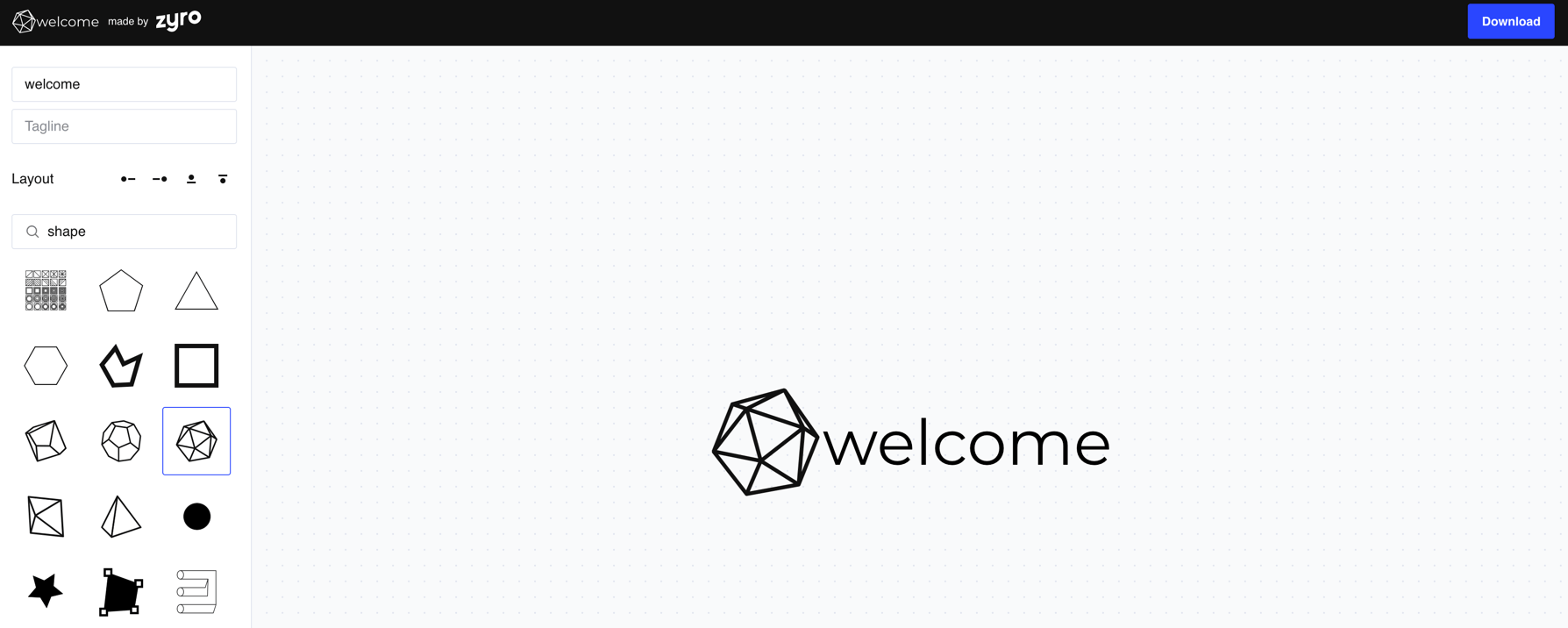
It’s very easy to use and you don’t need to sign up
Keep budgets low:
As you will be testing out your landing pages and have no idea if they convert, you should keep your budgets low. Don’t risk money here. It’s best to stick to a budget of $5 to $10 per ad per day. But create several versions of the ad as you need to test them out too. If you see an ad is performing poorly, pause it immediately and start testing a different audience, angle, or creative.
Run more video ads to your eCommerce landing page:
Another way to save money is by creating video ads. They drive more clicks and conversions than photo ads. You will be able to test your landing pages with a smaller ad budget.
Most people avoid creating video ads as they think they will take much longer to create. But you can actually create them quickly by using several easy-to-use online video editing tools out there. If you don’t have your own footage or want something even quicker, use a tool like Invideo. You’re able to create video ads with pre-built templates.
When creating video ads, focus on the first three seconds to immediately hook viewers with a compelling visual or question, as most users will scroll past if you don’t capture attention instantly in crowded social media feeds. The process of creating video ads has become significantly more accessible with AI-powered platforms that can automatically generate captions, suggest cuts, and even match music to your content’s pacing, eliminating the technical barriers that previously made video production intimidating for non-experts.
One often-overlooked advantage of creating video ads is the wealth of performance data they generate—platforms provide detailed metrics on watch time, drop-off points, and engagement patterns that help you understand exactly which messages resonate and where viewers lose interest.
Another thing you might want to do is add the retargeting pixels for all the major advertising platforms and networks like Facebook, Adwords, Pinterest, Twitter, etc. to landing pages and other parts of your website like the blog. Then retarget people who visited them recently. The best people to promote your website to are people who recently visited it. They will be more likely to convert.
Revitalize your e-commerce strategy with the persuasive power of video ads, known for their higher click-through and conversion rates. Contrary to common misconceptions about time-consuming content creation, user-friendly online video editing tools offer a quick and accessible solution. Utilize platforms like Invideo to effortlessly craft engaging video ads using pre-built templates.
Enhance your brand narrative and maximize ad budgets by leveraging the dynamic impact of video storytelling on your e-commerce landing pages.
PrestaShop migration can future-proof your ecommerce platform while preserving existing site content. Consultant partnerships and SEO migration services streamline transitions, facilitating data transfers to new architectures. Upgrading with migration guidance smooths launching enhanced capabilities.
#10 Upsell and cross-sell products on the landing page:
Once you have a winning landing page and know what offers work best, you can start upselling and cross-selling products. They can help maximize profit. According to Forrester Research, 30% of eCommerce revenue comes from these two methods.
You can promote these offers on the eCommerce landing page itself, on the checkout page, and even on the thank you page. To get the best results, make sure that the products you promote are highly relevant to the one they are purchasing. You can use a PIM tool to optimize all your product content and easily push it to your eCommerce store.
An example of cross-selling can be seen from this recommendation on Bestbuy.
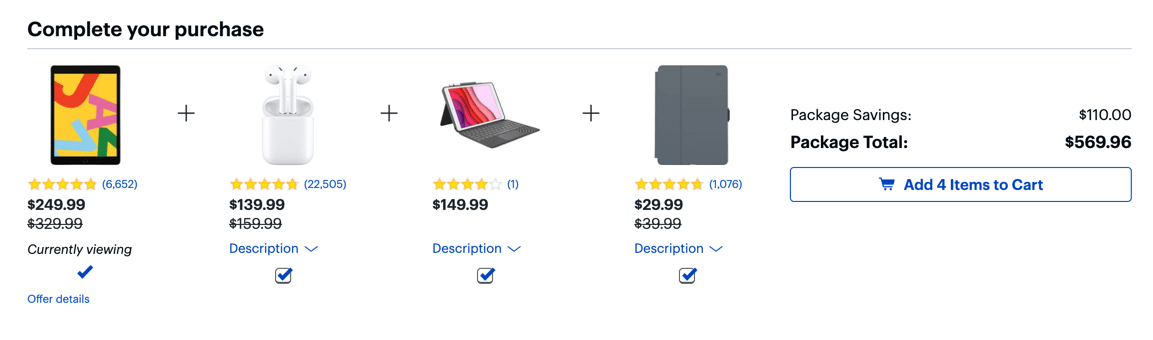
The products they recommend are relevant to each other. This level of relevance can help increase sales and average order value. This should also be easy to set up as most builders like Shopify have apps that help upsell and cross-sell products.
Another example can be seen on SchoolLockers. When a visitor is about to make a purchase, a simple upsell opportunity is presented, allowing the person to add to their locker purchase.
While this might seem like a simple idea, it is a very effective one that adds to the company’s overall revenue.
#11 Use customer testimonials
The power of customer testimonials should not be underestimated. They are one of the most important elements of any eCommerce landing page.
For eCommerce for manufacturers, showcasing testimonials from B2B clients can demonstrate reliability, efficiency, and quality, building trust with potential buyers making high-value purchases.
Make sure that you use persuasive customer testimonials on your eCommerce landing pages. They need to be real, relevant, and recent. The best way to get these is by using a tool to collect them automatically.
A free tool like Google Forms can help you collect customer testimonials quickly and easily. You can even use it to segment the testimonials by topic, product, or anything else. Then you can use these testimonials on your eCommerce landing pages, social media, and even in your email marketing campaigns.
An example of how customer testimonials can help those that are yet to buy from you can be seen on the home page of Doorsplus. With a rotating selection of testimonials, they are able to show social proof and increase confidence in potential customers.
Picture yourself as an alchemist, concocting the perfect elixir for building eCommerce landing pages that convert. In this mystical realm, customer testimonials are the rare and precious ingredients that hold the key to transforming mere visitors into loyal patrons.
These glimmering gems of social proof must be carefully selected, each one a shining example of authenticity, relevance, and timeliness. As you weave these enchanted words into the very fabric of your digital storefront, you create a mesmerizing tapestry that whispers secrets of trust and credibility to all who gaze upon it.
Embrace the arcane power of these customer voices, and watch as your conversion rates ascend to heights once thought impossible, propelling your eCommerce venture to the very pinnacle of online triumph.
Conclusion
These are all the tactics you can use to create eCommerce landing pages that convert. Start off by choosing a good host because loading time can affect conversion rates.
After that, set up the landing page using visuals, well-written copy, call-to-action buttons, and the other factors that were covered in this guide. Once you’re happy with your initial pages, create variations of the landing page and start testing them with ads.
Release the winning landing page to the public but never stop testing and tweaking. Let me know how you’re building eCommerce landing pages that convert in the comments and don’t forget to share.
Mitt Ray is the founder of Social Marketing Writing. Visit his website to download 22 free social media templates.