
18 Landing Page Examples You'll Want to "Steal" for 2021
By Daniel Ndukwu
Landing pages are everywhere but not all of them are created equally.
Whether you’re brand new to creating landing pages or an old hand, it’s important to stay on top of the latest best practices or you’ll be left behind.
Of course, I could tell you a bunch of things to optimize on your pages, but where’s the fun in that when I can show you a ton of landing page examples.
That’s exactly what you’ll get in this guide - 18 landing page examples, why they work, and what could be done to make them even better.
Why do landing pages matter?
Landing pages are, in a very real sense, one of the most important parts of your website. They can be used to set the tone for the rest of the relationship you have with your visitors.
Of course, you want to choose the right landing page tool but that’s only half the battle. The other half of the battle is showing the right message to the right person.
And that’s why they’re so important.
A landing page allows you to send targeted traffic to specific areas on your website so they see a message that’s in line with the traffic source that brought them there. This is also known as landing page message match. For example, if they clicked on an ad with a specific promise, it should be reflected on the landing page.
That’s just not possible with your homepage because it’s designed to cater to everyone that visits your website. In addition to message match, landing pages are laser targeted on a conversion action and contain far fewer distractions when compared to blog posts, about pages, feature pages, etc.
If landing pages are so good, why don’t websites have more of them?
Well, they probably do. You just don’t see them because most aren’t meant to be seen by the casual browser.
Which leads to another question:
How many landing pages should you have?
The short answer is – it depends.
The longer answer requires you to take many factors into consideration.
- How many customer segments do you have (each one should get a landing page)
- What stages of awareness have you identified and which ones do you target
- How many products do you have
If you have one customer segment, two products, and three stages of awareness then you can create six product landing pages. If you have two customer segments then that becomes twelve landing pages.
That’s not including landing pages for your lead magnets, giveaways, free tools, etc.
Let’s not get lost in the weeds. Instead, let’s focus on identifying the best landing page examples right now so you have inspiration.
18 landing page examples to inspire you
Lead gen landing page examples
These landing page examples are focused on what you would call an intermediate conversion. The page is trying to get someone to leave contact information or reach out so the conversation can be continued with email marketing or other means.
1. Intercom b2b sales

Intercom produces a lot of content – both free and paid. This is a long-form lead magnet page that does a lot of things well.
What we like
- Clear headline
- Subheadline that supports the headline and focuses on benefits
- Concise bullet points
- Action-oriented CTA
- Well placed testimonial
- Images of what’s inside the book
- Mentions the contributors and why you should care
What we don’t like
- Statistics used are out of place
- A FAQ that anyone who wants to get the book will already know the answers to
- You can leave the landing page to the blog
2. KyLeads on Quizzes
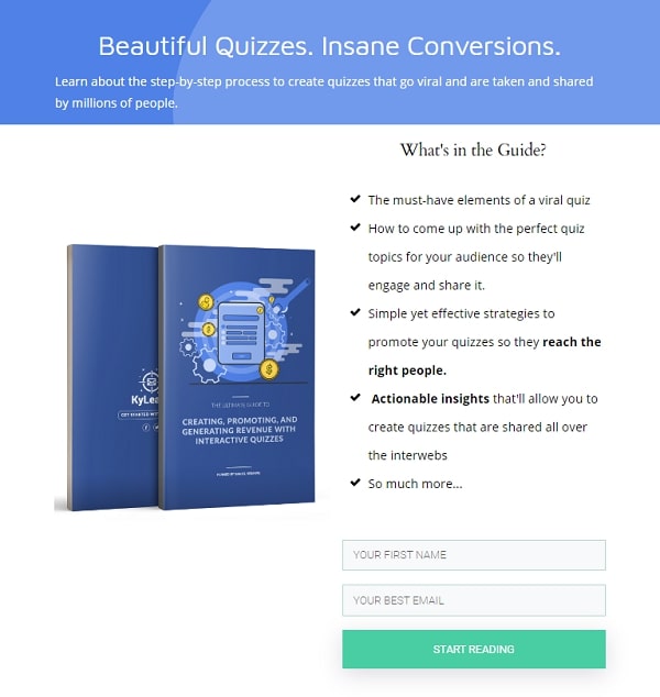
This is one from us that converts at roughly 22% day in and day out.
What we like
- Short headline that sums up the outcome of the book
- Subheadline that tells you what you’ll learn
- Benefit driven bullets that elicit curiosity
- Clear imagery of the book
- Action-oriented CTA
What we don’t like
- The page is short and may leave many questions unanswered
3. Leadpages build a website webinar
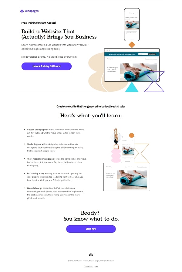
A solid landing page from Leadpages that promises to teach webinar attendees how to build a website that grows their business.
What we like
- Strong headline that puts readers at ease and speaks to a specific pain point
- Subheadline that follows up and talks about common issues
- “What you’ll learn” bullets that clearly show the deliverables
What we don’t like
- The imagery may not be indicative of most users
- They’re repeating the images multiple times on the page instead of using custom designs
4. Avocode design report

This is a beautiful page from Avocode that begs you to stay and consume the content.
What we like
- Aesthetically pleasing design
- Persistent download button in the header
- Unique menu on the left of the page
- Dynamic images
- Custom illustrations from different artists
What we don’t like
- CTA buttons leading to multiple places
- Prominently linking awards the page has gotten
- Links to the artist site which is another way to leave the page
- Logo is linked to the homepage
5. NoHQ
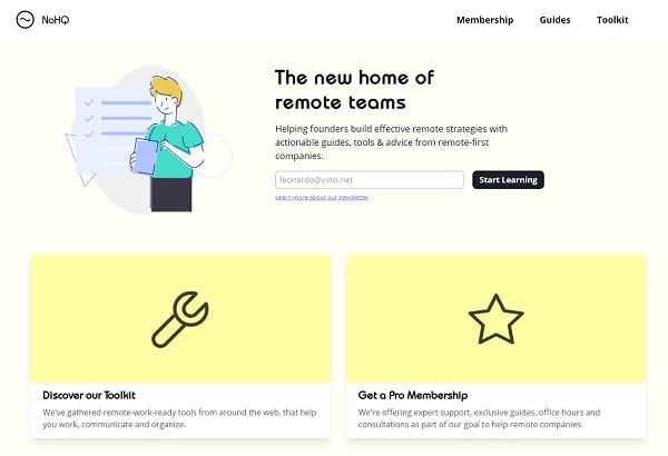
This page from NoHQ is beautiful in its simplicity. It has a warm color pallet and a minimal menu. It’s the homepage so there’s a lot of give and take because of what it needs to do.
What we like
- Custom illustration to showcase the brand
- A clear headline that lets visitors know exactly what they stand to gain
- Clear call out of the target audience
- Action-oriented and descriptive CTA button
What we don’t like
- The paid options are right below the newsletter signup which immediately gives the user another option
- CTA could be a brighter color that draws the eyes
6. Embacy

This landing page from Embacy about landing pages is cheeky but shows the brand personality.
What we like
- Clearly defined illustration style that’s playful but effective
- Minimal color use that enhances the message rather than distract from it
- Scroll effects starting from section five keeps readers engaged
What we don’t like
- The CTA is so subtle it can be missed (in fact, it was missed)
- The design portfolio takes you to another website
7. Backlinko
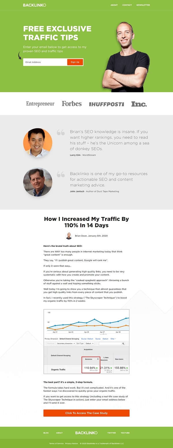
Brian Dean of Backlinko has been using the same homepage for quite a while. The focus is clear – get more email subscribers.
What we like
- Minimal menu options
- Headline talks about exclusivity
- Shows testimonials from well-known people in the marketing space
- Trust signals from industry websites
- Directional cues
What we don’t like
- There seem to be two separate CTAs – one for traffic tips and one for a case study
- All things considered, the design is dated
8. Upresume

This page draws the attention, there’s no denying that.
What we like
- Bold statement and design choice which grabs the attention of visitors
- Good use of white space and contrasting colors
- Directions about what to do
- No way to escape the page
What we don’t like
- Relying too heavily on the curiosity of the visitor to get them to the main CTA
- Not enough information (no information)
- Doesn’t clearly state what the service is (do you make resumes or do you offer templates, etc.)
Sales pages
Sales pages are pages that seek to sell a product directly to the visitor. They tend to explain everything that’s needed before they make a purchasing decision.
9. 100 for 100
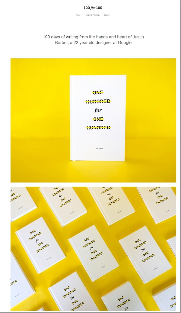
This page is interesting because it uses a lot of negative space and symmetry to keep the user interested in what’s being offered.
What we like
- The imagery pops off the page
- It gives the impression of a thoughtful design
What we didn’t like
- There’s almost no explanatory text
- You have to go to a different page to understand what the book is about
- The CTA is at the bottom of the page and has no context
- The little explanatory text there is doesn’t make the case for purchasing the book because no one cares that the author is a 22-year-old designer at Google
Note: This is an example of what not to do with a sales page. The design is nice but the conversion elements are missing.
10. Upcut
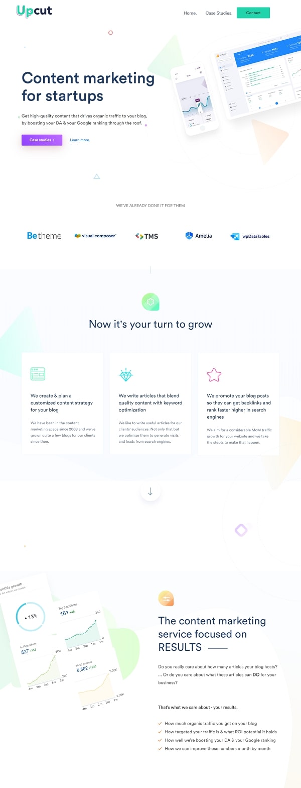
This page could also be considered a lead generation page but it was put here because this is how the company generates revenue. It has a minimal feel and is able to clearly communicate its value.
What we like
- Case studies – one of the most important things for service businesses – are placed front and center
- Contrasting colors for the most important button
- Clean illustrative imagery
- Trust logos of past clients
What we don’t like
- Some of the text is formatted poorly and covers images
- There’s a lot of information missing from the page which leaves many questions unanswered
11. Plato
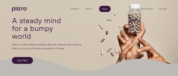
The Plato website gives the vibe of being carefully considered.
What we like
- Good use of consistent button colors
- Subheading that shares the benefits of the product
- Strong imagery throughout the page
- Interesting effects (an eye follows you around)
- The ability to learn more about the ingredients used
What we don’t like
- No trust seals or symbols
- The benefits of the product are way down the page
- No reviews or testimonials from past customers
12. Sumit Hedge
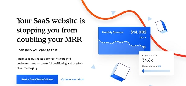
The website from Sumit Hedge is clean and goes a long way towards illustrating the value that’s being provided to clients.
What we like
- Headline speaks to a direct pain the target market experiences
- Subheadline provides the solution to that pain
- Shows logos of past clients
What we don’t like
- The “clarity call” language isn’t explained until you’re almost at the end of the page
- There are no case studies of past clients
13. Digital Marketer Lab

Digital marketer offers many different training resources and its Lab is one of the most popular.
What we like
- A thoughtful headline
- A subheadline that gives a definite timeframe
- Social proof in the form of a testimonial
- Imagery to support the points being made
- A thoughtful FAQ
What we don’t like
- It never mentions what the 11 masterclass certifications are
- No way to see what’s inside the 36 execution plans
14. 1-2-3 Affiliate Marketing

This course sales page by Pat Flynn does a few things well but makes a few strange mistakes which lead me to believe some of them are due to a limitation of the platform he’s using.
What we like
- Video testimonial
- Video explainer
- Cost clearly shown with the first CTA button
What we don’t like
- Logo takes the user back to the course pages
- The what you’ll learn and what’s inside section are short and aren’t too detailed
- Since cost is shown with the first CTA, it could be pushed down a bit
- The “who this course is for section" basically calls out everyone online so it may be better to leave it off
15. Sick Day Box

The Sick Day Box is a tongue in cheek product that, on further thought, may actually be useful.
What we like
- Thoughtful product positioning
- A playful headline
- Subheadline that sheds light on different use cases
- Clearly states what’s inside the box and why
What we don’t like
- Don’t use real images of what’s inside the box
- Only one testimonial which shows a specific demographic group which may turn other groups off
- Price is only mentioned once and can be easily missed by skimmers
Sign up landing pages
These landing page examples represent pages that focus on getting users to sign up for a product or service but don’t always require immediate payment.
16. Memberstack
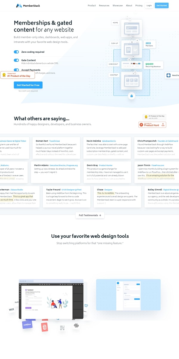
Memberstack, as the name implies, offers a membership site solution to customers and has an interactive website to keep people engaged.
What we like
- Interactive elements on the page to show different product features
- There’s a large collection of customer reviews and testimonials
- Clear headline and subheadline that explains what it is
- Clear action-oriented call to action
What we don’t like
- It doesn’t mention key information like how you collect payments from your own users
- Top menu is crowded which makes it difficult to lead users to specific places
17. Announce Kit
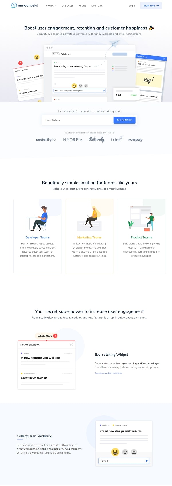
Announce Kit is an application that helps you keep your users informed about what’s happening with your company through a newsfeed-like interface.
What we like
- Clear benefit-driven headline
- Subheadline that explains what the product is
- Clear imagery that illustrates how the product looks/works
- Social proof in the form of logos
What we don’t like
- The additional features section is a list without context
- Doesn’t take advantage of more opportunities to ask for the sign up
18. Mercury
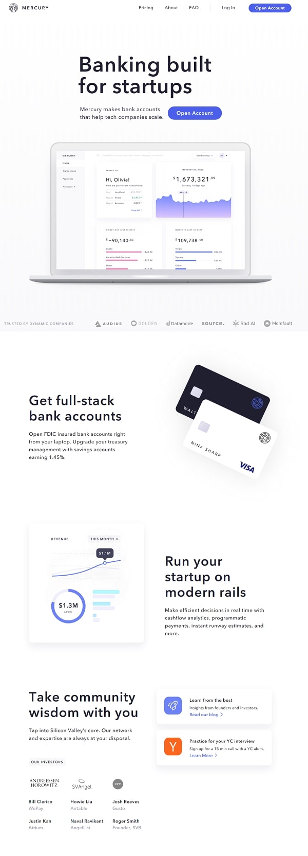
Mercury is an online bank that’d designed to make banking easier for startups.
What we like
- It has a strong headline that calls out its target audience
- It uses the language of their target audience like “scale” and “full-stack”
- Showcases value-added services
What we don’t like
- It’s not clear about who is eligible to use the service (global bank or limited to the United States)
- Not clear on the documentation needed to sign up for an account
Conclusion
Landing pages are everywhere but not all of them are created equally. This guide has gone through landing pages from a wide range of industries and use cases. You should have a much better understanding of what makes a well-designed landing page.
Copyright 2018 - 2020, KyLeads. All rights reserved.
