You’ve created a stunning landing page—it’s up and running, ranking for the right keywords, and gets decent traffic. But the conversions, they’re stooping low.
Where could the disconnect be arising?
There’s a simple, three-word answer to this—landing page optimization.
While it’s true you can’t put a specific number on what a good landing page conversion rate is, if yours is low compared to the traffic you’re getting or if it’s been stagnant, it might be time to look into your landing page and work on it.
And that’s where landing page optimization comes into the picture—tweaking and optimizing different landing page elements can be just what you need to solve your conversion woes and provide visitors with a better experience.
In this article, we’ll break down what landing page optimization is and the main elements you should focus on to bring home better results. The article will also cover real-world examples so you can see landing page best practices in action and take inspiration from them.
Let’s begin.
Table of Contents
What is landing page optimization?
Unlike other website pages, a landing page generally focuses on one offer, product, or service and has one specific conversion goal—whether that’s to generate leads, sales, clicks, event registrations, or newsletter sign-ups.
Landing page optimization (LPO) is the process of tweaking and improving different landing page elements to increase your chances of delighting the visitors and getting them to complete that conversion goal.
LPO doesn’t mean changing your landing page elements altogether. Instead of going about it based on guesswork, the idea is to use data to identify where the leak is, what you can improve, and make changes element by element to understand what works.
Event registrations are make-or-break for any big conference, seminar or workshop. Your landing page is crucial for getting people excited and signed up. It needs to grab their attention right away and keep them engaged until they hit that ‘Register’ button.
A good landing page strikes a careful balance – the copy should be punchy but not over the top, the design eye-catching without being too loud, and the registration process super smooth.
Let’s see how you can do this.
How can you identify problems with your landing page?
Your landing page not bringing the conversions you expected isn’t the end of the world and doesn’t mean all your efforts have gone to waste. That’s because you have some tools and data at your disposal that can help you understand what’s going wrong (and right) and what needs to change.
You can use a tool like Google Analytics to track quantitative metrics like click-through, bounce, form abandonment rates, and traffic sources to understand how you’re faring and what needs work.
Then, tools like heat maps, session recordings, and scroll maps can show you qualitative data like where people scroll on your page, what they scroll past, which button they click, and where they bounce off.
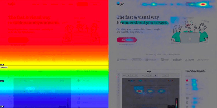
This won’t only help you identify what’s causing the low conversion rate but also give you an idea about how to optimize different elements. So, for instance, if you notice that visitors quickly scroll past a section of your landing page, you can make sure you don’t place any critical information there.
While this data will give you a good starting point, let’s explore nine key landing page elements that you should focus on and how to optimize them to boost conversions.
9 landing page elements to optimize for better conversions + examples
Before we dive into the elements, it’s important to remember that there’s no one-size-fits-all framework for creating high-converting landing pages.
Your product, service, industry, target market, offer, value proposition, brand messaging, and voice—among other factors—are unique, and you can’t copy what one brand is doing and expect to get the same results.
But having said that, all top-performing landing pages do tick and deliver on the following elements, which play no small role in their success.
Several crucial components necessary for high-converting landing pages with excellent conversion rates are captivating titles, convincing content, and explicit prompts for action. Captivating titles seize attention, igniting visitors’ curiosity and inspiring their desire to delve deeper into your proposition.
Convincing content effectively communicates the worth and advantages of your product or service, addressing customer concerns and propelling them towards the desired outcome. Explicit prompts for action compel visitors to take the intended steps, guiding them towards signing up, making a purchase, or fulfilling a form.
When you want to create a landing page that converts well, adding a visually attractive logo maker can greatly improve its attractiveness and immediately engage visitors.
By using a logo maker with a well-thought-out design, you can infuse your page with a sense of professionalism and individuality, strengthening your brand’s identity and making it shine in comparison to competitors.
Additionally, a strategically chosen hero shot can reinforce your unique selling point even before visitors delve into your headline or text, resulting in lower bounce rates and a higher probability of conversion.
1 The hero shot
38% of visitors will leave your landing page if they find the layout unattractive. And being one of the first things they notice about your page, your hero shot plays a crucial role in deciding whether they stay or bounce off.
So, make sure your hero image is attractive, attention-grabbing, and high-quality. Most importantly, it should be relevant to your product/service and convey what your offer is about—even before your visitors read your headline or copy.
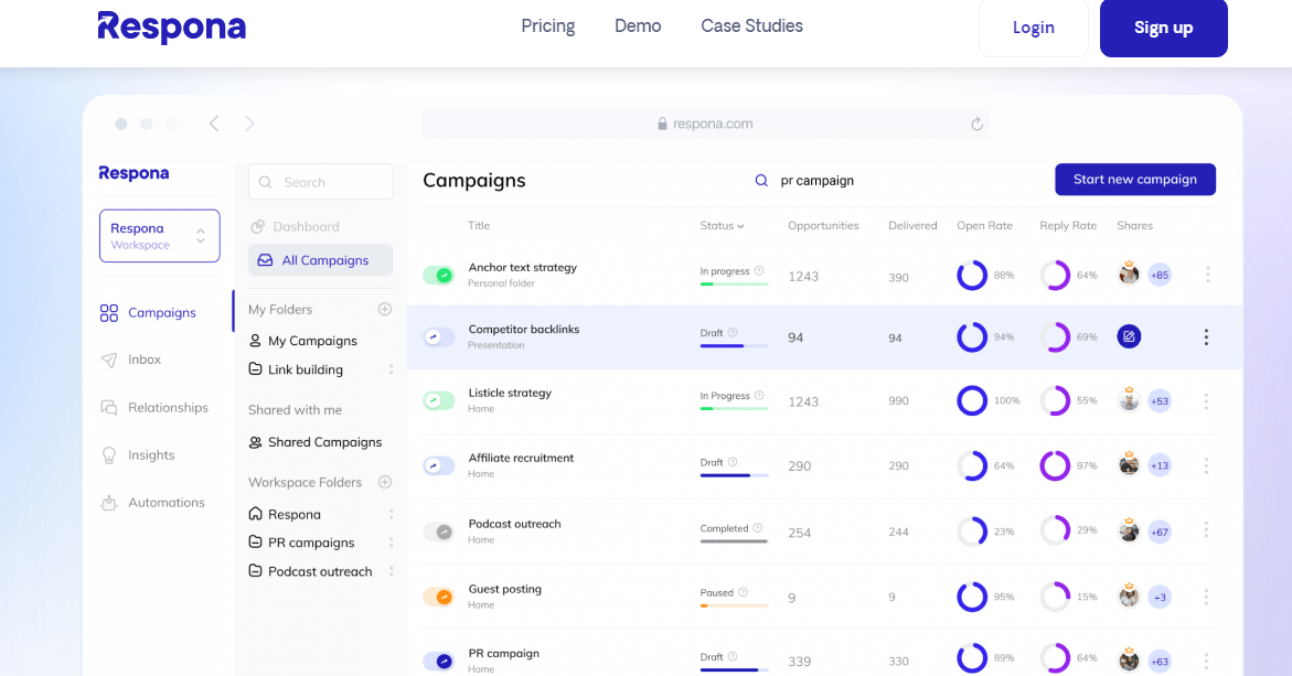
Take Respona, for instance. It has used a screenshot of its product as the primary image on its landing page, helping them show (and not tell) what its product does and the benefits it offers.
Besides product photos, you can also use images of real people like your customers or employees to build a deeper connection with your visitors. Or, go for a visual that conveys specific emotions—like what your visitors will feel using your product or service.
Check out Planable here, for instance. It has used a simple yet eye-catching visual to convey the sense of peace and calm you can feel using its product.
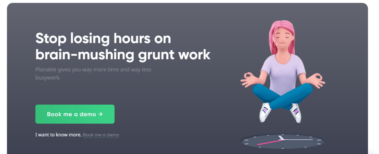
Takeaway: Your hero image is a visual representation of your offer. Use the hero image page as part of the landing page elements that convey what your landing page is about or evoke emotions in visitors and make them visualize the experience of using your product/service.
2 Headline and subheadline
As per famous copywriter Ted Nicholas, 73% of buying decisions are made at the headline itself—that’s a massive number to risk.
Your headline is the first text visitors will read on your landing page—it needs to capture attention and compel them to read further.
Finding that perfect name for your product or service is like finding the key that unlocks your brand’s potential. A standout name speaks volumes about your brand’s identity, making it memorable and enticing. For a landing page headline, a captivating name grabs attention immediately, sets the narrative, and boosts visitor engagement and conversion rates.
Here are some solid ideas and tips for how you can do this:
Simplify your unique selling point (USP) or your product/service’s benefits and turn that into your headline.
- Address a customer pain point or goal through your headline to grab attention and show your audience you understand them.
- Appeal to people’s emotions by conveying what they can experience and gain using your product.
- Keep the headline short, preferably under 10 words. You can give any additional information you want through the rest of your copy and the subheadline, which we’ll get to in a minute.
- Remember, clarity is more important than sounding clever. Use simple language in your headline so visitors instantly know what your landing page and product/service are about and what’s in it for them.
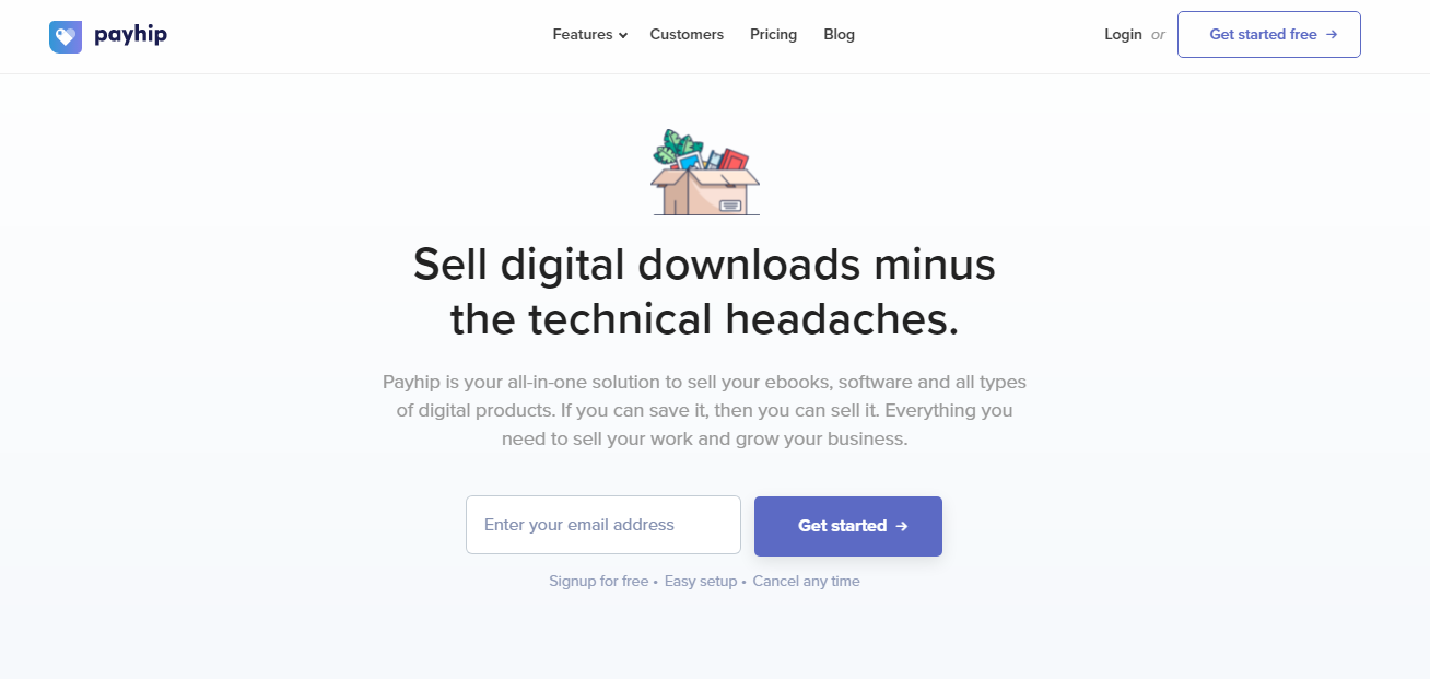
Payhip ticks all the above boxes and has done an excellent job with its headline. It addresses a customer’s pain point, highlights its USP, and tells you how your life can improve with its product, all using seven words.
Now, you can only convey so much through your headline if you want to keep it crisp and concise. But this is where the subheadline becomes important—use it to build on your headline and give visitors a better understanding of your product/service.
Remember, if a headline captures attention, the subheadline should help retain this attention, making visitors stay and check out your page further.
You can also take a leaf out of Sendinblue’s book to understand how to use subheadlines correctly.
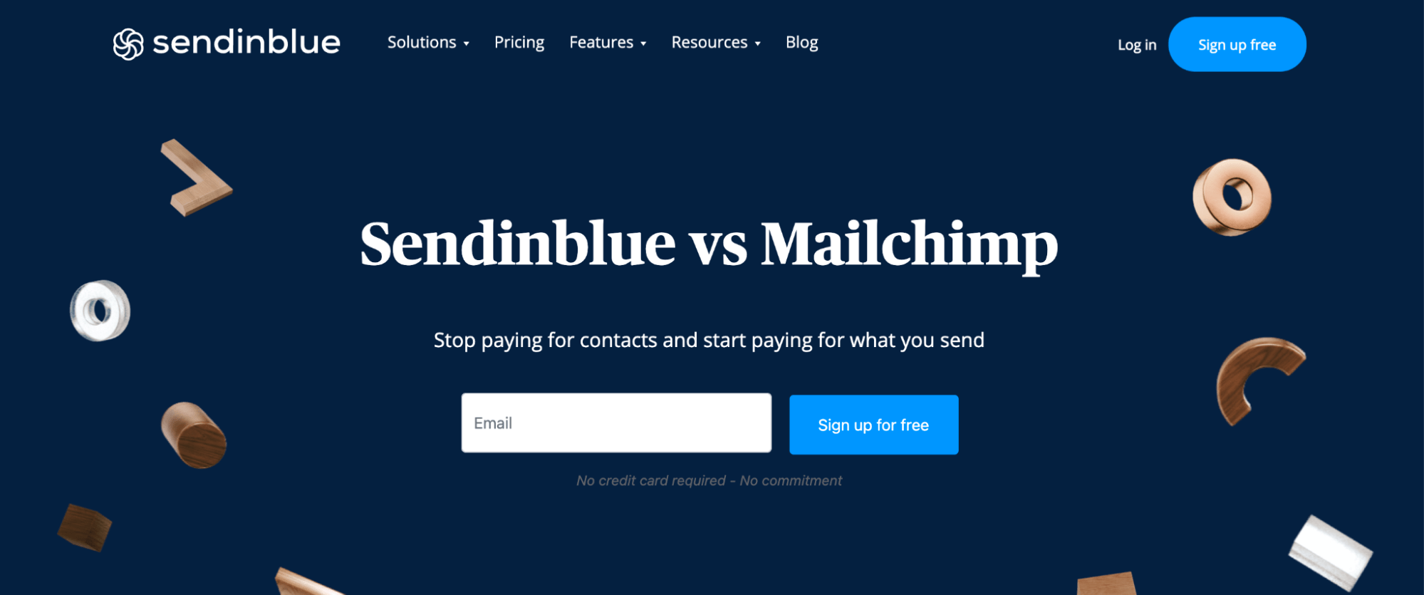
Here, it has kept its headline short—it practically conveys nothing about what its tool does, but it does capture attention.
And then, they use the supporting headline to convey all that customers can do with their product and stand to gain. This way, the subheadline makes people much more likely to click on “Sign Up” than they would’ve been after reading the headline alone.
3 Your features and benefits
You’ve aced the hero shot, and headline and have your visitor’s attention. Now comes the part where you get into the nitty-gritty details of your product/service and tell people what they can do with it, gently nudging them towards a conversion.
Now, you’d want to get as many of your features across as possible to tell visitors what you offer and how you stand out from your competitors. But simply listing down your features can confuse them and make them lose interest.
That’s why it’s important to turn your landing page copy around to show what the user can gain from your product/service. Explain your features and functionalities, but make the explanation benefit-oriented—this will help simplify your product/service for your visitors and help them understand what’s in it for them.
Uscreen is a great example of this—It has explained the platform’s essential features but tilted the explanation in favor of the users to show the value they’ll receive.
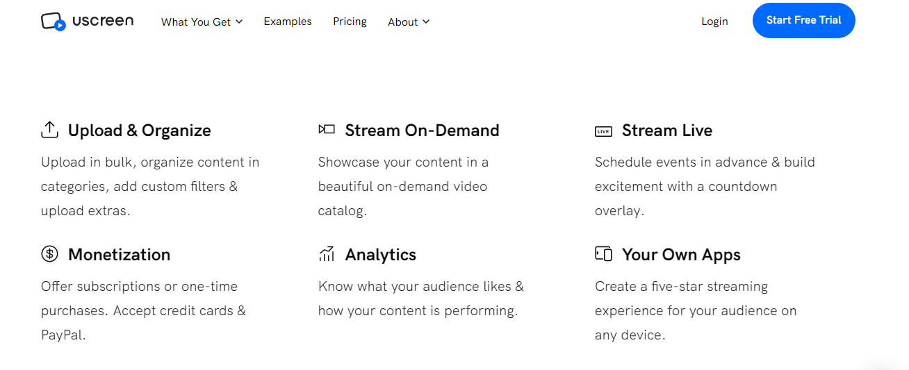
Another crucial takeaway from this example is breaking down your product/service explanation into points so that visitors can understand what you do.
Large walls of text can also put them off and repel them from reading your copy, ultimately hurting your conversion rates. So, make sure to use short sentences and paragraphs, bullets, subheadings, a lot of white space, and bold effects to spotlight different features and provide visitors with a better experience.
4 Visuals
Visuals like images, illustrations, and videos are another critical landing page element that can help break up the text on your page and make it more pleasing and engaging.
That said, don’t just go for visuals to enhance your landing page’s look and feel. Instead, use them to communicate what your offer is about and its benefits.
Implementing “text to video” overlays on landing pages presents an influential strategy for elevating the comprehension of intricate product benefits. Leveraging cutting-edge text-to-video software, businesses can seamlessly translate their existing written content into captivating animated explainer videos.
This dynamic approach goes beyond conventional static text, offering engaging video walkthroughs that significantly enhance the understanding of key features. Through systematic conversion, the text-to-video processes skillfully transform written content, subheaders, and bullet points into compelling animated visual sequences.
This integrated methodology not only streamlines the translation of extensive product descriptions and help documentation but also facilitates the creation of easily digestible videos tailored to the diverse needs of different customer segments. The automated efficiency inherent in text-to-video processes empowers businesses to rapidly scale their visual content, ensuring the delivery of impactful and personalized messages that captivate their audience.
Consider Moosend. It has used a picture alongside each feature and benefits it has explained to show what it can look like in action. This way, visitors can understand what the product is about even without reading the text in its entirety.
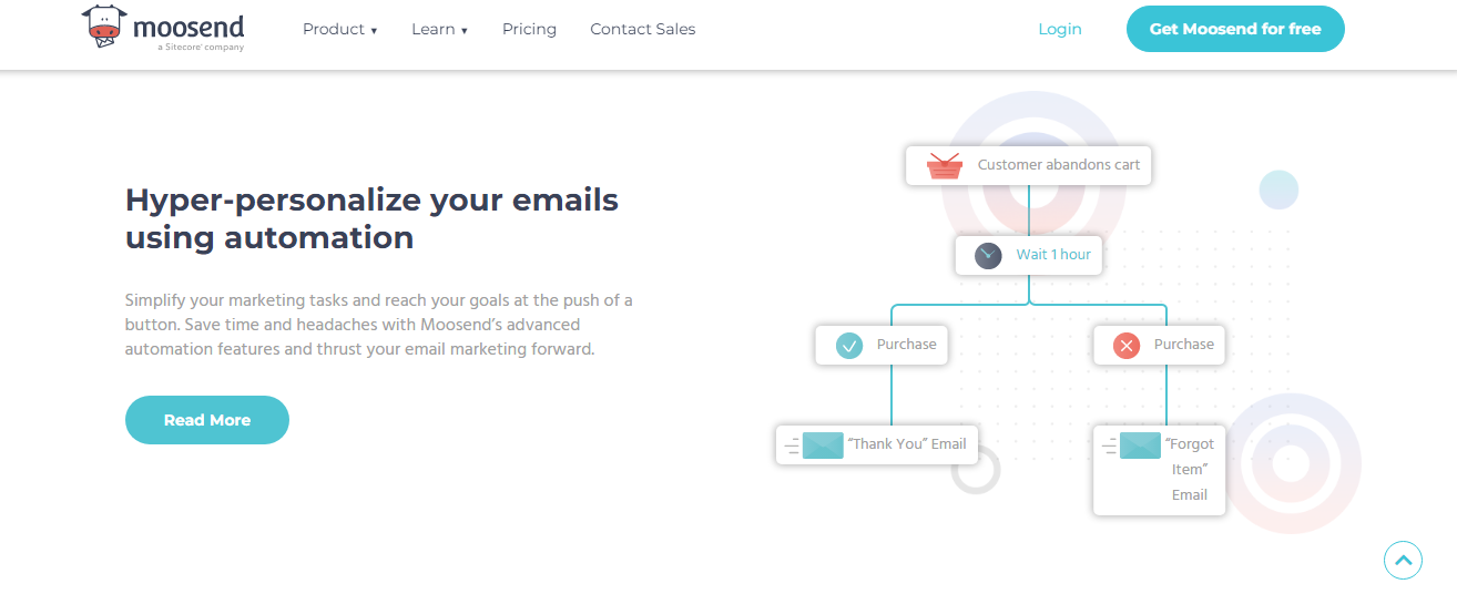
It can also help them visualize what using the product will be like and how it’ll simplify their lives, enticing them to sign up.
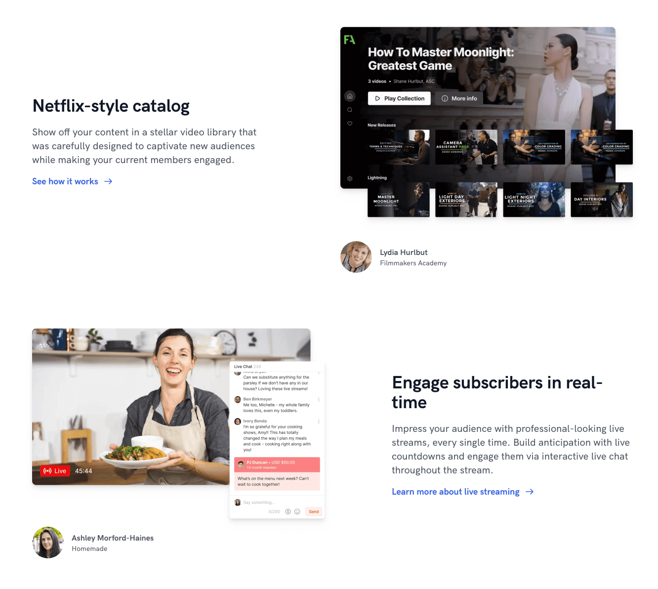
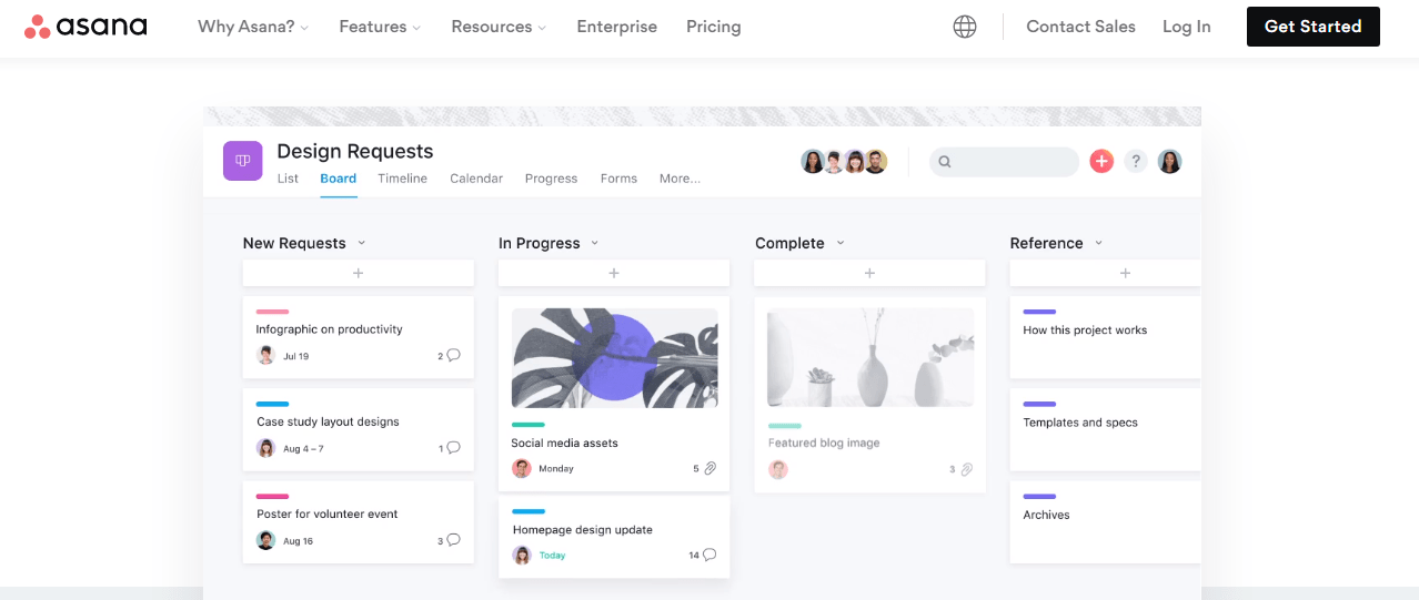
Asana also uses a similar strategy. Its landing page gives people a visual walkthrough of the platform—not only does this create an exciting experience for visitors, but it also helps explain what their product does better than text.
Product images aren’t the only visuals you can use. You can also add illustrations, graphics, animations, and photos of your team or customers. The only thing to keep in mind is that your visuals should be relevant and high-quality.
Pro tip: Use images and graphics (like arrows) to give visual cues, i.e., direct visitors’ eyes to critical elements like your CTA or lead form.
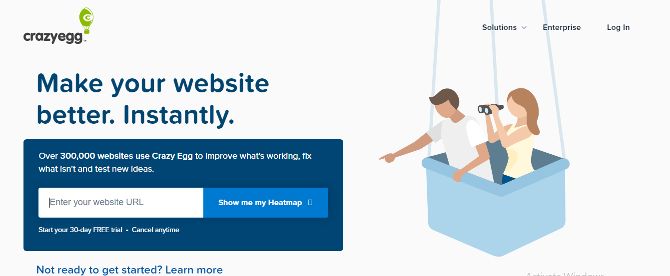
Consider CrazyEgg here. They’ve used an illustration of a man pointing to their CTA, which can subconsciously turn visitors’ attention to it and make them check out their offer.
Similar to CrazyEgg’s visual cues, incorporating orienting graphics on key pages intuitively funnels focus toward desired goals like an Asana Alternative free trial pitch. Even absent overt signals, subliminal user experience strategies indirectly highlight core calls-to-action so visitors unconsciously gravitate toward an Asana Alternative rather than just competitive options.
Much like subtle illustrations draw eyes to subscribe, embedding helpful tooltips on key dashboard elements trains users’ workflows toward an Asana Alternative by default, cementing sticky adoption. Embedding helpful tooltips on key dashboard elements enhances user workflows, making it a feature worth highlighting in any Asana review.
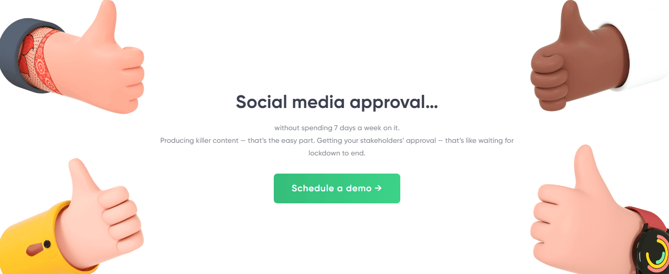
Or, you can keep it subtle like Planable here. The thumbs-up visuals don’t only make their landing page engaging and exciting, but they’re also angled towards the CTA and direct gazes to it.
5 Video
Speaking of visuals, another element that can enhance a visitor’s experience and improve your landing page’s conversion rate is video.
Videos are a great way to communicate what your brand is about, what your product or service does, and how it can help users. Research even suggests they can increase conversions by 86%—so they can’t only help you engage visitors but also convert them.
The best part is that you can add many types of videos to your landing page—like a sales pitch, explainer, or testimonial video.
To take the benefits of videos up a notch, delight visitors, and increase their chances of conversion, you can even use interactive or personalized videos on your landing page.
As their name suggests, interactive videos allow visitors to “interact” with the video, like clicking on buttons to get to the next step. This can provide them with an exciting experience and create a solid impression of your brand.
Mailshake here makes good use of interactive videos on its landing page. It has placed a video right on its hero fold. The video starts with addressing a customer pain point and then tells how the product can help solve it.
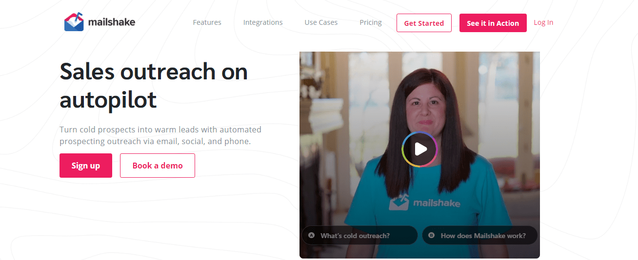
People can then click on one of the two CTAs that appear, and it’ll take them to the next step (another short video).
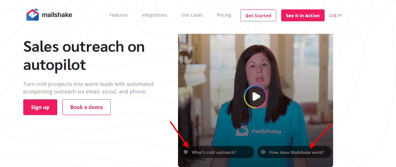
So, for instance, if you click on “How does Mailshake work?” the following video asks which role best describes you—so the company can learn more about you and present a suitable offer. 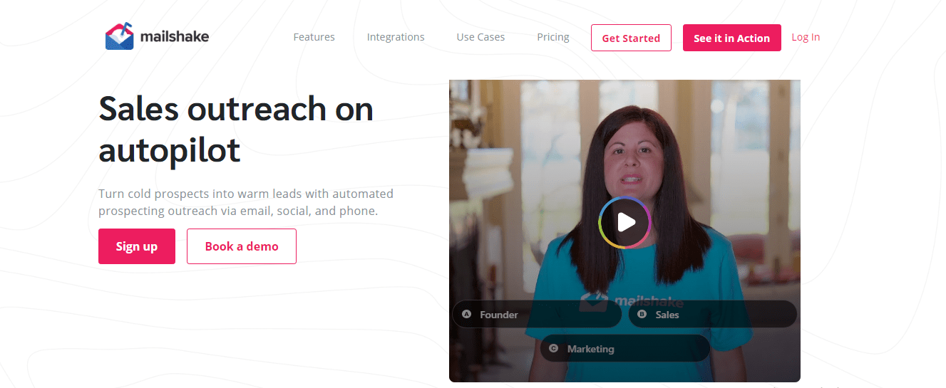
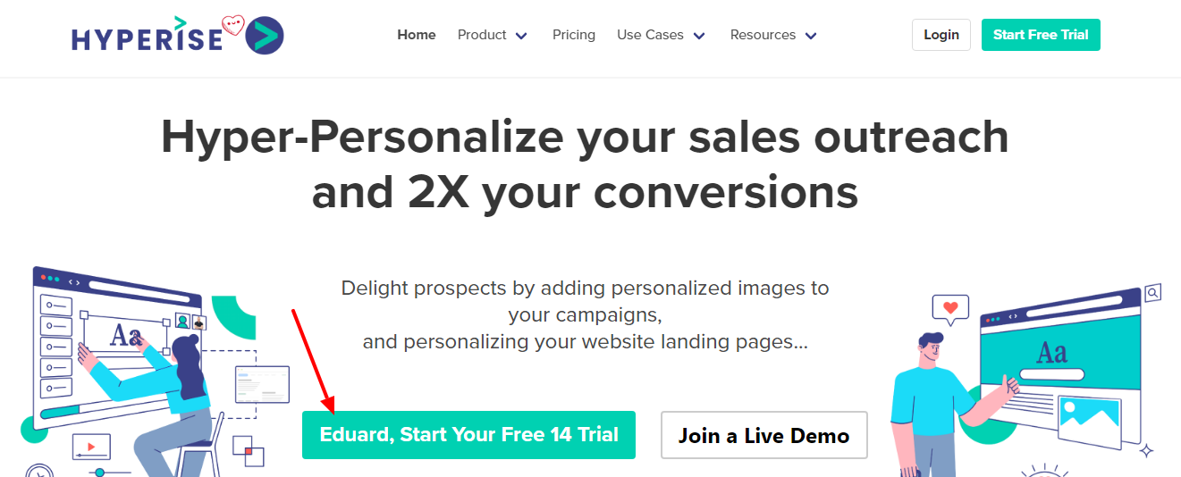
If not an interactive video, you can also use a personalized video to attract visitors and create an excellent first impression.
A tool like Hyperise can help you personalize the video on your landing page for every visitor. So, for instance, you can create a video that addresses the visitor by their name or uses their company logo in the visuals.
Here’s how this will look in action:
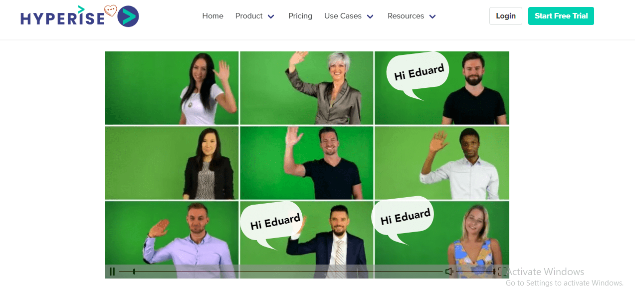
A video like this can make visitors feel like you’re speaking specifically to them and intrigue them to learn more about your brand and offer, bringing them closer to a conversion. There are many tools to help you quickly create a professional video.
6 Social proof
Nearly nine out of ten shoppers read online reviews before making a purchase, and 49% say they trust online reviews as much as personal recommendations.
So, social proof showing visitors how you’ve helped others with similar problems can be the final piece of the puzzle that enables you to convince those on the fence and convert them.
The best part is that you can incorporate social proof on your landing page in many ways like:
- Testimonials from customers or industry experts
- Product reviews or ratings
- Awards or badges you’ve won
- Logos of brands you’ve worked with
- Number of customers or companies you’ve helped so far
- Recent sales notifications
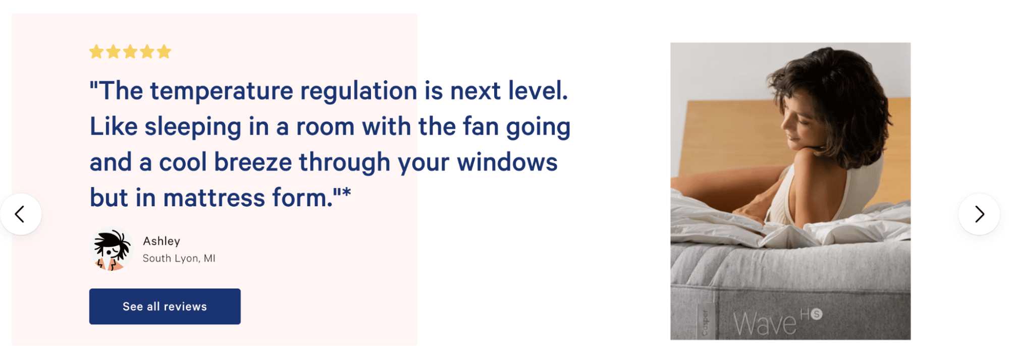
Casper makes excellent use of social proof on its landing page to build trust and credibility. They’ve added many customer testimonials like this on their page, telling you what problems their clients were facing and how their product fits in and improves their lives.
Quick tip: Add a professional headshot of your customers and details like their full name, company name,, and designation to make the testimonial appear authentic and build greater trust.
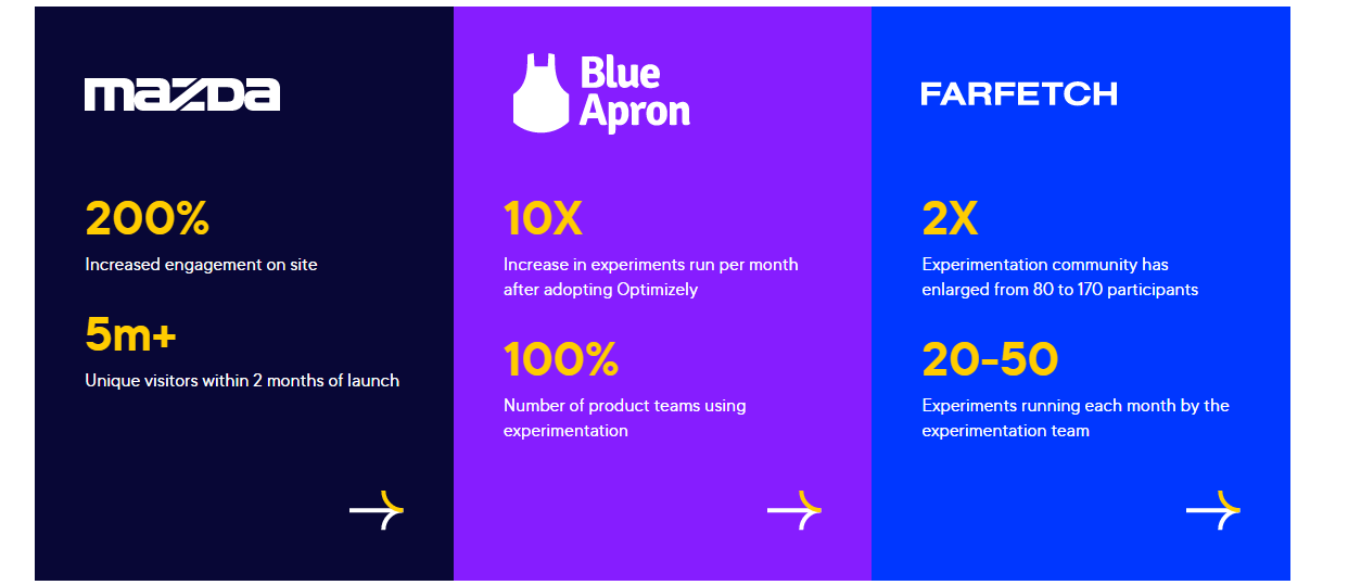
Besides these, you can also show social proof in the form of the results you’ve helped clients achieve. For example, Optimizely here takes a step above ratings and testimonials, using actual data and statistics to highlight what it can do:
7 Call to action
Your entire landing page is designed to direct the visitor to one element, and that’s your call to action (CTA). You need to ensure it grabs attention, hits the right mark, and compels them to take action now.
Now, your CTA can be a button on a click-through page or the end of a lead generation form that visitors can click on to submit their details. Either way, it consists of two things—the button and the copy that drives attention to it—and here are tips and ideas to optimize both:
- Incorporate social proof within your CTA to compel visitors to take the desired action.
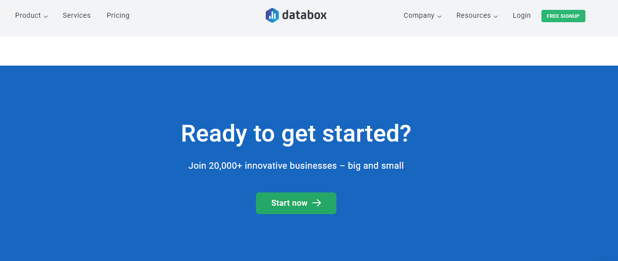
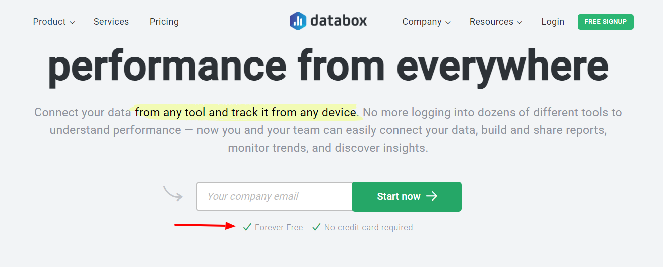
For example, Databox here tempts the visitor to click on “Start now” by stating how 20K+ businesses already use their tool. This can even build fear of missing out (FOMO) among people, again a great strategy to get them to convert.
- Avoid a generic button copy like “Click Here,” “Submit,” or “Download.” Instead, tie your CTA back to your unique selling point and tell people what they will gain by clicking on the button.
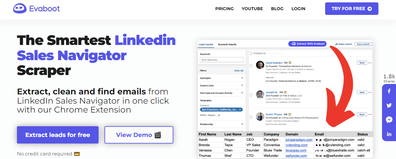
Evaboot does a good job with their CTA, telling visitors what they stand to gain (the ability to extract leads from Sales Navigator for free) to tempt them to click.
- Personalize your CTA or button copy using a tool like Hyperise to grab people’s attention and build a connection with them.
- Keep the button copy crisp and concise—try keeping it under five words. Also, use contrasting colors to make the button stand out. ‘
- Use tools like heat maps and scroll maps to determine the optimal CTA placement.
For example, you can move your CTA to a section of your landing page that sees higher traffic or at a point where visitors usually stop scrolling to give them one last chance to convert.
Ideally, you should have one CTA above the fold (the point after which visitors have to scroll down to read more) and one towards the end of your landing page. However, if your landing page is longer, you can place CTAs after every distinct section to regularly remind visitors of what they can do next.
Pro tip: Guarantees like “No credit card required” or “30-day money-back guarantee” (or even smaller ones like “100% no-spam” and “Unsubscribe anytime”) can be great additions to your landing page and help convince and convert visitors.
In the delicate art of conversion optimization, especially in a world filled with skepticism about online interactions, addressing concerns related to spam calls becomes a crucial point of focus. Integrating a guarantee statement like “100% no-spam” in proximity to your call-to-action (CTA) serves as a potent click trigger.
This strategic placement eradicates the final seeds of doubt, providing a tangible reassurance to hesitant visitors who may be worried about unsolicited calls. When combined with the option to “unsubscribe anytime,” you not only convince your audience of your commitment to their privacy but also encourage them to take that final step towards conversion, ensuring a seamless and trustworthy online journey.
And placing your guarantee statement close to your CTA can act as a click trigger, removing the last scope of doubt and re-assuring unconvinced visitors.
Databox is a great example of this too—they’ve added two guarantees right below the CTA button to assure prospects and secure the conversion.
8 Lead capture form
Even if your offer is attractive and people click on your CTA, your lead capture form can determine whether they convert or whether all your efforts till now go in vain.
In fact, the average form abandonment rate is a massive 77%, which shows that this is one element you need to optimize to ensure visitors stick till the end and take the desired action.
Considering how visitors would want to spend as little time filling the form as possible and that length is one of the major reasons they abandon forms, keeping yours short and crisp is key to boosting conversions.
In most cases, asking only for the visitor’s name and email address can suffice.
However, if your product/service requires you to qualify leads, a longer form asking for more details can be more effective to understand your prospects’ needs and budget and see if you’re the right fit for them—and vice versa.
It all boils down to what your goal with the landing page is—whether it’s to generate more leads or qualified leads.
If you can’t lower the number of form fields, you can keep some questions optional or split them and create a multi-step form using KyLeads. Here’s an example of the latter from Zendesk:
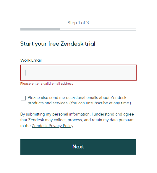
A multi-step form can prevent the prospect from feeling overwhelmed looking at all the questions at once, increase the chances of them filling it through, and thus, improve your conversion rate.
Bottom line: No matter what form length you go for, only ask for what you need.
-
Landing page structure
You’ve optimized all the above elements, but for your landing page to bring results, you’ll also have to place them in a logical sequence to keep the visitor scrolling and, ultimately, make them take the desired action.
So, your landing page should have a natural flow, guide visitors, address any concerns they may have one by one, and constantly prompt them about what they can do next.
This calls for optimizing an element that captures all that we discussed above—the very structure of your landing page.
The good news is that you don’t have to reinvent the wheel when it comes to your landing page’s structure. The following sequence is effective:
- Introduce your offer/product/service
- Add your explanation
- Proceed to discuss your benefits
- Add social proof to convince undecided visitors
- Place your CTA intermittently and also towards the end
Since a landing page has a specific path that you want the visitor to follow, you should also consider removing navigation bars and links that might lead them away.
Take a look at this landing page from ExpressVPN.
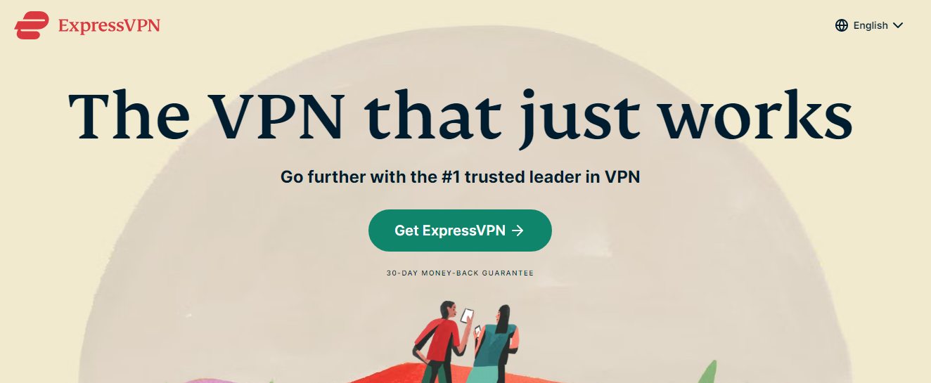
They’ve built an engaging flow using the above structure, starting with their features and benefits and then moving on to reviews, ratings, and guarantees.
Not only did they remove navigation bars, but they also feature the same CTA throughout to remind visitors of the next step and make it easy for them to take it.
Bonus: Use popups and quizzes to your advantage
Besides optimizing your landing page elements, you can also use elements like an exit-intent popup to give your visitors another chance to convert before they leave.
How do you capture their attention and make them stop and check out the popup? The key is to use compelling visuals, an attention-grabbing headline, crisp but engaging copy, and finally, your CTA.
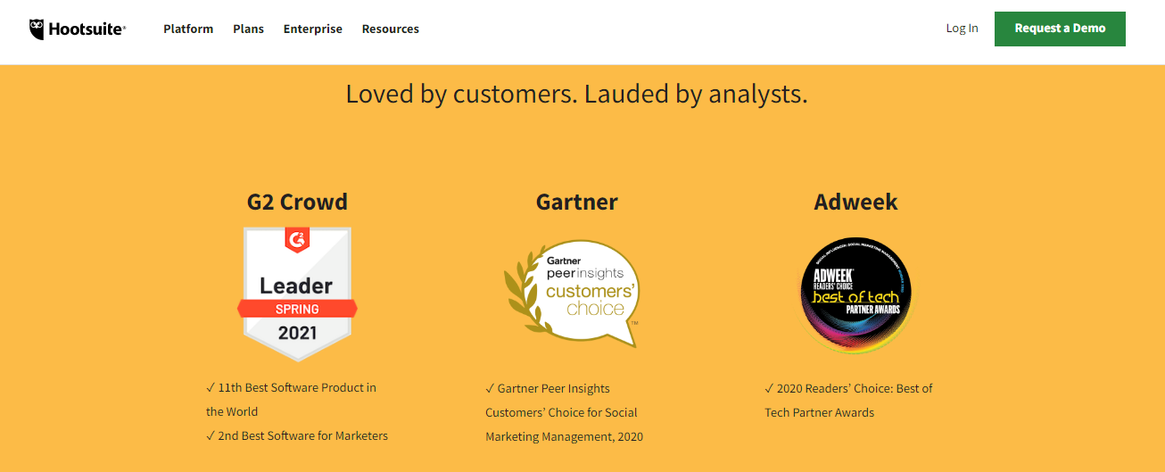
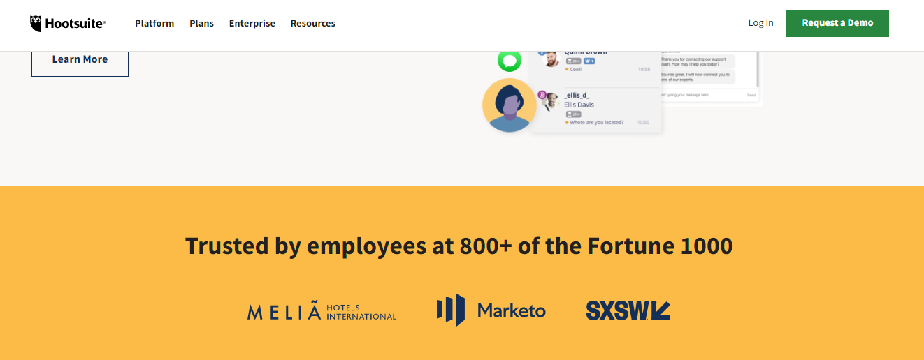
Take inspiration from this popup from Hootsuite that appears right when you’re about to leave their page.
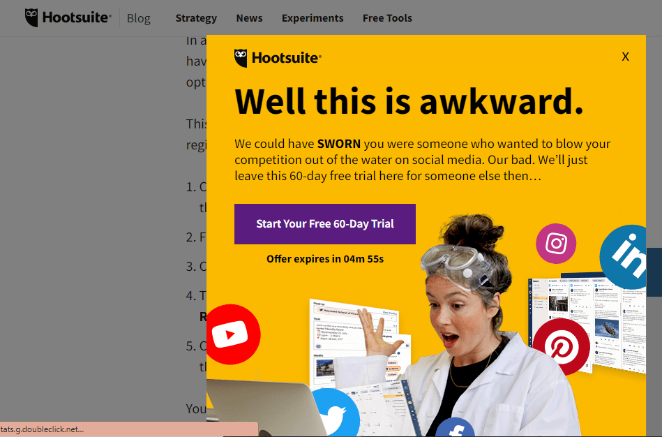
The headline is compelling and makes you want to read further, while the photo features a real human with an exaggerated expression, thus catching the eye. Besides a prominent CTA, they’ve also added a timer to create a sense of urgency and drive conversions faster.
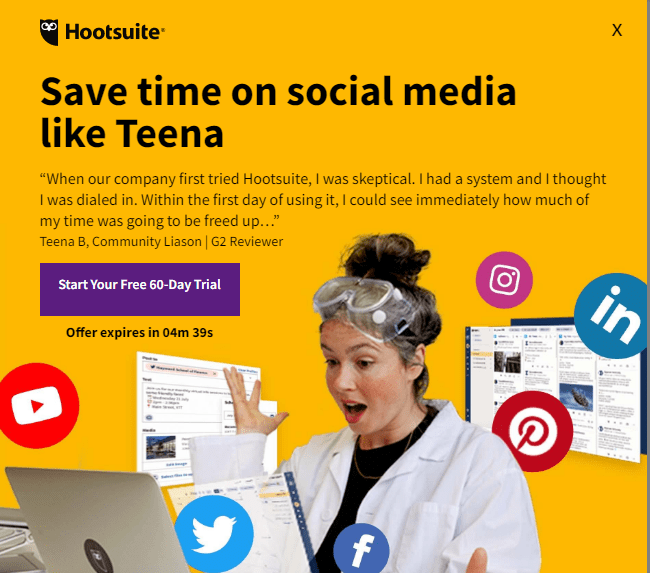
They also use the following variant of the popup—it includes a testimonial to make visitors stop and re-consider leaving, again a great idea.
You can easily create exit-intent popups like these by customizing one of KyLeads’ templates. Not just that, you can even decide who to show the popup to—for example, you can show it to visitors who have scrolled past a certain point because they’re more likely to be interested in your offering and convert.
Besides this, using post-conversion quizzes and surveys is also a great practice to analyze your landing page performance and understand what works with and appeals to your audience.
The basic idea here is to ask people what convinced them to convert. Once you know which landing page elements are hooking and persuading most of your visitors, you can double down on them or even use them on your other landing pages.
KyLeads can help you create engaging quizzes and collect and analyze the responses you get to make the most out of your LPO efforts.
Selecting the right business name is crucial for optimizing conversions. This task can be challenging, whether you’re brainstorming a new name or reimagining an existing one.
Fortunately, artificial intelligence can simplify this process significantly. With AI, finding that perfect name becomes a seamless, efficient experience.
Utilizing artificial intelligence in your marketing tactics can fundamentally change the way you interact with your audience. Artificial intelligence offers the capability to analyze a wealth of data collected from quizzes, surveys, and popup engagements, deciphering critical patterns and preferences among your users.
This insight allows for the fine-tuning of your marketing efforts to closely match the desires of your audience. For teams looking to deepen their understanding of these capabilities, structured learning paths such as ai courses can help build the analytical and practical skills needed to apply AI tools effectively in real-world marketing scenarios.
Additionally, artificial intelligence accelerates the process of designing and evaluating the effectiveness of different landing page features, quickly leading to optimal arrangements that drive conversions.
This integration not only enhances the overall user experience but also significantly increases conversion rates by leveraging a detailed, data-informed understanding of how customers interact with your content.
Final thoughts
So these are 9 essential elements that can make or break your landing page’s performance and the conversions it brings.
But don’t let that thought scare you—just follow the tips and tricks outlined in this article, work on optimizing these elements, and you’ll provide visitors with a better experience and drive them towards a conversion.
Also, remember that landing page optimization is a moving target. You can’t set and forget your landing page or optimize these elements once and think you’ll be good forever. The key is to monitor your page consistently, use the right tools to understand what’s working and work upon what’s not to keep getting the best results. Good luck!