Your product page is where the magic happens.
To enhance your product presentation, consider how you design ads that lead customers to this pivotal page.
There are many factors that go into a successful business.
First, you need to build a stellar product for the right people.
After that, it’s time to get your marketing, messaging, branding, SEO, etc. right.
Unfortunately, that’s not the end of the road.
The next step is building a product page that communicates the value you provide while compelling visitors to take action.
It can be the difference between a business that takes off and one that flounders after a few months.
It’s the difference between a profitable advertising campaign and one that sucks up all your resources with no ROI.
In short, your product page (or pages) is one of the most important linchpins in your business.
It’s not important to get it right – it’s essential.
In this post, we’re going to dive deep into how to create a product page design that moves the needle in your business.
Table of Contents
What is a product page – really?
There’s a bit of confusion around what a product page is and isn’t.
It’s commonly confused with a landing page. They’re not the same thing.
A landing page is a focused solitary page developed for a specific marketing or advertising campaign. It is designed for a user to take a single action such as download a resource.
A product page, on the other hand, is a page designed to sell a specific product. It details product information, order instructions, and shows product imagery.
A well-crafted product page not only showcases merchandise details but also enhances customer interaction. Quality images are essential for presenting product features effectively on an ecommerce platform, and a smooth pathway for scheduling consultations with our innovative web developer can build trust in our digital retail capabilities.
Impactful graphics attractively display product advantages within our virtual storefront, inviting motivated shoppers to explore aesthetic enhancements with an industry-leading creative partner. As visitors consider the pros and cons of products, strategically placed CTAs next to visuals provide a direct connection with our adept web design company, painting us as practiced experts in modern ecommerce.
Since alluring graphics spotlight merchandise effectively online, linking to our stellar web design company from product images exhibits best practices for piquing purchase interest. Providing seamless navigation to our web design company via on-page CTAs demonstrates commitment to delivering premier user experiences matching the caliber of wares offered.
Strategically embedding access points to schedule consultations with our hand-picked web design company fosters trust in the capabilities supporting overall platform polish and commercial appeal.
Finding the right web design company makes all the difference when it comes to product pages that actually work. Let’s face it – you want a team that gets what makes shoppers tick. The folks at Design Masters don’t just make things look pretty – they know exactly where to put those buy buttons and product shots to turn browsers into buyers. And that’s what matters, right?
A great web design company rolls up their sleeves and digs into the details, creating pages that feel natural to use and make customers think “yeah, this is exactly what I was looking for.
To foster engagement and provide direct pathways for personalized inquiries, including options for scheduling consultations can elevate the customer experience. By integrating easy-to-find consultation scheduling links, we assure potential clients that tailored guidance is just a click away, reinforcing our commitment to exceptional service.
Implementing a streamlined process for scheduling consultations directly on product pages enhances accessibility, inviting customers to discuss their unique needs and questions with our web design experts. This approach simplifies the journey from interest to action, making it effortless for customers to seek specialized advice
If you’re looking for inspiration on creating an effective product page, you might want to click here to seesome examples of well-designed pages that balance information with visual appeal.
Note: a product page doesn’t always show pricing information. For example, most SaaS websites separate pricing and product information.
Ecommerce websites tend to display pricing information on product pages and have conversion rates around 3%.
Now that we’re on the same page, let’s dive into the process of building a compelling product page.

The product page copy
This is where the product page is made.
You can have the most useful product with the prettiest pictures but it won’t get the job done if your copy sucks.
How to write copy is beyond the scope of this article.
Instead, we’ll focus on the necessary elements and a few tips to enhance your writing.
Length of product page copy
There’s a long-standing debate about how long copy should be.
Some people say no one reads anymore so make it short.
Others believe you can’t say anything important in a few sentences so make your copy long.
I say it should be as long as necessary to get the job done.
That’s not helpful. There are general situations when you should use long and short copy.
These situations vary and no rule is written in stone but when in doubt, follow the guidelines I’m about to give you.
When to use long copy
Use long copy for your product pages when the product is:
- Expensive to the point of needing justification later.
- Is complex and has many features that need to be explained.
- Is part of a specialized sector not many people come in contact with.
- Not unique so you need the extra copy to explain your case.
- They found it but they weren’t looking for it. Your copy is a chance to convince them.
When to use short copy
Use short copy for your product pages when:
- The product is simple and doesn’t require much explanation. Show them how to buy.
- It doesn’t cost too much so people won’t need to justify the purchase later.
- The CTA itself isn’t asking for an upfront purchase. An example would be to start a free trial.
Specificity
A vague product page doesn’t get results. No one wants to buy a product only to go through the process of returning it or seeking a refund.
Instead, they won’t buy it in the first place.
At all times, be as specific as possible.
If you’re selling shoes, don’t say they last for a long time. Instead, mention how you simulated 9,475 hours of walking time and they still looked brand new.
The more specific you are in your copy, the more believable your claims are.
Do you have testimonials from customers that point to specific results or outcomes they received?
Do you have a quality control process that ensures purity? Alcohol companies do this by telling us their drinks were distilled three times and aged over the course of five years to ensure quality and flavor.
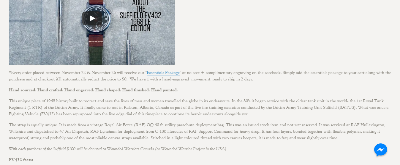
Novo watches takes storytelling and specificity to heart. In the above image, it looks like a text heavy page.
That’s not the case.
They have compelling product imagery and a video above the fold.
Down below, they get into the details. It tells the story of the machinery they repurposed to make the watch.
The details and history weave together to form a strong narrative which helps close the deal on their $4,000 (CAD) watches.
Benefit Driven
Features are important yet they don’t matter without context.
Let’s say you’re selling a laptop that has one terabyte of hard disk space. That’s nice but most laptop buyers don’t know what that means in a practical sense.
This is where the benefits of your features come into play.
You can restate it as one terabyte of hard disk space to store your entire movie library, tens of thousands of songs, and pictures of every family event.
Suddenly, it’s easy to see how useful one terabyte of space is.
There’s a simple test you can perform every time you write a feature. At KyLeads, we call it the “And so what test.”
For every feature you have or want to mention, ask yourself “and so what?”
Our sunscreen has SPF 30. And so what?
Which means your skin is protected from 97% of all UVB radiation so you can enjoy your time in the sun without worrying about harmful effects.
We discuss the benefits of our features on our quiz product page. Instead of just saying you can do xyz, we also point out why that matters and the advantages it gives.
Use Cases
Have you ever understood what a product did and thought it would be valuable but couldn’t decide how you’d use it?
With a fashion-oriented purchase, you may like the piece but can’t figure out what you’d wear it with. That alone may make you skip it.
What about when you want to get something more important like software for your business?
You can understand the value of the software but don’t know how to use it in your business.
This happened to us recently.
We use a tool called Databox to combine and visualize some of our data.
When we were evaluating it, we knew it would be valuable but couldn’t figure out how to apply it to our particular situation.
Databox knows their prospects have this problem so they include a line on their homepage that addresses it.
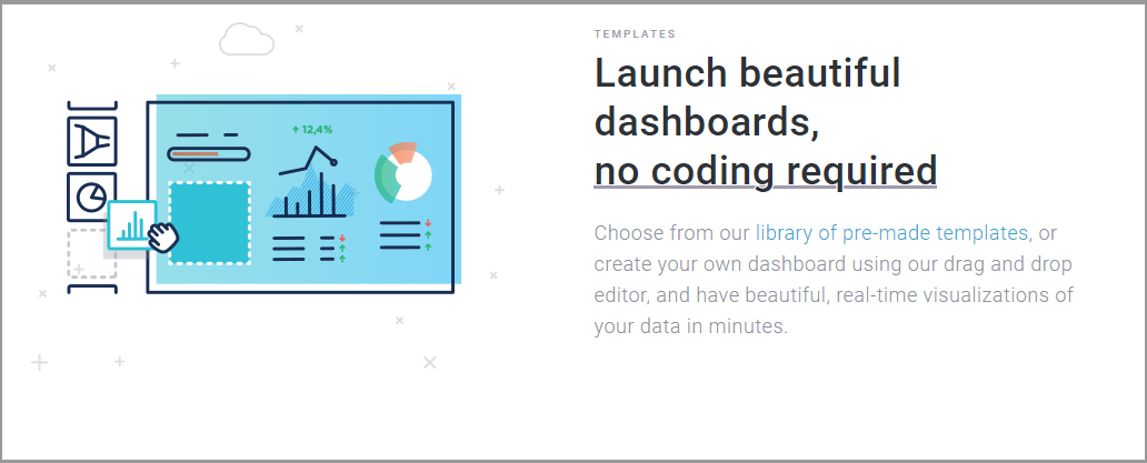
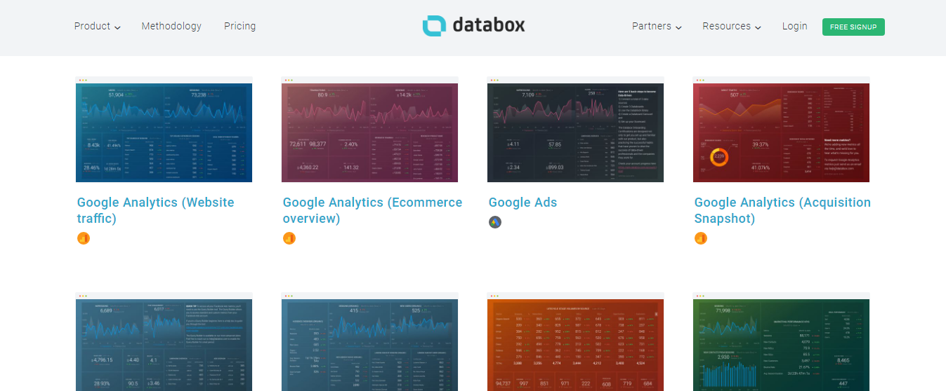
The link in the above image takes you to a page with multiple templates. Each one is a use case.
That’s just the tip of the iceberg. Almost any product can benefit from displaying new and interesting use cases to potential customers.
- Computers can be used for gaming, social media, or entertainment.
- A table can be used in the living room, office, or on the patio.
- Shoes can be for work, a night on the town, or weekend hangouts.
You know the ways your product can be used better than anyone. Educate your potential buyers to give your product page design an edge.
And if you turn to a web design company for services, your task is to introduce your product to them in the best possible way.
Ecommerce web design plays a pivotal role in product presentation, seamlessly blending aesthetic appeal with functionality to enhance user experience and drive conversions.
Collaborating with a proficient web design agency can further refine these aspects, ensuring that your product pages not only captivate but also effectively convert visitors into customers.
This is where WooCommerce development services play a crucial role in enhancing your online store’s functionality and user experience.
Why? People who work on presenting your stuff to customers should also know all the ins and outs of it and preferably have experience of using it. If they don’t, how can they do their job properly? Rhetorical question.
The explosion of easy-to-use website builders and AI website builders has completely changed how we all, from big businesses to solo entrepreneurs, think about making our mark online.
These user-friendly tools are packed with features that let anyone customize how they present their work or products, really hitting home with the people they want to reach.
Imagine being able to drag and drop your way to a site that not only looks stunning but also tells the story of what you’re offering in a way that clicks with your visitors. Entrepreneurs are getting clever with these tools, showcasing their products’ many uses and perks in a way that draws people in right from the start.
Becoming a designer with no-code website builder is like unlocking a secret door to design wizardry. Suddenly, you’re a designer without ever touching a line of code – how cool is that? These nifty tools are shaking up the game, letting folks from all walks of life whip up jaw-dropping websites.
It’s not just about slapping together a pretty page, though. These builders are packed with clever features that let you tell your story and show off your products in ways that really click with visitors. Imagine dragging and dropping your way to a site that not only looks the part but also works like a charm.
Visible refunds, shipping, and terms pages.
No one likes to be surprised during or after a purchase.
How would you feel if you were excited about a book, a pair of shoes, or anything else you were about to buy only to realize the shipping charges were exorbitant?
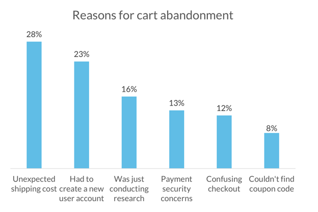
If you’re like 44% of people that abandoned carts, shipping may have played a part. It’s better to pre-qualify visitors who won’t pay shipping than have them skew your metrics.
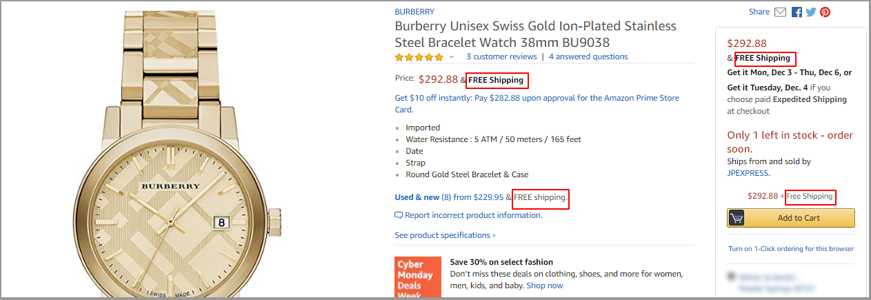
Amazon is crystal clear with their shipping information. For the product in the above image, they mention how much shipping costs four separate times.
Be crystal clear about how long shipping takes and how much they will pay. You don’t want people hitting up your support line for products that haven’t arrived yet.
Apart from shipping, make sure it’s easy to find refunds, returns, and terms of service pages. An online purchase comes with a lot of uncertainty.
It may not fit, the software may not work right, the widget may be a different shade of blue, etc. Clear refund and return information alleviates some of that fear and increases the likelihood of someone giving you a try.
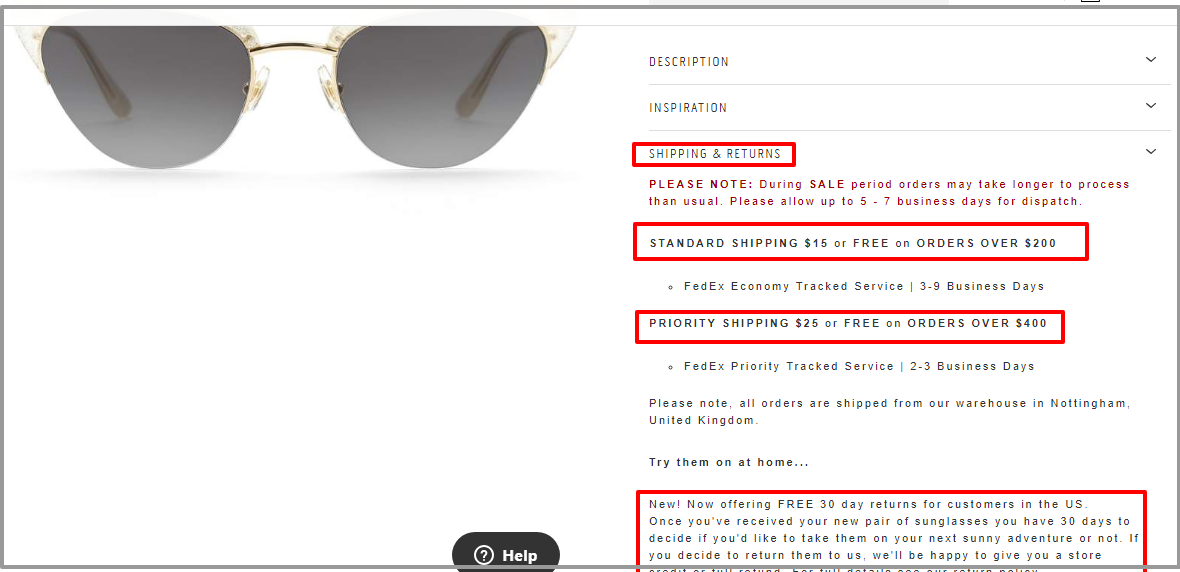
Sunday Somewhere includes shipping and return information right on the product page.
Now, people can make an informed decision about whether or not they’ll pay shipping fees.
Videos
Before we jump into videos, I want to make it clear that they’re optional.
Not everyone has the budget or the skills to make high-quality videos.
A subpar video will do more harm than good so if you can’t get it right then skip this step altogether.
Now that the disclaimer is out of the way, video can work wonders on your product page.
They have been shown to increase conversions by up to 86%.
It’s easier said than done.
I’m sure you’ve seen poorly executed videos that do more harm than good.
There are three key elements:
- Cohesive narrative. A good story/narrative draws us in and keeps us engaged. While you’re busy enjoying the story, lessons and information are passed into your mind. There’s no defense because we’re hardwired to love a good story.
- Leave out all the buzzwords, jargon, and symbolism. You’re not trying to win an award, you’re trying to get people to buy. Let them know what it does, why it matters, and the outcome they can expect as a result.
- Quick delivery. Again, you’re not trying to win an award. You’re trying to get a message across. Deliver it as quickly so your visitor doesn’t get tired.
In Qubit’s product video, they focused on one thing – speed. They wanted to illustrate how fast it was to get set up with their platform.
It was cohesive. They focused on one aspect of their product.
It was clear. They used no words and let the video do the talking.
It was concise. At 1:44, it was a good length for on the go consumption.
Technical specifications
An online purchase is unique in many ways. Your customer is trying to understand what they’ll get from a few pictures and words.
There’s no way for them feel, smell, weigh, or otherwise interact with the product.
Images and videos help but they still leave a lot to be desired.
Many product page designs don’t make room for the technical details/specifications. It seems like unnecessary information people don’t need.
It’s true, a lot of people don’t care.
It’s also true that a lot of people do.
A small percentage of them will write in and ask for the information they need.
Most of them will bounce and leave you with a lost sale.
For the people that want the technical specifications, you can add them under a tab or in a section after the main product information.
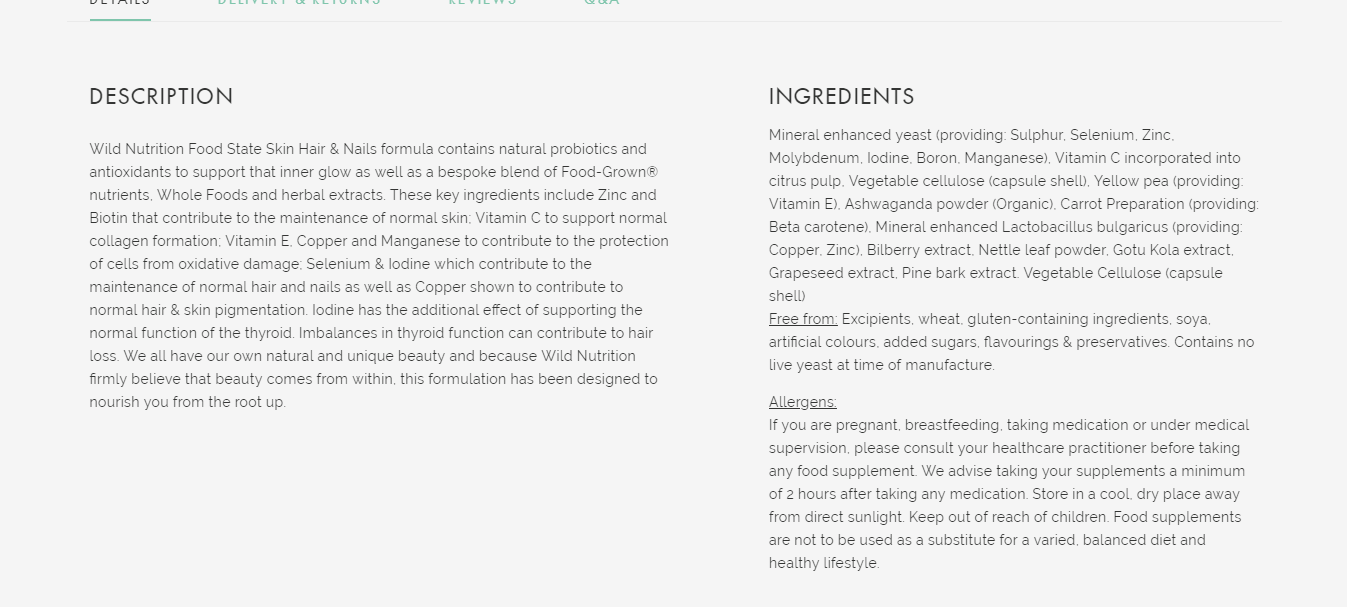
One of Press London’s products is what they call homegrown supplements for hair, skin, and nails. They offer a quick description next to the product image and an option to read more.
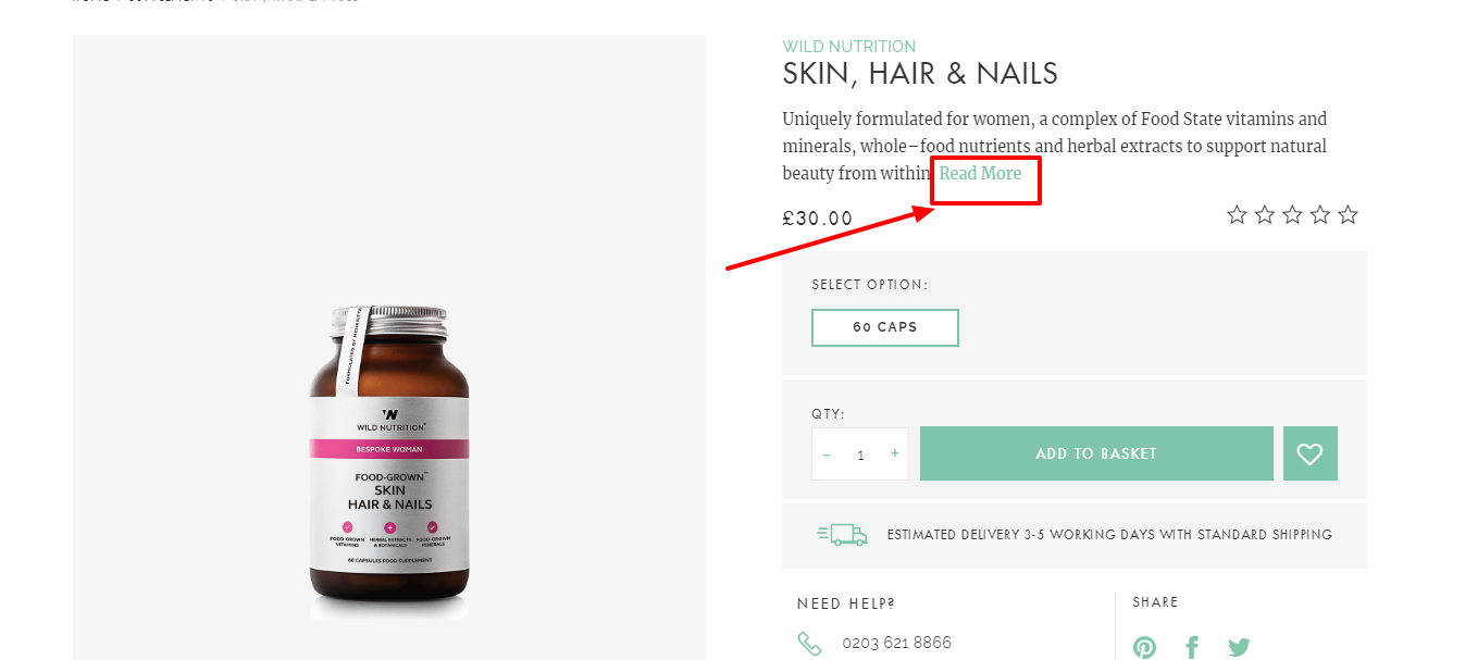
They’re aware their customers need more than a three line description before they buy ingestibles. In response to that, they add a detailed section that gives a more thorough description as well as an ingredients list.
Imagery
Images are a tried and tested way to illustrate your product. It doesn’t matter if you’re selling software, clothes, or drones.
In fact, you can’t sell without images.
People want to see what they’re buying before they enter their credit card details.
- Larger images
Shopping is a tactile experience. People see and feel the products they buy. Online, that sensation is missing. The best way to bridge that gap is to use clear high-resolution images.
Mall.cz saw a 9.46% increase in sales when using clear large images for their products.
For a digital product, screenshots of the dashboard or lessons inside the product also work.
- Multiple angles
This follows on the heels of high-quality images. People need to be able to see the product from different directions.
When I’m buying shoes online, I want to see the sole, the front, the back, and everything in between. I also want to be able to see the stitching.
According to ThinkWithGoogle, user-controlled zoom is an important factor for mobile shoppers.
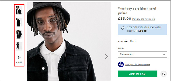
In the image above, ASOS provides multiple angles of the product so browsers can get a clear picture of what they’re buying. In addition to that, they have a video.
- Different designs
Standard product photos are on a white background. While this isn’t bad, it won’t allow you to stand out from the white noise of the internet. Hence, you can change the background of a photo to fit your needs.
In addition to the standard white background, show your products in use in different situations and with different people.
For example, if you’re selling shoes, show them in a formal, casual, and office setting (whichever ones apply).
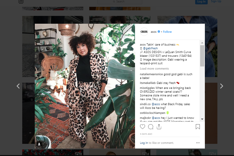
Finally, gather and curate UGC (user-generated content) for your product page as well as for your wider marketing collateral.
ASOS curates UGC and uses it throughout its marketing collateral.
The product page design helps you interact with your clients through images and designs. It is very beneficial for your product because it will help you present its features, pros, cons, etc.
Incorporating user-generated content (UGC) not only adds authenticity to your product page but also allows potential customers to see your products in real-life scenarios, enhancing their understanding and confidence in making a purchase decision.
For businesses looking to elevate their online product presentations, the utilization of a cutting-edge accessibility testing tool becomes essential. Such a tool shines in assessing the inclusivity of web pages, meticulously aligning them with critical accessibility guidelines.
Its deployment revolutionizes the layout of product pages, creating an inviting environment for a wide spectrum of users. This enhancement in webpage design not only broadens the scope of potential customers but also enriches user engagement, addressing the varied requirements and tastes of every site visitor.
By leveraging UGC and employing an engaging product page design, you can effectively showcase your product’s unique features, highlight its benefits and drawbacks, and create a visually appealing experience that resonates with your target audience.
Clear CTA’s
Calls to action (CTA’s) are the buttons, text, and little nudges you place throughout your website to inspire a visitor to take your desired action.
There are no hard and fast rules for CTA’s. The only thing you must do is test them.
With that being said, there are best practices to give you a head start.
CTA Copy
There are many schools of thought when it comes to CTA copy – especially on the product page. I think they’re over analyzing it.
There are two things to keep in mind above all else:
- Keep it short. Your actual call to action should only be a few words long.
- Action commands. Phrases like Shop now, Proceed to checkout, and add to cart aren’t used by accident. They’re embedded commands that inspire action.
CTA color
Again, there are no hard and fast rules about the color of your buttons. Some people say use a red button to increase conversions.
While that may be true in certain cases, it may not always be feasible. This is especially true if your branding doesn’t play nice with red.
In such cases, you can explore alternative strategies to make your buttons stand out and drive conversions. Consider incorporating elements of your logo design, such as specific shapes or graphic elements, into your button design.
This approach not only enhances visual consistency but also reinforces brand recognition and strengthens the connection between your logo and the desired action.
Andreas Carter Sports increased their conversions by 50% by changing their CTA button from green to blue.
Your situation may be different. The most important thing to keep in mind is that your buttons need to stand out from the rest of the page.
CTA placement
This is a given but make sure your button is where it can be easily found.
If your visitors need to search for it then you’ve already lost.
Place it in a prominent position above the fold close to the major value proposition or title.
Conversely, you can place it next to the price of the product.
There’s no rule that says you can’t have more than one CTA on your page. On our forms product page, we place multiple CTA’s throughout the content.
Customer Reviews and Testimonials
The last element I’ll mention that’s super important for your product page designs are honest reviews and testimonials.
90% of buyers say their decisions are influenced by online reviews.
Some brands throw their customer reviews on a wall of love or something similar.
Why do that when they can work so much harder for you on the product page itself?
Express watches added customer reviews to their product pages and increased sales conversions by 58.29%
In a survey of 1,000 consumers, it was found that reviews were the number one factor that drove shoppers to buy a more expensive product.
Few customers leave reviews because:
- They’re busy
- It can be difficult
Take the pain out of leaving reviews by adding the option to leave one right on the product page.
WordPress.org clearly displays reviews for plugins.
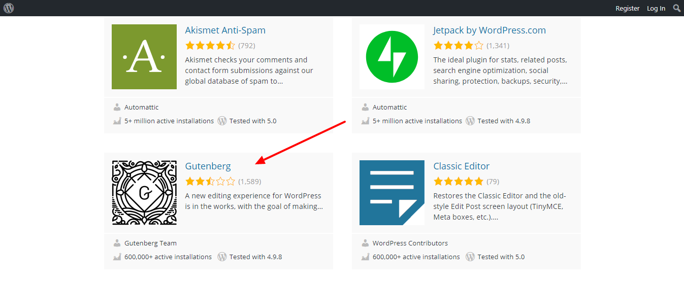
It seems people aren’t happy with Gutenberg.
There are a number of ways to take advantage of the reviews you get.
- Video reviews on the product page for people to play while making the final decision.
- A weighted review score that takes into account all the reviews you’ve received for that product over time. The individual reviews that make up this average are also displayed.
- A text review (without the score) that shows the persons headshot and a specific reason why they liked your product.
- Images of the customers using your product or service. This is also useful for other marketing collateral.
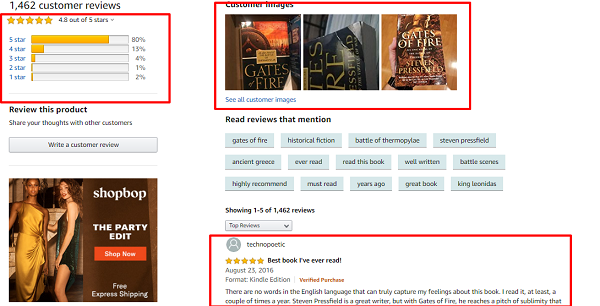
This Amazon page for Gates of Fire by Stephen Pressfield (recommended read) combines many of these features together.
A note on negative reviews: If all of your reviews are five stars then something is wrong. You can’t be perfect for everyone. A bad review here and there is expected and can help you shape the kind of product people love.
Second note: You may not have reviews and testimonials in the beginning and that’s perfectly OK. We all start from zero.
Examples of Product Pages that work
We’ve gone through the process of understanding what makes a great product page stand out. Now, let’s look at a few examples of high converting product pages.
Note that some of the things mentioned below are on the page but not in this particular screenshot.
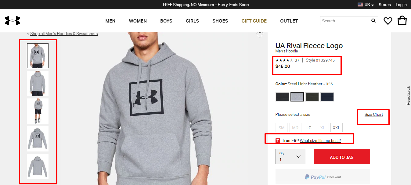
What I like:
- They show multiple angles of the product with and without a model
- They have a prominent star rating for the product
- Size chart clearly visible to reduce returns due to poor sizing
- Contrasting call to action button with action-oriented wording
- An extra sizing chart that would give you a better idea of the fit
- A recommended products section
What I don’t like:
- The product description is just a bunch of bullet points that list out features and few benefits
- No lifestyle shots of the clothes in action
- Shipping information isn’t readily available
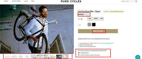
Pure Cycles sells premium bikes for adults. At least, that’s the message I got from their messaging and the imagery they use.
What I like:
- The details section is well written
- They have product as well as lifestyle images
- Further down the page there are videos of the product in action
- Reviews score is prominently displayed
- Return policy and warranty is clear
- Action oriented call to action button
What I don’t like:
- The reviews aren’t on the same page
- Size information isn’t clear until you scroll further down the page and open a different tab
- Call to action button blends in with the color palette of the website – it’s muted.
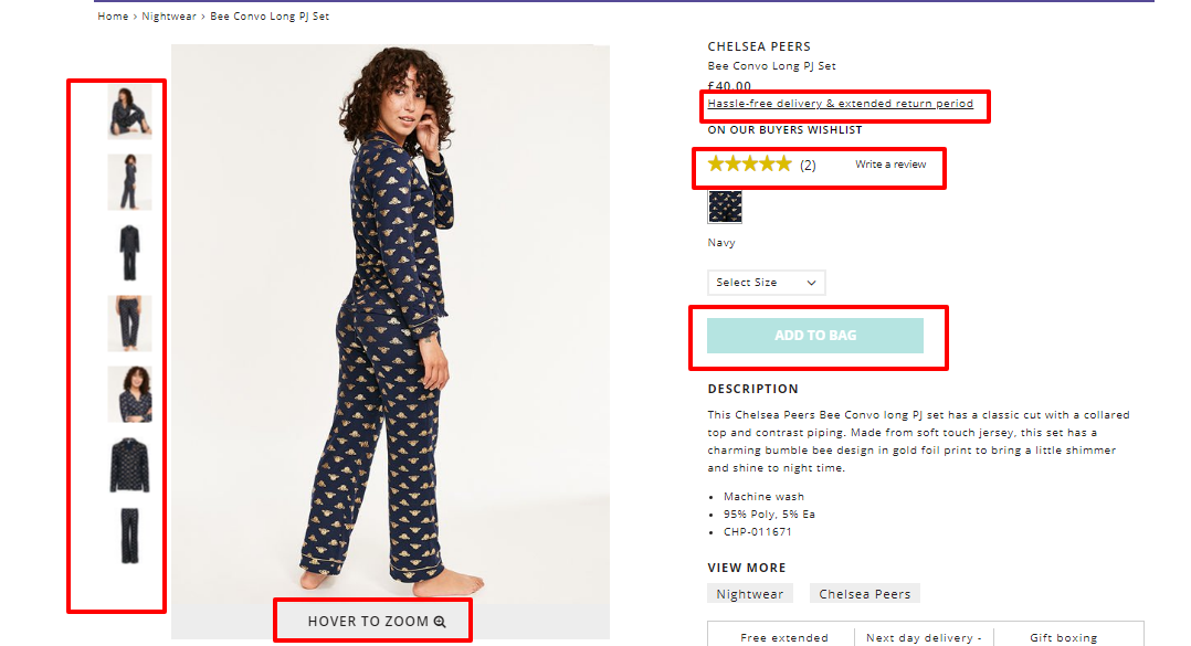
Figleaves is a women’s Ecommerce brand that sells lingerie, nightwear, and Uggs (no comment on that one).
What I like:
- Prominent reviews section
- Very clear shipping and returns info. If you click the link, it opens a popup.
- Multiple product images with and without the model
- Zoom on hover to get a closer look at the product
- Action-oriented call to action
- Recommended products further down the page
What I don’t like:
- No sizing information
- Call to action button is a different color but it’s muted
- Generic product description
- No lifestyle images
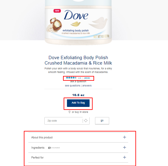 We all know Dove for their beauty products and more recently for their real beauty campaign. They also do well with their product page.
What I like:
- They have prominent review info
- Nice CTA color
- Strong CTA text
- Interesting question and answer section
- More detailed information nestled in dropdowns
- Product zoom function
What I don’t like:
- The product image takes up most of the fold
- No return information
- No shipping information
- No pricing information
Conclusion
Your product page is an asset that determines whether or not your business will be successful. I hate to put so much emphasis on a single page but it’s the truth.
IF there’s missing information or it’s poorly presented then all your marketing can go to waste.
In this post, we’ve taken a deep dive and you’re well equipped to create amazing product pages.
Start with the copy and make sure it’s specific and benefit driven. Show important information upfront to instill trust and reduce the fear associated with buying things online.
When you have compelling copy, the right imagery, and clear calls to action your product pages do what they were made to do – sell.
Let us know how you’re designing your product pages in the comments and don’t forget to share.
Great post, thanks for the post.
Hey Magnus,
I’m glad you were able to take something away from the post.
Cheers.