Website optimization mistakes are everywhere.
The internet is an unforgiving place.
It’s also interesting in that there’s a lot of information freely available.
- Your public library makes you pay for a card (and late fees)
- You have to buy physical books
- You need to pay for the good shows (HBO and Netflix)
People on the web don’t like to pay. Trust me, I run a SaaS company. We jump through hoops to keep our customers happy.
I digress.
Denizens of the web don’t pay with fiat currency; they pay with something more valuable – attention.
It’s almost impossible to capture the attention of web surfers. Once you have it, the fight to keep it is epic. You need more than a few sentences and a WordPress installation.
How does that affect you?
Website optimization is the process of improving key metrics important to you. Those metrics are different for everyone. Anything that distracts your visitors will kill your website conversions. When people notice, they’ll run away – never to return.
Your desired action isn’t on their mind.
There’s a light at the end of this tunnel. Most website optimization mistakes, with a little planning and foresight, are avoidable. If you think that your website has problems that you aren’t able to fix, you can always find a good full-service digital agency that will meet your needs.
Expert serverless consulting services deliver strategic guidance for assimilation selecting optimal pathways synthesizing existing legacy with cloud-native.
Accomplished serverless consulting teams impart fluency in evolving serverless ecosystems unlocking innovations inaccessible within conventional paradigms.
When it comes to website optimization mistakes, knowledge and preparation are key. By familiarizing yourself with common pitfalls and taking proactive measures, you can avoid many issues that may arise. However, if you find that your website has problems that you are unable to resolve on your own, there’s no need to worry.
If you find that your website has problems that you are unable to resolve on your own, seeking expert WordPress website maintenance services can provide the professional support you need.
There are full-service digital agencies available that specialize in helping businesses like yours. These agencies help you hire PHP developers, SEO experts, web developers, and more to address any website optimization issues you may be facing.
Getting help from WordPress pros can really turn these website headaches into wins for your business. We’ve seen countless companies breathe new life into their sites by teaming up with developers who really know their stuff.
The right WordPress development service won’t just fix what’s broken – they’ll help you build something that actually works for your visitors and looks great doing it. And here’s the best part: when your site runs smoothly and looks professional, you’ll notice fewer people bouncing off your pages and more of them sticking around to become actual customers.
So, don’t hesitate to reach out to them for assistance. Remember, there’s always a solution to every problem, and with the right support, you can overcome any challenges and achieve your website optimization goals.
Let’s dive in.
Table of Contents
1. Crowded top menu
The most important areas of your website should be accessible within three clicks. This applies no matter the page someone lands on.
It’s been taken too literally. Webmasters seem to think every page is important. They’re not.
A subcategory of a subcategory of your services should NOT be in the main navigation menu. Rather, the link should be on the relevant category page.
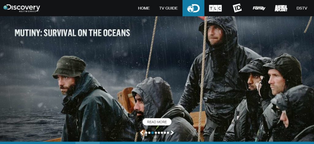
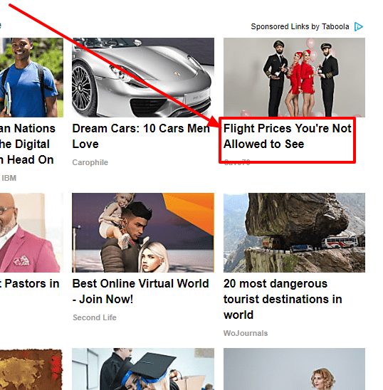
Here’s an example of a crowded top menu.
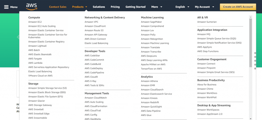
In the above image, taken from Amazon Web Services, the menu is full of options. A casual browser wouldn’t know where to start. If they’re not motivated, they’ll bounce right off the page.
I bounced right off the page.
What’s happening here?
It’s simple; the human brain is a lazy contraption. It always takes the path of least resistance and minimal energy consumption. It’s in passive mode, also known as cognitive ease. You need a conscious effort to move it into active mode which causes cognitive strain.
Do you think your visitors are going to exert that kind of energy for you? No.
The Fix
Preempt this scenario by streamlining your menu to the bare minimum. Every business is different so I won’t tell you what to put in your main navigation. Instead, I’ll give you a few general suggestions:
- About (optional)
- Contact
- Pricing
- Services/products
You can get away with one or two more menu items. Not many.
You also shouldn’t have many drop-down options. No dropdowns from dropdowns. That’s just tacky.
The extra menu items you’ve removed need to go somewhere.
For example, you streamline the menu item “about” which had the drop-down items:
- Story
- Team
- Values
- Mission/vision
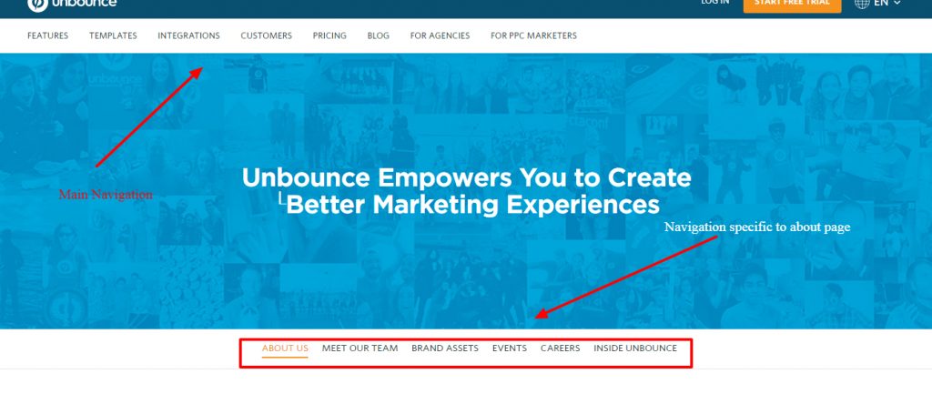
When they click on the about page, you talk about what your customers will resonate with the most. You still give them the option to explore the other menu items on the about page. Here’s an example from Unbounce.
Finally, if you’re adding links to the menu because of SEO, you have to stop. It doesn’t work like that and Google devalues SEO links in the navigation anyway.
Instead, you need to build contextual internal links within the content and articles. The more you build, the better. And adding internal links manually is best, but if you’re strapped for time, use a plugin like Link Whisper to automate internal linking to the fullest.
2. Marketese
“Industry-leading omnichannel solutions to help you send the right message, at the right place, at the right time.”

Say what?
Let’s try that again.
“The best way to communicate with your customers in the places they find most convenient.”
Ah, that’s much better.
Marketese holds a special place at KyLeads. We hate it. You know how you have a favorite sports team and that sports team has a strong rival? Even the colors they wear can set you off.
That’s how we dislike marketese. It doesn’t do anyone any favors. It stems from multiple places:
- Copywriters who don’t have a clue
- Business owners who don’t have a clue
- That intern without a clue
The end result is the people they’re talking to tuning them out. This goes back to the first point. We don’t have the mental bandwidth to decipher your message. If it’s not clear then we’re not going to give it the time of day.
Marketese is your enemy. Nothing can happen unless you’re understood. You can’t be understood until you speak the language of your prospect.
The Fix
What can you do to make it better?
The good news is marketese has, possibly, the simplest fix. All you have to do is talk like a real human being.
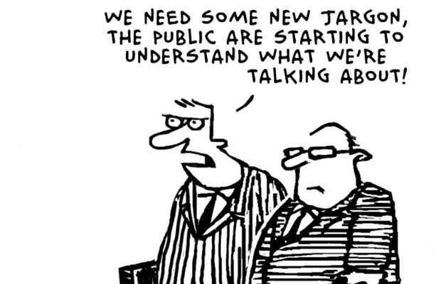
- Remove all jargon
- Remove all buzzwords
- Kick out technical speak
- Appeal to the emotions.
This is easier said than done. It takes practice. Remember, people make decisions based on the way they feel. The logical part of our brain takes a backseat in the process.
Don’t believe me? Science has proven it.

3. Convoluted message
A convoluted message follows on the heels of marketese. They’re similar but different. A message suffering from marketese is convoluted. All convoluted messages aren’t marketese.
Just like all mothers are women but not all women are mothers.
Put another way, you can talk like a human but still fail to communicate.
How do you know if your message isn’t clear?
Ask yourself a few simple questions:
- What am I selling?
- Who am I selling to?
- What’s the major benefit?
- Why should they choose me over a competitor?
- How have I handled objections?
Now, these questions don’t only apply to items you make money from. The same is true for messages designed to get email addresses or anything else.
They’re all transactions.
They’re easy for you to answer. Ask someone who doesn’t have a clue about the product if they understand what’s going on.
Do they give you the same or similar answers you’d give?
If they do then congratulations, your message is clear. If they’re way off or have no idea then congratulations, your message is convoluted.
The fix
The fix, like most things in life, is simple.
The first step is to highlight a clear benefit. This should be one of the first things a visitor sees when they land on your page.
Partnering with a top web development company can be a really groovy move. That’s because they can assist you in implementing compelling solutions and ensure that your site not only effectively emphasizes these benefits, but is also optimized for usability and functionality.
If you’re facing persistent issues with your website, partnering with experienced web design companies can provide a comprehensive solution. These companies offer tailored services that not only address immediate technical problems but also enhance overall user experience, ensuring your site remains competitive and effective in attracting and retaining visitors.
Such collaborations can help mitigate common pitfalls in website optimization, enabling you to focus more on core business strategies and less on technical challenges.
Improving your site is important not only for enhancing customer experience but also for achieving your company’s objectives. By making well-informed decisions based on evaluating crucial website metrics, you can significantly enhance site performance. It provides deep insights into customer engagement, and page load times, pinpointing specific areas that demand attention.
For example, monitoring bounce rates and session durations offers critical feedback on user interest. Likewise, it empowers you to optimize CTA and landing pages, driving more impactful results and fostering continuous improvement.
Engaging WordPress Optimization experts can significantly enhance website performance, reducing loading times and improving overall user experience, which are essential for maintaining visitor engagement and satisfaction.
It sounds complicated, but with a cool team on your side, it’s all quite easy to implement. And what kind of results are you looking forward to? Increased engagement and conversions!

Disruptive Advertising mentions two benefits. Spend less AND beat the competition (though, we’re not fans of having two promises).
The second step is to boil down what you’re selling into a simple statement. The more direct it is the better.
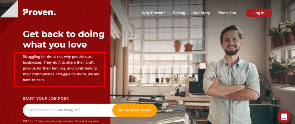
“Struggling to hire is not why people start businesses. They do it to share their craft, provide for their families, and contribute to their communities. Struggle no more, we are here to help.”
I love the offer from Proven. It’s visceral. It works.
The third step is to push all your benefits through the “and so what” test. The “and so what” test makes sure you have real benefits.
- It’s made with cotton
And so what?
- Ehn (yea, not a real benefit)
- It’s made with stain-resistant fibers
And so what?
- So you can wear your clothes and forget about spills or doing the laundry this weekend.
That’s much better.
The fourth step is to own up to challenges that’ll form objections. For example, a common objection is that your prospect doesn’t have time to take a course. You can acknowledge that and let them know you’ve prepared the course in five-minute videos that are self-paced.
The last step is to talk like your prospects.
A few days ago I was trying to figure out what those things that show up in Google results below the website are called.
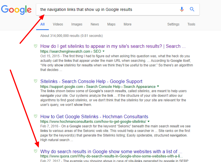
I had no idea where to start. I just typed in a random query I thought would yield results “the navigation links that show up in Google results.” Much of what I got back didn’t tell me if I was on the right track. Then, one website mirrored the language I used. I knew I was in the right place.
That’s the same effect mirroring your prospect’s language will have on your conversion rates.
After you’ve followed these steps, ask another person to take a look. Are their answers closer to yours this time around? Rinse and repeat as needed.
4. Formatting that’ll make you cringe
I’ve written half a dozen books. A few of them were about specific business insights. Others were fiction.
With all of them, formatting was important – very important. It’s the difference between someone reading cover to cover or dropping it on the first page.
Content with poor formatting is intimidating – especially on the web.
What’s the big deal about it?
How does it affect conversions?
Let me ask you. How would you feel if the fifteen hundred words you’ve read up to this point were in one long block of text?
An uninterrupted string of words is far from ideal. As a reader, you can’t scan the text, decide on the most important information, or even hold your space.
For the content creator who’s looking for a conversion, you can’t take advantage of the way people read online.
In multiple eye-tracking studies, it was discovered that people read information in an F pattern.
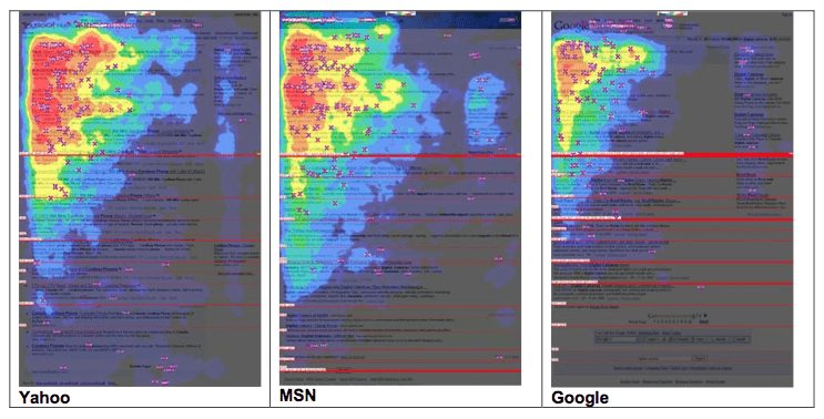
With proper formatting, you can put the most important information right in the path of their gaze.
The Fix
Web formatting is kind of a big deal. It’s what determines if people will read what you’ve created or not. Here are a few insights that’ll help:
- Use headings to break up the text every three to four hundred words
- Have a clear visual hierarchy
- Paragraphs should be three lines or less
- Bold important information (don’t go overboard with this one)
- Use numbered lists or bullets to break up text
- Use relevant images to break up text (the key word here is relevant)
Put the most important information on the path your users will take. If you’ve got an offer or call to action, place it in the proper place on the page. Remember the eye-tracking image from above.
Integrating an invoicing software solution directly into your website workflow delivers a powerful advantage for increasing conversions. These user-friendly tools revolutionize the billing experience, guiding customers through a seamless process from product interest to final payment.
Strategically placing links or anchors to your invoicing platform across high-traffic site areas creates an intuitive path to purchase. When an invoicing software system operates cohesively with your website design, it breeds consumer confidence in your brand’s professionalism – driving higher conversion rates and cultivating loyal customer relationships.
5. Navigation links on landing pages
We learn every day. I’ve known this tidbit for a few years. No navigation links on landing pages. That doesn’t mean the rest of the world knows it.
I’m always surprised when I see this mistake being made.
A landing page, in this context, is a page built for the specific purpose of compelling a visitor to take your desired action.
That is all.
It could be to:
- Sign up for a free trial
- Download an Ebook
- Sign up for your mailing list
- Purchase something
The desired action doesn’t matter. What matters is the focused nature of the page.
A single goal.
Extra links that don’t contribute to your goal are to be pruned ruthlessly. No exceptions.
I searched Google for an email marketing tool.
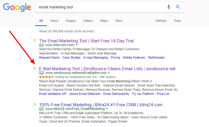
I clicked on the ZeroBounce link which took me to this page.
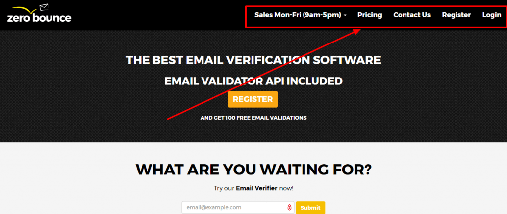
It’s falling into the trap of sending most of their visitors to the homepage. Not only that, it allowed me multiple opportunities to leave their page.
Landing pages tend to be difficult to leave or land on. That’s intentional. Once your visitors is there, it’s either they take your desired action, leave your website, or go back to the previous page.
Don’t get this part wrong.
The Fix
Remove navigation links in the header. Also, if your logo is visible on this page, make sure it’s not clickable.
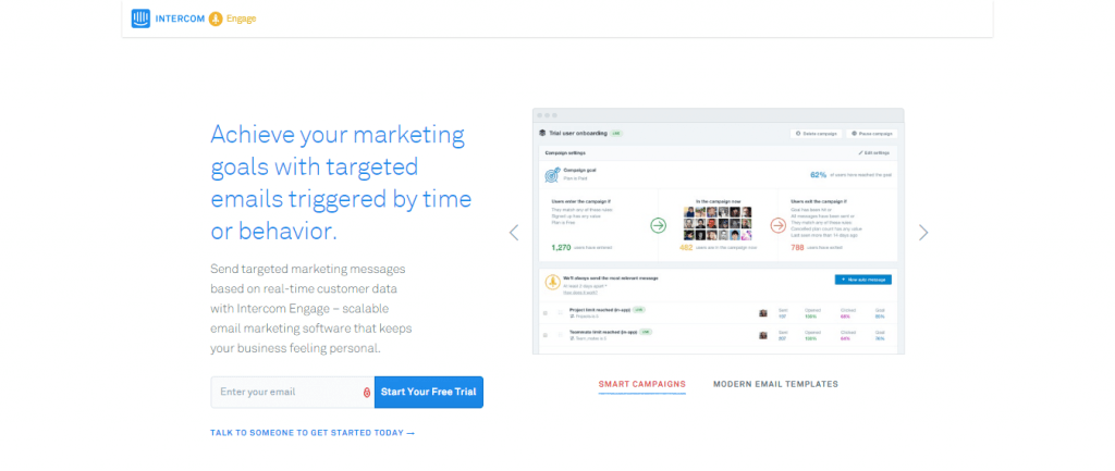
The landing page above is from Intercom. If you land there either you start your free trial, exit the page, or press back. There’s no escape.
6. Poorly conceived headline
Headlines are part of the backbone of your page, opt-in form, or ad. David Ogilvy, in Ogilvy on Advertising, said 5 times as many people see the headline as the body copy.
If you get 1,000 people to read your copy that means 5,000 people saw your headline. It makes sense to spend time tweaking it.
A good headline is different from clickbait.
I was subscribed to the mailing list of a popular SEO practitioner who will not be named. He used the most sensational headlines to get his emails opened. When I’d open the email and click through to the page, I’d be left hanging.
What took me there and what I saw were always different. That’s also a problem with message match which we’ll touch on later in this post.
I fell for it about three times. After that, I ignored his emails and later unsubscribed. I also reported him as spam – something I almost never do.
I felt misled. I’ll never trust him again.
So how do you build mouthwatering headlines that entice your readers without misleading them?
The Fix
There are a lot of headline formulas. I’ll touch on them in a moment.
First, the elements that make great headlines:
- Clear benefit
- Taps into our curiosity
- Creates urgency
- Emotional words
- Power words
- Specific (that could be numbers or an outcome)
You won’t use all these elements in every headline. Aim for one or two. Now, on to a few headline formulas you can use.
- [Product Name] is a [product category] that [different thing it does best]
This one is commonly used by TechCrunch. Nice and clear.
Fitness app: Tep is an adorable fitness tracking app that works like a tamagotchi.
- They All [Did Unpleasant Thing] When [Unexpected Thing], But When [Ideal Result of Using Unexpected Thing]!
Selling stationery: “They all laughed when I said I’d host the shower, but when they saw the invitations!”
Selling art school: “My dad didn’t say a word when I told him I was going to art school. But when he walked into my gallery!”
- Who Else Wants [Most Desirable Outcome or Benefit]?
Fitness: Who else wants to look great naked?
Real estate: Who else wants that classic neighborhood experience?
- The Only [SEO Keyword Phrase] Made Exclusively to [Most Desirable Outcome or Benefit]
Ski vacation: The only ski vacation designed exclusively to turn beginners into pros
Invoicing software: The only invoicing software made to do your billing for you.
- The only [product category] that doesn’t [objection or anxiety].
The only car that doesn’t require gas or electricity.
The only online course that doesn’t require hours of your time.
Check out this post for a complete list of headline formulas.
Swiped.co is also a great place to get inspiration for writing headlines.
7. Too many options leading to different end results
The human brain can handle roughly 110 bits of information at a time. Conversations require 60 bits of processing capacity. Reading or writing requires the same.
Every option you add to your website takes a few bits of information to process.
In psychology, there’s a phenomenon referred to as the Zeigarnik effect. It states people remember uncompleted or interrupted tasks better than completed ones.
How does that apply to the options on your landing page?
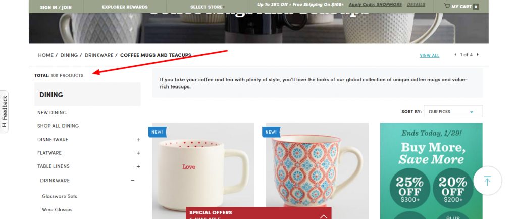
Yea, no one is going to look through 105 coffee mugs.
Every option you introduce – like start a free trial, sign up for our mailing list, get 20% off – is another incomplete task. Each one is eating into the 110 bits of processing capacity we have.
Not only that, each option produces a larger opportunity cost. If they decided to go with 20% off then they can’t take advantage of the free trial.

These are just the options on your page. There are still other options available in the wider market.
Barry Schwartz makes a compelling argument in his book The Paradox of Choice. The more options we have the unhappier we are.
Why?
Because we have to give up much more to make that choice.
The fix.
I’ve stated it before. The most elegant solutions are simple. Get rid of all your extra options. Focus your landing pages, opt-in forms, and any other conversion devices on one goal per page.
The action doesn’t matter. The important part is your focus.
All the images, videos, audio, headings, and text should also reinforce your overarching goal. If not, get rid of them.
This page is focused.
8. Image sliders
Image sliders equal too many options.
They’re deceptive. They’re beautiful. They allow you to shorten the page. They deliver visual stimuli.
They’re one of the most annoying website optimization mistakes.
I know, we’re visual creatures. Facebook posts with images get as much as 2.3x more engagement.
Instead of a single call to action above the fold, you have two or more. Your visitor won’t click on the first option because they want to see what else you’ve got.
What if they’re all enticing?
Your visitor will be stuck. They may click or they may not. No one knows. You’re also forcing them out of their passive interaction with the world. They have to make a conscious decision.
Why would you do that to them?
Make it easier on them by offering one choice. They’ll know if they’re in the right place and you’ll know if your value proposition needs tweaking.
The Fix
No image sliders.
They slow down your website, introduce complexity, and damage conversions. You don’t need them. If you’re keen on using images then choose a good hero image.
Use images in other parts of the page. Don’t incorporate them into a slider. I’m asking nicely here. Please don’t do it.
Look at the KyLeads beta launch page.
The focus was 100% on the message. No sliders, no images, and a simple background. If your current product shots are too busy, you can easily change background elements to create a cleaner look. The call to action was prominent and our conversions were consistent.
9. Stock photos
I’ve got nothing against stock photos. We don’t use them much – if at all – on KyLeads. I understand some websites will benefit from them. There are some instances when you should avoid stock photos.
- All images of people using laptops right on the beach.

You can’t see a thing – the glare is too bright. I also prefer to swim or make new friends. I guess I’m weird.
- Stock images in testimonials
You’re using testimonials to increase credibility – right? Why would it ever seem like a good idea to use a stock image there? That’s an image you can buy off the internet. Did you also buy that testimonial?
Any goodwill associated with your testimonial will be destroyed the moment people realize you’re using a stock photo. A lot can be forgiven. Lying about results cannot be.
- Free stock images
If you’ve been around the internet for a while you’ll know them. Even if you’ve been browsing a lot of websites in the same space, you’ll notice them. There are a few stock images that are nice, but have been used to death.
In the ever-evolving digital landscape, where online presence is paramount, the realm of web hosting emerges as a critical cornerstone for businesses seeking to establish an unassailable digital footprint. This indispensable service not only provides a secure and reliable platform for websites to thrive but also plays a pivotal role in shaping the user experience – a factor that can make or break a brand’s success.
By partnering with a reputable web hosting provider, organizations can transcend the limitations of mere online real estate, unlocking a world of seamless functionality, lightning-fast load times, and unwavering uptime – the hallmarks of a truly exceptional digital presence. Embrace the power of web hosting, and bear witness as your online endeavors soar to new heights, captivating audiences and leaving an indelible mark in the annals of digital excellence.
They’re usually listed on unsplash.com pexels.com or any of the other high-quality free stock photo sites. Stay away from them. If you’ve got to use stock images then at least shell out a few dollars to get the legit ones. Here’s a list
Note: I mean stock photos on sales pages or product pages. You’re free to use them on blog posts.
The fix
Stop using stock photos altogether. This is our preferred method. We don’t use stock photos. We don’t use them on our landing pages, our blog posts, or anywhere else. The closest you’ll get to a stock photo here is a meme.
Like this one:

Those don’t count. The world loves memes. This was a decision we made early on. All of our imagery is designed. If it’s not designed then we took them ourselves.
If you can’t invest in web design and or a designer then take the images yourself. You have a smartphone. Most of the world does.
The last fix is to ask your customers to take pictures. User-generated content (UGC) is amazing. It works wonders and is built-in social proof.
There are many types of user-generated content (UGC), including Reviews, Comments, photos, videos, social posts, and blogs.
UGC has become increasingly popular with the rise of social media platforms and online communities, allowing individuals to share their opinions and experiences with a wider audience.
One of the benefits of UGC is that it provides a more authentic and genuine perspective on products, services, and experiences, helping other users make informed decisions based on real-world feedback.
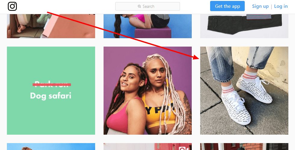
ASOS – a popular online retailer – does this all the time. Their customers take images, post them to Instagram, and tag ASOS while using a special hashtag. ASOS uses them all over the place and reinforces the credibility of their brand.
You don’t have to be a fashion retailer to tap into user generated content. A home window repair firm increased conversion rates 30% by switching out a stock photo for one their customers took.
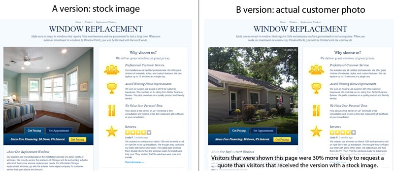
Why?
Because it was obviously authentic (authenticity is a post for another day).
10. Message mismatch
How would you feel if you saw an ad like this one:
That led you to this page:

You’d be confused, annoyed, and maybe leave the page. That’d be a natural reaction. What brought you to the page isn’t what you’re seeing.
From what was written on the ad copy, you’d expect to see a few once in a lifetime deals. Instead, you’re taken to the homepage.
I can’t find any of the supposed deals.
The imagery is different.
The colors used in the ad and the page don’t even tally.
In essence, there’s nothing tying me to the ad I clicked and the page I landed on. That’s what it means to have a message mismatch.
Message match is when what brought someone to the page matches what they see on the page.
So how does that affect your bottom line?
Imagine if you saw a Coke ad in your Facebook news feed. They’re talking about a contest they’re running that allows you to travel the world with three friends. Cool. It’s Coke. They can afford something like that.
They use their characteristic red and smiling faces.
When you click on the ad, you’re taken to a landing page that talks about the competition. The only thing is there’s a bunch of blue. Coke’s red is missing.
You may brush it off. More likely, you’ll do more research to make sure the contest is legit. Apart from that, the chances of you parting with your personal information just fell by a large margin.
When you’re crafting landing pages that are built to convert, the mismatch is anything but obvious. Only 48% of marketers build a new landing page for each marketing campaign.
The other 52% of campaigns are dumping users on the homepage or landing pages optimized for something else.
The Fix
It’s easy to slip into message mismatch. You’re close to your products and services. You know what they’re SUPPOSED to do and be.
Your visitors aren’t in your head.
Any whiff of inconsistency is greeted with suspicion and doubt. Can you blame them? The internet is the modern day Wild West.
The best thing you can do to avoid message mismatch is to keep your headlines consistent, your colors the same, and the imagery similar.
That doesn’t mean your ad headline needs to be exactly the same as your landing page. In many cases that approach is detrimental.
This is the ad.
This is the landing page.
In the above example, the ad and the landing page have similar wording, a consistent design, and the same colors. There’s no doubt in the prospects mind that they’re on the right page. The only thing left is to read the copy and sign up.
- Choose keywords to use in your ad/social post/ search results you’ll repeat in the headline of your page
- Use the same colors
- Take advantage of similar imagery
- Use the same tone
11. Testimonials without a backbone
We know testimonials increase conversion rates. They’re a way for a third party to back up your claims. What most people don’t know is there’s a right way and a wrong way to use testimonials.
Some just aren’t up to par.
They don’t have a backbone.
As I mentioned a few moments ago, the internet is like the Wild West. People have their bullshit detectors turned up to full power.
Testimonials are meant to highlight specific results your customers get by working with you. Vague testimonials like:
“I became happier after I went through the program.”
Won’t cut it.
“After taking the program, I have been able to spend more time with my family, haven’t had a panic attack in three months, and have peace of mind when I sleep at night.”
The power of specific, measurable testimonials becomes even more apparent when they address tangible lifestyle improvements that potential customers can easily visualize and relate to in their own lives. When testimonials mention concrete outcomes like “sleep better through the night without waking up” or “finally sleep better after years of tossing and turning,” they create emotional connections that vague statements simply cannot achieve.
The credibility factor multiplies when testimonials include specific timeframes and measurable changes, such as “within two weeks I began to sleep better and wake up feeling refreshed for the first time in months.
The second testimonial points to specific ways the customer has become happier.
Yes, they work with you to be happier. They need help painting the picture of what happiness looks like.
Did you know the better you articulate the transformation your products create the more you can charge?
I digress.
Testimonials from real customers are the best way to paint that picture.
The Fix
Testimonials are there to create trust between your business and a potential customer. To do that, the testimonial itself needs to be trustworthy.
Here are a few ways to make that happen:
- Include the full name of the customer
- Link to the customer’s social profile or website
- Add an image of the customer
- Use a specific result (my business improved won’t cut it. Try, our conversion rates improved by 30% in 21 days)
- Address a specific objection you know your prospect has.
- Don’t over edit.
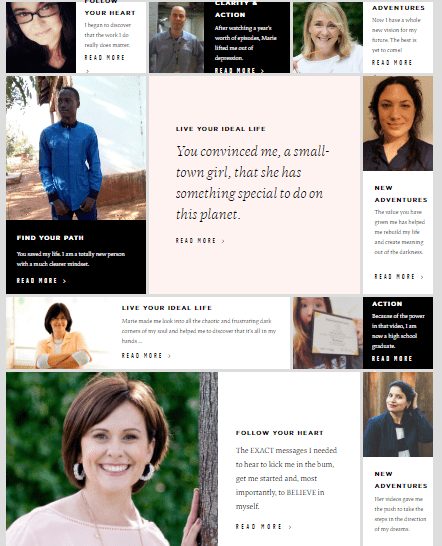
Marie Forleo has an entire page on her website dedicated to testimonials. You can view many more testimonial examples in this excellent resource.
12. Auto-playing music and videos (or any weird noise for that
matter)
This isn’t the mid-2000’s. Your website isn’t Myspace. No one wants to be subjected to your music preferences. We also don’t want to watch your video without warning.
When I asked the Inbound.org community about what website optimization mistakes they disliked, there was an overwhelming consensus that auto-playing music and videos suck. Chimes and other miscellaneous noises came in a close second.
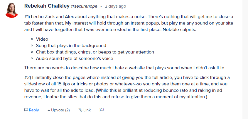
#1) I echo Zack and Alex about anything that makes a noise. There’s nothing that will get me to close a tab faster than that. My interest will hold through an instant popup, but play me any sound on your site and I will have forgotten that I was ever interested in the first place. Notable culprits:
- Video
- Song that plays in the background
- Chat box that dings, chirps, or beeps to get your attention
- Audio sound byte of someone’s voice
There are no words to describe how much I hate a website that plays sound when I didn’t ask it to.
#2) I instantly close the pages where instead of giving you the full article, you have to click through a slideshow of all 15 tips or tricks or photos or whatever–so you only see them one at a time, and you have to wait for all the ads to load. (While this is brilliant at reducing bounce rate and raking in ad revenue, I loathe the sites that do this and refuse to give them a moment of my attention.)
This sums it up well.
The Fix
I know this may be hard for some. You’ve heard that videos can almost double your conversion rates.
They shouldn’t be forced on your users. The internet is a democracy. People vote with their time and attention. Let them choose.
That’s when you unlock the impressive conversion rates associated with video and other rich media. Not before.
Turn off video autoplay features, chimes, and audio playback.
13. Creating in a bubble is one of the biggest website optimization mistakes
In business, there’s a time between when you start creating and when you receive the first bit of feedback. I refer to it as The Desert.
The first piece of feedback is The Oasis. The intervening periods are the hardest.
You don’t know if people like what you have, want what you’re making, or are willing to pay for it. You’ve no idea what changes to make and which features to keep.
What happens here can be forgiven. You’re making a lot of educated guesses and working off of assumptions. Welcome to Business 101.
It’s what happens after you’ve arrived at The Oasis that can kill you.
Your customers and visitors are telling you what you need to know all the time. They tell you on social media, support inquiries, and website actions.
These customers are saying it loud and clear. Improve your service.
Whether you take that feedback and improve is a different story. If you do then you have the potential to not only increase your conversion rates, but build a brand your customers love. If you don’t then, well, good luck.
The Fix
Create feedback loops and monitor social media.
How do you do that?
There are many tools that’ll help you set up a feedback loop. You can simply send an email to your customers after they purchase. Wait a few days so they can use it but not so long that they forget about you.
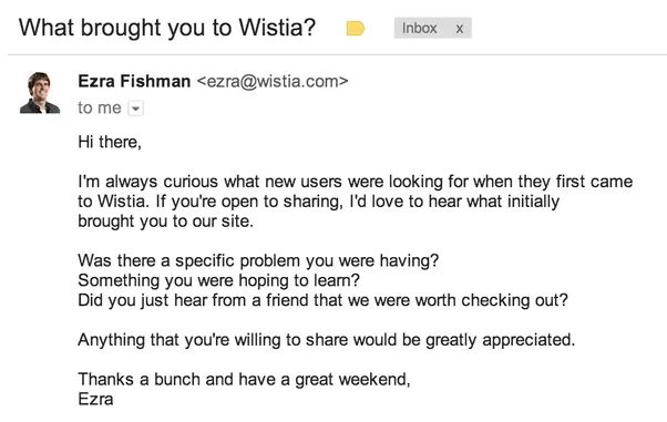
Here’s an example of a great feedback request email.
Not everyone will respond to your feedback request. That’s expected. There are other ways to understand where you can improve.
- On site surveys (really good way to get insights).
- Social media monitoring.
Use a tool like Qeryz, Qualaroo, or Hotjar to create on site surveys.
You don’t need to ask a hundred questions to get what you need. Here are a few to get you started:
- How familiar are you with (insert brand name)
- Very familiar (been to this site many times)
- Familiar
- Not very familiar (This is my first time here)
- What’s happening in your life that brought you here today?
(text field)
- Were we able to give you a solution you’re happy with?
(text field)
The first question gives you insights about stage of awareness. How much do they know about you and your product? The second question gives you voice of customer insight. You’ll learn how your prospect describers their problem, the referral sources, and potential lead magnets.
You may find out many of your prospects are coming from Facebook which indicates lower end awareness. For them, you could create a lead magnet campaign and drip out educational content about their problem, your solutions, and why you’re the best brand for the job.
Play with the questions until you get the insights you need to improve conversion rates.
When persistent website problems become challenging to fix, a full-service digital agency can step in with expert solutions. Offering an extensive range of services, including SEO, web development, and strategic content planning, these agencies are equipped to tackle even the most complex website issues.
Their approach ensures your site is fully optimized, meets industry standards, and performs at its highest potential. By working with seasoned professionals, you not only save time but also achieve impactful results, boosting your website’s efficiency and overall success.
The last part of the fix is social media monitoring. Many times, people will take to social media to complain or praise you. They don’t always tag you. It’s your job to find out what you’re doing right – and wrong – then act accordingly.
This is how social media interactions should go.
You don’t live on social media. Neither do we. To catch all the mentions of your brand – both good and bad – would take too much effort. For that, you have Mention.com.
Just like the name implies, it’ll help you monitor the internet for mentions for your brand.
Use these three sources of feedback to build products your community loves.
14. Bland calls to action and multiple calls to action
Without a call to action, there’s no conversion. Without conversions, your website is useless.
A common misconception is that people, after reading your excellent copy, will know the next action to take. The written word is easy to misinterpret.
The Bible was written 2,000 years ago. It’s a series of books. Each one has a different aspect of the same message. Over time, it’s been interpreted in many ways.
The crusaders used it to wage war.
Catholics used it to kill off Protestants.
Unscrupulous individuals have used it to systematically oppress other groups of people.
At its core, The Bible is a book that preaches love. That’s all. There’s no clear call to action after every book. Since it’s been left open to interpretation it has been interpreted by whoever, however, and whenever.
I digress.
Your call to action is the catalyst that propels your prospect to move. Without it, you may get your desired results or you may not. It’s up in the air.
Why would you slap any old text onto one of the most important elements of your conversion device?
I don’t know the answer either.
My personal favorites:
- Subscribe
- Buy
- Download
What am I subscribing to?
What am I downloading?
What am I buying?
Are you seeing the problem yet?
The Fix
Calls to action clarify the next step. It leaves nothing to chance. Or rather, it reduces the amount of interpretation required.
Remember, anything that can be misinterpreted will be.
The fix is to clearly state what you want your user to do. The call to action doesn’t need to be a standalone device.
Put another way, you don’t need to fit everything into a button or hyperlink.
The only goal is to make the next step crystal clear.
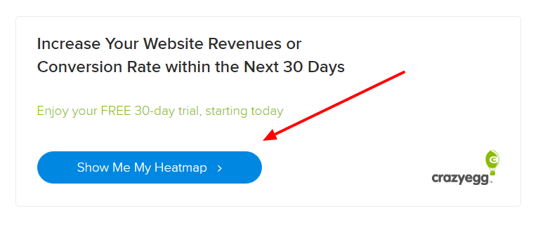
In the above image, Crazy Egg got it right. They stated the main benefit of their service, let you know your commitment (30 day trial), and used interesting language to prompt the next step (show me my heatmap).
They’re framing you as the owner of the heatmap. As humans, we work harder to keep things we own than we do to acquire new things.
That’s why people will work 10x as hard to keep their home as they will to buy a new one.
Everything in Crazy Egg’s short copy supports the call to action. The button itself reveals how the service will deliver its promise and what you’re going to do in the next step.
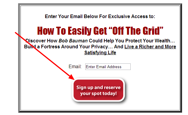
The above image commands the user twice. The first command is in the pre header text “Enter your email address”
The second command is on the button “sign up and reserve your spot.”
As soon as you fork over your email, a spot is reserved just for you. How much clearer can it be?
15. Leaving objections unanswered
There’s an objection for everything. It doesn’t matter how awesome the offer is.
I invited two of my friends out for a night on the town Everything was on me. One of them, a guy, didn’t hesitate to accept the invitation.
The other one, a lady, wasn’t so fast to jump on the train.
At first, she didn’t have any clothes to wear. I told her to put on a little black dress (she has a lot of them).Then she remembered she had to wake up early in the morning. I promised to get her home in time.
After that she claimed she’d already gone to most of the places in town. I assured her we would hit a few of the newer spots.
We went back and forth like this for a while. I patiently fielded every one of her objections. Some were legitimate, most weren’t.
You’re probably wondering why I spent so much time doing this when I was taking all the risk. It’s because I wanted to hang out with her. She’s a good friend.
I want to build a sustainable business even more. Most people don’t spend a fraction of the time I did addressing customer objections. It’s killing website optimization efforts.

Some objections are legitimate. Some aren’t. All of them can derail a conversion. Don’t leave it to chance. If you ignore the elephant in the room then you’re inviting trouble.
You come off as if you’re hiding something. Are you? I didn’t think so.
The Fix
Be honest.
Acknowledge the hard parts contained in your offer.
Sure, some people aren’t ready to put in the work, energy, or part with their money. You don’t want them as customers.
They’ll hog your support lines, ask for refunds, and spread bad reviews about you. If you have customers like that then fire them.
If the product is expensive, acknowledge that and let them know why. You don’t use genetically modified organisms throughout your supply chain and believe in free range produce. It costs more so the end product is more expensive.
If they’ll have to put in work then let them know.
Though you’re honest, you don’t have to paint yourself in a less than ideal light. I said honest, not foolish.
There’s a difference between saying you’ll have to wake up at the crack of dawn and you’ll have to wake up earlier than you’re used to. There’s also a difference between saying most people will flat out fail and we have customers who’ve not achieved the results they’re after.
The better part of valor is discretion.
16. Asking for more information than is absolutely necessary
The world is privacy centric. We live in an age of big government and big data.
Nobody wants to give away more information than is absolutely necessary. You don’t want Uncle Sam or the Big G to have your data (they do but that’s the subject of another post).
A long form staring your prospect in the face is bad.
They’ll wonder why on earth you need so much information. The end result is your form doesn’t get filled out, your product doesn’t get bought, and you’re out a conversion or two.
HubSpot and Canva got together to create a useful design resource. It contains almost 200 templates to make ads, social media posts, blog images, etc.
They’re on the right track. They’ve made a lead magnet their target market wants and needs.
They fumbled on the form.
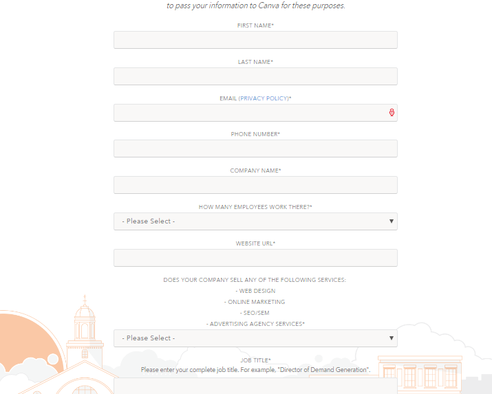
I don’t know about you but I’m not filling out that form to get a few templates. I can get the same thing for much less elsewhere.
Long forms scare people away. There are better ways to get the information you need to segment your contacts.
The Fix
There are multiple approaches.
- Shorter forms
The easiest fix is to shorten your forms. If you’re asking for 10 fields then reduce it to four. If you’re asking for a hundred then try asking for only twenty.
I know it’s easy to say.
Let me ask, do you need all of that information? Isn’t there another way to get it? Can you ask them questions throughout your email drip sequence? Can you make informed decisions based on the kind of content they interact with?
In the end, most of your lead generation forms should look like this:

This form is for registration. It asks for your name, email, and password. That’s as short as it gets.
For checkout forms, unless you’re shipping a physical product, you don’t even need to ask for their address. I know – blasphemy.
What are you using it for though?
- Break long forms into multiple pages
If there’s no way to shorten your form and it’s over five fields, consider breaking it into multiple pages. This makes it less daunting for your visitors to part with their information. You never show more than a few fields at any given time.
Seal the deal by adding a progress bar to the top of your form. You can also use the information they filled out on the first page (always ask for name and email here) to follow up with them if they abandon the registration process.
- Interactive lead generation devices (E.G. Quizzes)
I may be biased because we give you the tools to create high converting quizzes. That notwithstanding, they’re an awesome lead generation device.
Quizzes tap into multiple parts of our psyche.
- They appeal to our narcissism because they give us the opportunity to learn more about ourselves.
- They appeal to curiosity because you don’t know exactly what they’ll tell you.
- They appeal to our Ego because we can share them on social media and amass positive social proof.
Not only that, they give you, the owner of the quiz, a way to get the right information without presenting your visitors with a pushy questionnaire.
17. You’re not using specifics
What sounds better?
- Last week 1345 joined the SuperFit Revolution.
Or
- Last week over 1000 people joined the SuperFit Revolution.
The first example has a ring of authenticity to it. The numbers come off as legit. You don’t get the same impression with the rounded number.
Most copy on the web isn’t specific. They speak in vague platitudes and marketing jargon. It’s not their fault. They didn’t know any better – until now.
The Fix
Get as specific as you can – then get even more specific.
What do I mean?
Alright, let’s say you have a few hundred subscribers. At first blush, you may want to round up and say “Join five hundred people who get our weekly emails.”
It’s more effective to say “Join 483 people who get our weekly emails.”
There are many ways to ad specifics to increase your conversion rates. A few of them are:
- Case studies
In this post on Blogging Wizard, I shared the strategies I used to grow my email list almost overnight.
Readers were hooked. Many joined my mailing list.
- Statistics
Nothing is more effective than a stat. We’ve created a beautiful resource that focuses on conversion rate optimization statistics. It’s been linked to, shared, and otherwise used all over the internet.
Part of the reason is because it’s beautiful. The other part is because it’s full of cold hard facts.
Facts serve as references after the conversion action, add credibility, and keep your user in passive mode.
Use them.
- Exact details
Listen to a master storyteller. I don’t mean a writer – those count too – I mean an oral storyteller. Sit down around the fire and listen to them paint the picture with their words.
They set the scene masterfully. Yes, they may tell you what Johnny was wearing. That’s not where the magic lies. They’re masters because they tell you what Johnny was wearing, where he was, what he was doing, how he was doing it, and how he felt while it happened.
They give you enough details to feel the wind on your skin, smell the world in your nostrils, and most importantly, to experience everything Johnny experiences.
You don’t have to tell a story. You do need to add the details.
“Download the 10 chapter, 138 page, guide on conversion optimization.”
The devil resides in the details. Take advantage.
18. Load times
The final website optimization problem. Don’t be fooled. Just because it’s last doesn’t mean it’s not important.
There have been multiple studies about how site speed affects your conversions. This one from Soasta, and this one from Section.
They all arrive at similar conclusions. The slower your website, the greater negative impact it has on conversions. Think about how you use the internet. You’re wandering through half a dozen sites at any given time.
If one of them refuses to load what do you do?
Do you wait for it?
Not likely. If you’re like me, your friends, and the rest of the world then you’ll close it and look for the information elsewhere.
Load times kill your conversions for two major reasons:
- It’s a horrible first impression
- People never get to see all the other things you worked so hard on.
Together, people never see what you’ve created and they don’t give you a second chance to show them.
The Fix
There are multiple ways to fix load times. Some of them are easy and some of them are super difficult. f you have the necessary skills and enough time, you can fix these problems by yourself. However, if you think this task is too much for you, you can always do a bit of research and find a reliable reliable Webflow agency, WordPress developer, or web design companies that can share their knowledge with you, or do all of the heavy lifting for you.
Additionally, you may explore specialized agencies or freelancers experienced in Bubble development to ensure a smooth and efficient process in creating your web application.
By partnering with a reputable Bubble development agency or skilled freelancers, you can leverage their expertise and experience to unlock the full potential of the Bubble platform and ensure a seamless development process for your web application.
I’ll touch on a few and give you resources to further your education.
- Don’t load content (Images, videos, audio) until your visitor interacts with it.
For example, you won’t load images halfway down the page until your visitor scrolls that far. That’ll save you a lot of bandwidth, especially if you use image-heavy content. For WordPress, you can use a plugin like Lazy Load. Additionally, make sure to integrate a good web hosting for WordPress which will help your website perform more smoothly.
Learning how to choose a web hosting service ensures you pick a provider that balances speed, reliability, and security, making your WordPress site run efficiently under all conditions. Lazy loading extends beyond images to encompass videos and even offscreen JavaScript that doesn’t need to execute until users interact with specific page sections, collectively reducing initial page weight by 40-60% on content-rich sites while maintaining full functionality once elements enter the viewport.
Implementation requires careful consideration of user experience: setting appropriate threshold distances (loading content 200-300 pixels before it becomes visible) prevents users from seeing blank spaces or loading spinners, while placeholder images or skeleton screens maintain layout stability and create perceived performance even when actual content hasn’t loaded yet.
Learning how to choose a web hosting service ensures you pick a provider that balances speed, reliability, and security, making your WordPress site run efficiently under all conditions.
Beyond lazy loading images, a robust web hosting control panel can be a game-changer for optimizing your site’s performance. These sophisticated interfaces offer a treasure trove of tools, from one-click cache management to server-side compression, empowering even novice webmasters to fine-tune their digital domains.
Integrating a good web hosting service is paramount for optimal website performance, especially for content-rich sites that rely on WordPress. A high-quality website host will ensure faster load times, robust security, and seamless handling of increased traffic. By choosing a provider tailored to your site’s needs, you’ll be enhancing the user experience and the overall efficiency and reliability of your online presence.
What’s more, by connecting a reliable hosting service for WordPress, such as Hostpapa or SiteGround, you can provide a smoother experience for your site, optimize bandwidth usage, and improve the overall user experience. This seamless integration of web hosting with WordPress software allows small real estate business owners to effortlessly create microsites, generate valuable links, and effectively showcase their properties online.
Your website’s speed can be significantly hampered by unoptimized, heavy visual content. By introducing fast and adaptable visuals such as image sliders, your webpage’s loading speed can be remarkably accelerated. These image sliders not only add charm to your site’s aesthetics but they’re also designed for swift performance, ensuring your site remains easy to navigate while preserving its SEO significance.
A website redesign is the perfect opportunity to optimize these elements, ensuring that visual content is both lightweight and high-performing while aligning with modern design standards and user expectations.
- Turn on compression.
This page is well over 100kb. That means it’ll load more slowly. Before getting to you, it was compressed and sent over. The end result is reducing the time it took to download (let me know how it did in the comments).
A simple tool to make it happen is Gzip.
Don’t worry, the majority of browsers can support compressed files.
- Cache static files
When someone visits your website for the first time, they have to download a lot of components. When you enable caching, many of those cached components are stored on their hard drive. The next time they come, they only need to download a fraction of those elements.
Here are a few useful tools for caching:
- Wp Rocket
- Wp Fastest cache
- W3 total cache
Now, here are a few tools to check the speed of your site. They give you great recommendations if you’re not up to par.
Speed up your site. Then do it again.
Over to you
We’ve moved through the minefield that is website optimization. One wrong step can spell disaster.
Even if you do most everything right, you may not get the results you’re looking for. It sucks I know. Keep an eye on the 18 conversion killers we’ve covered in this post.
Of course, there are more items that could be added to the list. These are the most common and the most dangerous. If you can find and correct them then you’ll be well on your way to hitting a conversion rate most websites only dream of.
Ignore them and you’ll never unlock the true potential of your website.
Let me know what you’re doing stay on top of website optimization mistakes in the comments section.
Awesome article Daniel! I picked up quite on a few mistakes I’m making myself and will definitely correct them.
Getting some right though 🙂
Will definitely bookmark this to come back for reference!
You’re not the only one Marlene.
I’ve been guilty of over half these mistakes myself. Thanks for reading.
I’d say some people hate when a landing page doesn’t allow me to click to the home page. If the landing page gets my attention I want to learn more about the company by clicking around before I sign up. When I can’t do that I feel annoyed.
Agree on the marketese talk. Just make it simple English , resonates so much better.
I only got through part of the list because 7557 words is a LOT! 🙂 but good use of providing benefit with the “fix” portions
It may be a personal pet peeve but there’s no denying it boosts conversion rates when someone can’t click right back to the homepage.
thanks for reading, I know it’s a monster, check back as often as you need.
Great article!
I’m glad you liked it. Have a good one.
awesome sauce
Haha, I’ve not heard that phrase in quite a while. Thanks for reading.
Great article!
Lots of useful information.
I’m glad you got value out of the article, thanks for reading, have a good one.
Great artcle Daniel. Learned a lot!
Glad you liked it Simon. Thanks for reading.
Awesome
Very interesting and useful read
Great stuff!
Love your writing skills,
keep sharing things like this.
Very Useful Content
Keep us motivate with your skills