You use forms on your website to receive information from visitors. Unfortunately, most forms do more harm than good.
Instead of gathering important contact information to do things like book appointments, follow up with email sequences, or initiate a consultation, they are inadvertently chasing visitors away.
The end result is growth that is hindered or does not exist at all.
In this article, you will learn multiple ways to convince website visitors to submit their contact information and how effective each one is for encouraging customer relations and boosting your overall conversion rates. By the end, you will understand what to do and how to implement it on your website.
Table of Contents
1. Gated content: how it can drive business growth
When you offer content on your website such as videos, blogs, and white papers, it’s either gated or ungated.
Ungated content doesn’t require payment to access. A common example of this may be your blog. Blogs are often ungated, allowing visitors to read and exit the page with a lack of clarity about their individual needs and means of nurturing these visitors.
Gated content is what we’re most interested in.
Why?
Because gated content, as you have probably guessed, is content that requires website visitors to submit payment before accessing it. Payment doesn’t always mean money, it can be information as well. Examples of gated content are video tutorials, eBooks, and live webinars.
Webinars are typically perceived as high-value content than other gated content types. The webinar landing page by Salesforce does a lot of things well.
To effectively capture and nurture leads from webinars and other gated content, businesses can leverage the power of Salesforce Service Cloud implementation, which enables seamless integration with marketing automation tools and provides a unified view of customer interactions across channels.
By integrating dbt Cloud into their data stack, organizations can further refine and transform customer data, enabling more personalized and data-driven engagement strategies.
Unlike the usual email exchange, they ask for a lot of information from visitors. In this case, it is expected and commonly accepted because of the high-perceived value in webinars and the target audience.
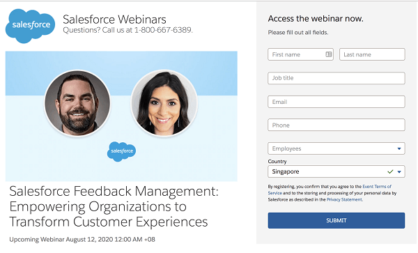
Figure 1: Salesforce webinar sign up page
Successfully using gated content has been shown to lead to higher conversion rates.
How does gated content generate growth?
Gated content is popular among businesses because it serves as an effective way to identify potential prospects who are reluctant to be approached by salespeople.
While unwilling to speak to a sales rep, these buyers are willing to exchange some personal information in return for useful information relating to their current challenges or purchase decisions. A simple email exchange for your gated content can be the stepping stone in building a relationship with your prospect.
These prospects in the awareness and consideration stages of the purchase process can then be tracked and nurtured across different channels before being, hopefully, passed on to the sales team at the appropriate time.
Be careful, though; you need to create valuable content that is more in-depth than any ungated content on the internet.
How should I implement gated content on my website?
How you utilize gated content depends on the type of business you have.
If you own a business that offers a specific service, a wonderful way to use gated content is through price quotes. Creating a pop-up window or linking to an offer for a free price quote on your services is a great way to entice visitors to submit a form.
If you own a restaurant or shop, compile a list of discounts from related vendors and give it away in exchange for contact information. Conversely, you can create educational content related to your brand and request contact details before visitors can access it.
An example can be seen in how B12 uses gated content in the form of a customized website draft to convince visitors to use its product. This provides potential prospects with an idea of what website they like based on the automated design that is curated in a few minutes. Buyers can decide if they want to move ahead with a purchase decision.
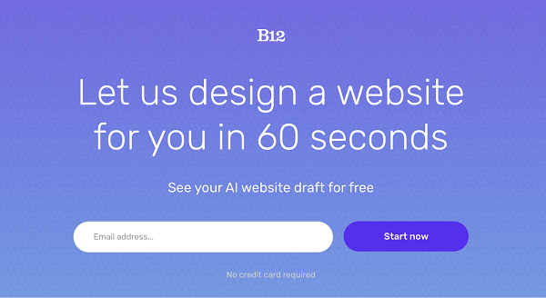
Figure 2 – B12’s free website draft
What should I ask on my gated content forms?
This depends on your type of business.
If you run a B2B company, important fields to put on your form can be the following:
- Name
- Industry
- Job title
- Business location
- Email address
- Phone number
Brainrider is a good example of a B2B form that asks for minimal but important information from potential prospects. This helps to distill and qualify prospects based on ideal qualities that you see in your target customer profile.
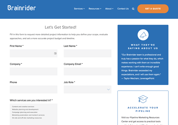
Figure 3: Brainrider’s form
These may seem simple, but they serve a purpose. You’ll learn if your customer base is made up of large or small companies, what industries they operate within, and the job role of the person who’s inquiring about your business. Of course, you’ll collect contact information to follow-up with potential customers.
B2C businesses have slightly different needs because they are dealing directly with consumers. Consider putting the following fields on your form:
- Name
- Address
- Phone number
- Email address
Having this information makes it easier to get your content to your audience. And an increase in brand awareness often leads to an increase in business growth.
Gated content is not only an effective means to ensure your website visitors submit forms, but it’s also easy to implement. The first step is to promote content your audience really wants. You then need to build a landing page to the gated content so that visitors can opt-in if they choose to access it. This landing page is where you’ll advertise the content and the form the visitor needs to fill out.
We’ll share more examples of gated content throughout this article.
2. Newsletter updates that are subtly enticing
The importance of newsletter sign-ups cannot be overemphasized. The Content Marketing Institute report for 2018 found that 74% of content marketing firms surveyed find email marketing tools, such as newsletters, to be their most effective means of generating new leads.
First-time visitors to your website may not intend to sign up for your newsletter. That’s okay. The idea is to make them want to once the opportunity presents itself.
The best way to get visitors to submit a form and sign up for your website newsletter is to be subtle yet enticing.
Check out this newsletter signup form from an article on ahrefs.com:
Figure 4 – Ahrefs’ subtle newsletter signup widget
With this example, you can see how it would be easy to entice a visitor to sign up for your business’s newsletter. It’s a subtle nudge you can create for your own website. A newsletter CTA reminds your visitors that they can get great content sent directly to their inbox by submitting that form.
How do I use newsletter forms on my website?
A newsletter signup form placed alongside superb content that keeps your visitors interested in your business is a winning combination.
Unlike banners and pop-ups, you can have a form situated at the right or left-hand border of the website, such as with the ahrefs’ example above. This ensures the form is out of the way of whatever content your visitor is interested in reading, yet still in view. You can also embed it within the content.
Create sign up forms using a tool like KyLeads and add it to specific blog posts. You can further increase conversions by adding content specific forms – also known as content upgrades – to individual blog posts.
You want to make sure you place it in a strategic location, which we talked about above, and develop a welcome email sequence that will automatically be sent once the visitor signs up.
3. Use contact forms to enhance the user experience
You want your website to make its mark on visitors. One powerful way to do that is by embedding contact forms on your site that allows users to posit questions and give feedback.
When a website doesn’t offer visitors a way to contact them, they can feel a real disconnect with the company. Prevent this from happening by placing a contact form that’s clear, user-friendly, and promotes a community feel.
A great example of such a contact form is on the skincare brand Derma-E’s website. They offer a contact form on each product’s individual page that serves as a product Q&A.
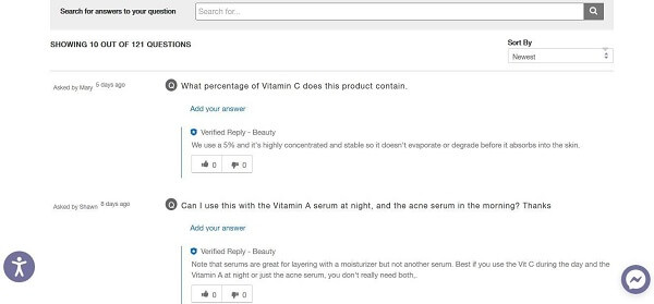
Figure 5 – Derma-E’s product contact form
In the above example, users can contact the brand directly to ask about ingredients and how to use products. Visitors can also search within the questions already posted to find results that match their needs.
Contact forms are so effective because they build trust. 73% of website visitors expect businesses to know what they need and what they expect. This is where contact forms come in.
Which type of contact form should I use on my website?
It should reflect your business’s industry and your business’s personality.
For example, If you own a shop that sells beauty products you may develop a product Q&A like Derma-E.
But this may not make sense if you are, for example, a restaurateur or run a criminal defense law firm. It just won’t bring any convenience or benefit to your customers.
If you’re willing to invest in business solutions, they should precisely meet the customer’s pains and needs, not just be a pretty and fancy piece of kit with the purpose of boasting “look we’re fancy, we have an app that our customers don’t need at all”.
Another type of contact form to consider is a multi-step form. These survey forms invite website visitors to select the best option that best describes their situation. This helps the company categorize the visitor from the choices they made, qualify them as potential leads, and control the type of messages it receives from visitors.
A customized website design can help guide users smoothly through forms, boosting completion rates.
What’s great about multi-step forms, as opposed to traditional vertical forms, is that they provide visitors with specific options to choose from rather than have them enter text information. People aren’t forced to give personal information until after they find what they’re looking for. This can lead to higher conversion rates, as your business has already demonstrated it can help them with their needs.
Improving conversion rates is vital for successful digital marketing tactics, requiring an in-depth analysis of the elements influencing user engagement on online platforms.
A thorough investigation into how individuals interact with internet forms and materials allows organizations to significantly boost their conversion performance.
Such an initiative demands a harmonious mix of data analysis and imaginative thinking to amplify participation and efficiently refine the process of acquiring leads, aiming at bettering interaction optimization for superior achievements.
There are also more traditional contact forms you may be familiar with. They’re straightforward and ask the visitor to supply their contact information and submit a question or comment they have.
Many websites prefer contact widgets over traditional contact links or live chat. A chatbot widget can solve your visitors’ queries using automated questions and answers that the visitor chooses. Once a question is selected, an answer or series of answers is automatically generated. This can increase visitor satisfaction while saving you customer service costs and limiting human error.
A contact widget can also be used to allow your website visitors to leave you a message. They simply click on the contact icon and up pops a form that includes fields like name, email address, and a message box.
How simple or complex you wish to make your contact form is entirely up to you. It’s easy to embed a contact form on your website by following a few key steps. To see how easy it is to create a form on your website, check this out.
4. Give them a gentle nudge with exit popups
When visitors intend to leave a website, they typically drag the pointer to the top of the webpage to engage a new website or to exit the browser. Exit popups are triggered by these actions and serve as a gentle reminder to the visitor to submit their information.
According to Neil Patel, exit popup forms are effective at increasing conversion rates. Their customers reported an increase in their conversion rates by 17%.
There are multifold benefits to a successful exit popup campaign. People cannot help but notice them and, when designed right, they’re a great way to generate a steady stream of new contacts.
Price quotes are a great option to drive business growth. With the right customization of this feature, you can significantly speed up the order creation process and thus make life easier for your customers. Most companies that have implemented this feature have increased customer traffic several times over.
How can I use exit popups on my website?
Exit popups typically feature a brief message that invites visitors to submit their email address. This often comes with a promotional offer, such as a percentage off a future purchase made on the website.
If you own an accounting firm, for example, your website pop-up can invite visitors to submit their email address for a free initial consultation. A restaurant owner may use exit pop-up forms to tempt visitors to input their email address to receive an invitation for a special event. Shops can use exit pop-ups to advertise a new line of products that they want to ensure their visitors notice. Software-as-a-service companies can also use exit pop-ups to showcase a video of their product demonstration.
By implementing this approach, you will unlock a restaurant email marketing plan that possesses the power to transform an increased number of visitors into loyal patrons. Intrigue and entice your guests with exclusive deals, complimentary goodies, and exceptional incentives in order to persuade them to share their email addresses. Employ compelling and unambiguous language that will maximize conversion rates while clearly communicating the value of your offerings.
Planable understands the importance of showing the benefits of the product through simple but effective copy and a video.
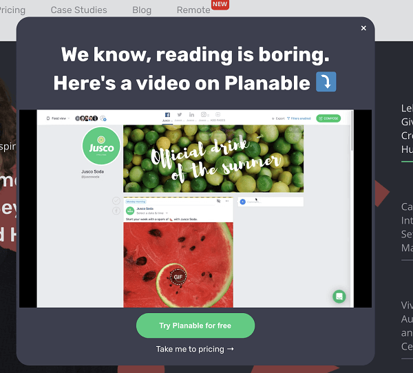
Figure 6 – Planable’s product exit pop-up form
Exit pop-ups are simple to design and often have enviable conversion rates, making them a form that every business website should use. They have the potential to turn visitors exiting your website empty-handed into brand new leads.
After you create the promotion and identify the target audience, it’s time to design the popup form. Here’s a great guide to kick-start your popup form journey.
5. Use banner announcements as a call-to-action
Banner announcements are typically displayed along the top border of a webpage and guide website visitors to a specific spot on a site. They’re an effective form as a call-to-action as they steer your visitor’s attention to something you’re trying to highlight, such as a promotion.
Banner announcements also can be found along the footer of your webpage to denote the use of cookies and other privacy terms.
As the reliance on third-party cookies continues to diminish, businesses are increasingly turning to cookieless marketing to maintain effective digital advertising strategies. This approach focuses on leveraging first-party data, contextual targeting, and privacy-compliant solutions to deliver personalized user experiences while adhering to evolving privacy regulations. By adopting such strategies, businesses can enhance user trust and ensure sustainable marketing practices.
But for the purposes of website conversion, we’ll stick to talking about it as a CTA.
Fine-tuning and streamlining your approach is certainly significant, yet grasping the use of cookies is equally critical when it comes to enhancing your form conversion rates.
These digital markers, especially those from third parties, empower you to monitor user engagement and activities, providing valuable analytics for further improvement. By strategically using these insights, you can design forms that not only resonate with your visitors but also cater to their requirements in the most user-friendly manner.
Banner announcements are an effective tool in getting customers to submit a form due to their simplicity. Most banners are strategically placed and offer a simple yet actionable message. They also help navigate website visitors in the case of a newsworthy event.
How do I use banner announcements on my website?
Banner announcements are incredibly easy to develop and simple to set up.
B2B brands may create a banner announcement to display a new feature that helps attract other businesses to their services. For example, check out the announcement banner in the Proposify website header:
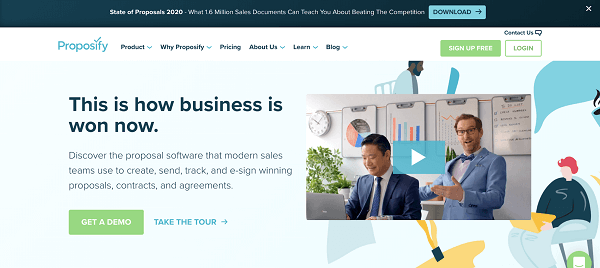
Figure 7 – Proposify’s website banner
This banner guides website visitors to its most valuable gated content – its annual report from accumulated data they’ve built over the years. It’s a means of both helping the businesses they partner with and advertising the resources they’re proud to provide.
Before designing and implementing your banner, consider what message you want to convey to your visitors. Here are some announcement bar ideas you can consider:
- Highlight a recently released product
- Link to your latest blog post article
- Inform readers of special opening hours
- Shoutout to your customer or employee of the month
- Showcase a valuable portfolio or case study
- Use a countdown timer for a special promotion
- Promote an upcoming event or webinar
- Offer a free giveaway or download
- Link to an FAQ
- Share recent achievements for an award or certification
- Add follow links for your social media accounts
You should have a CTA in mind that represents your company’s values and is tailored for your visitors.
You can easily create and edit a banner on your website with just a few steps. Choose where you want your banner to be placed on your website. Decide on what you want to use your banner to direct your website visitors to first and get creative with this valuable real estate.
6. Measure results and boost conversions with calculators
Using a calculator is a simple and effective variation to forms. In this manner, you get to bring value to your visitor immediately and also collect potential leads for your business.
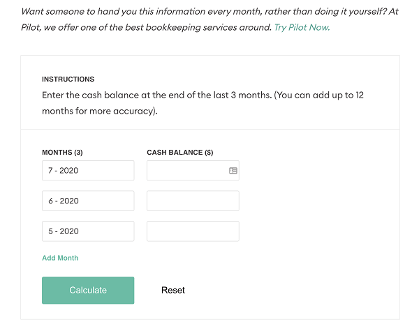
Figure 8- Pilot’s website burn-rate calculator
Pilot’s burn-rate calculator helps founders figure out their current financial situation and invites them to leave their contact information as potential leads. Not only do the visitors get immediate feedback and valuable information for their needs, Pilot gets qualified leads too.
Using a calculator as a means of collecting leads can serve your website visitors and business and help them better understand the problems they face and how you can help them.
Conclusion
By utilizing these different forms and tools, your website will generate more leads and your business will grow. Remember, a website is only effective when you offer value to your visitor. These are different ways that you can convince your audience to submit their information willingly.
Let me know how you’re building website forms that convert in the comments and don’t forget to share. 🙂
Amanda Lim is a Digital Marketer at the website design company, B12, and an avid researcher of social media, web design, and marketing.